Week Two: Summarizing & Visualizing Numerical Data
Welcome!
In this week’s coursework we are going to continuing exploring data, through data summaries and visualizations, focusing specifically on numerical variables. We will be using the dplyr package in R to wrangle our data and the ggplot2 package to created data visualizations.
0.1 Learning Outcomes
By the end of this coursework you should be able to:
- outline the differences between numerical and categorical variables
- describe what type of summary statistic is appropriate for a given distribution of a numerical variable
- discuss when it is / is not appropriate to summarize a variable with a mean
- create visualizations of one and two numerical variables
- discuss the benefits and shortcomings of different visualizations
1 Prepare
1.1 Textbook Reading – Part 1
Required Reading: Exploring Numerical Data
Reading Guide – Due Monday by the start of class
Submit your completed reading guide to the Canvas assignment portal!
1.2 Concept Quiz – Due Wednesday by the start of class
The two concept quizzes from each chapter have been combined into one concept quiz on Canvas.
- Suppose we have data on the departure delays of flights flying out of New York. What shape would you expect the distribution of departure delays to have?
- right skew
- left skew
- bimodal
- mutimodal
- uniform
Hint: Think about how you would “typically” expect flight delays to behave.
- To better decide what summary statistic we should use to summarize the departure delays it would be best to create a data visualization of the distribution of departure delays. What type of visualizations could we make? Select all that apply!
- boxplot
- histogram
- barplot
- density plot
- scatterplot
1.3 Textbook Reading – Part 2
Required Reading: Data Visualization

Reading Guide – Due Wednesday by the start of class
Submit your completed reading guide to the Canvas assignment portal!
1.4 Concept Quiz – Due Wednesday by the start of class
The two concept quizzes from each chapter have been combined into one concept quiz on Canvas.
- What aesthetics are being used in the following plot?
Hint: Think about what goes inside of the aes() function and what does not.
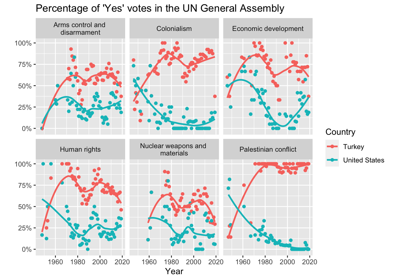
xaxisyaxiscolorfacetspointslines
- What geometric objects are being used in the displayed visualization?
Hint: Think about what geoms you would use to make this plot!
- points
- lines / smoothers
- colors
- facets
- What aspects of the distribution of departure delays can you see in the histogram that you could not see in the boxplot?
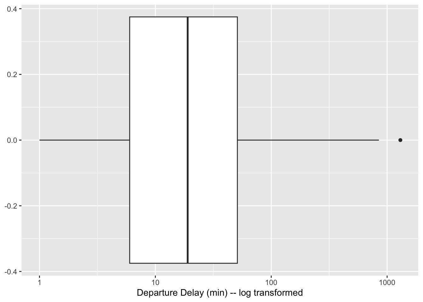
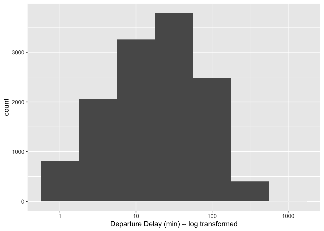
- shape of distribution
- median
- outliers
- mode
2 R Tutorial – Due Wednesday by the start of class
💻 Required Tutorial: Exploring Numerical Data
Submit a screenshot of the completion page for each tutorial to the Canvas assignment portal!
