ggplot(data = births14,
       mapping = aes(x = mage, y = weight)) +
  geom_point() +
  geom_smooth(method = "lm") +
  labs(x = "Mother's Age",
       y = "Birth Weight of Baby (lbs)")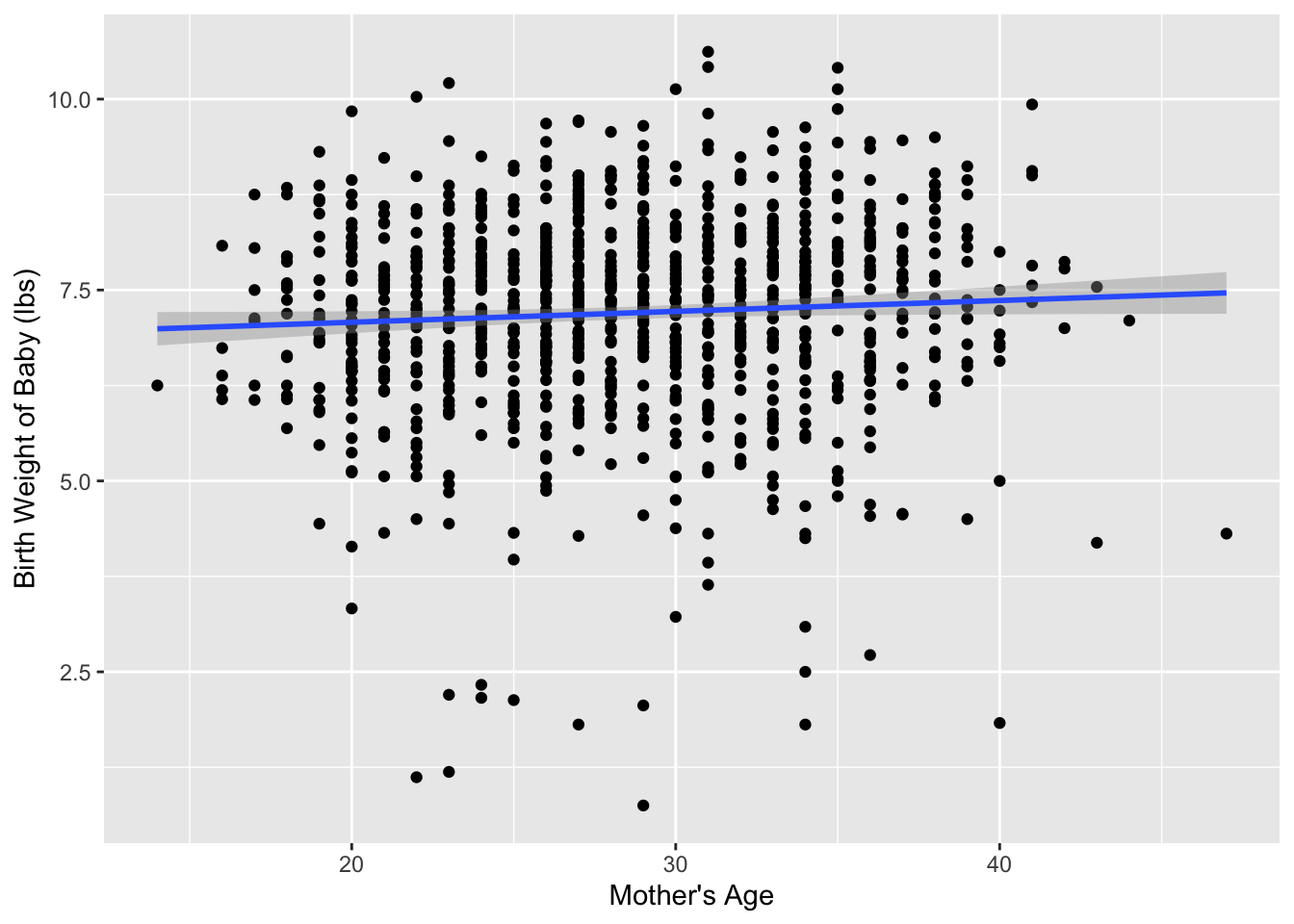
This week’s reading is a compilation of Chapter 8 from ModernDive (Kim et al. 2020), Chapter 24 from Introduction to Modern Statistics (Çetinkaya-Rundel and Hardin 2023), with a smattering of my own ideas.
In the last reading, we studied the concept of sampling variation. Using the example of estimating the proportion of red balls in a bowl, we started with a “tactile” exercise where a shovel was used to draw a sample of balls from the bowl. While we could have performed an exhaustive count of all the balls in the bowl, this would have been a tedious process. So instead, we used a shovel to extract a sample of balls and used the resulting proportion that were red as an estimate. Furthermore, we made sure to mix the bowl’s contents before every use of the shovel. Because of the randomness created by the mixing, different uses of the shovel yielded different proportions red and hence different estimates of the proportion of the bowl’s balls that are red.
We then used R to mimic this “tactile” sampling process. Using our computer’s random number generator, we were able to quickly mimic the tactile sampling procedure a large number of times. Moreover, we were able to explore how different our results would be if we used different sized shovels, with 25, 50, and 100 slots. When we visualized the results of these three different shovel sizes, we saw that as the sample size increased, the variation in the estimates (\(\widehat{p}\)) decreased.
These visualizations of the repeated sampling from the bowl have a special name in Statistics – a sampling distribution. These distributions all us to study how our estimates ($) varied from one sample to another; in other words, we wanted to study the effect of sampling variation. Once we had over 1,000 different estimates, we quantified the variation of these estimates using their standard deviation, which also has a special name in Statistics – the standard error. Visually we saw the spread of the sampling distributions get narrower as the sample size increased, which was reiterated by the standard errors – the standard errors decreased as the sample size increased. This decrease in spread of the sampling distribution gives us more precise estimates that varied less around the center.
We then tied these sampling concepts to the statistical terminology and mathematical notation related to sampling. Our study population was the large bowl with \(N\) = 2400 balls, while the population parameter, the unknown quantity of interest, was the population proportion \(p\) of the bowl’s balls that were red. Since performing a census would be expensive in terms of time and energy, we instead extracted a sample of size \(n\) = 50. The point estimate, also known as a sample statistic, used to estimate \(p\) was the sample proportion \(\widehat{p}\) of these 50 sampled balls that were red. Furthermore, since the sample was obtained at random, it can be considered as unbiased and representative of the population. Thus any results based on the sample could be generalized to the population. Therefore, the proportion of the shovel’s balls that were red was a “good guess” of the proportion of the bowl’s balls that are red. In other words, we used the sample to infer about the population.
However, we acknowledged that both the tactile and virtual sampling exercises are not what one would do in real life; this was merely an activity used to study the effects of sampling variation. In a real-life situation, we would not take 1,000s of samples of size \(n\), but rather take a single representative sample that’s as large as possible. Additionally, we knew that the true proportion of the bowl’s balls that were red was 37.5%. In a real-life situation, we will not know what this value is. Because if we did, then why would we take a sample to estimate it?
So how does one quantify the effects of sampling variation when you only have a single sample to work with? You cannot directly study the effects of sampling variation when you only have one sample. One common method to study this is bootstrapping resampling, which will be the focus of the earlier sections of this reading.
Furthermore, what if we would like not only a single estimate of the unknown population parameter, but also a range of highly plausible values? For example, when you read about political polls, they tell you the percent of all Californians who support a specific measure, but in addition to this estimate they provide the poll’s “margin of error”. This margin of error can be used to construct a range of plausible values for the true percentage of people who support a specific measure. This range of plausible values is what’s known as a confidence interval, which will be the focus of the later sections of this reading.
Medical researchers may be interested in the relationship between a baby’s birth weight and the age of the mother, so as to provide medical interventions for specific age groups if it is found that they are associated with lower birth weights.
Every year, the US releases to the public a large data set containing information on births recorded in the country. The births14 dataset is a random sample of 1,000 cases from one such dataset released in 2014.
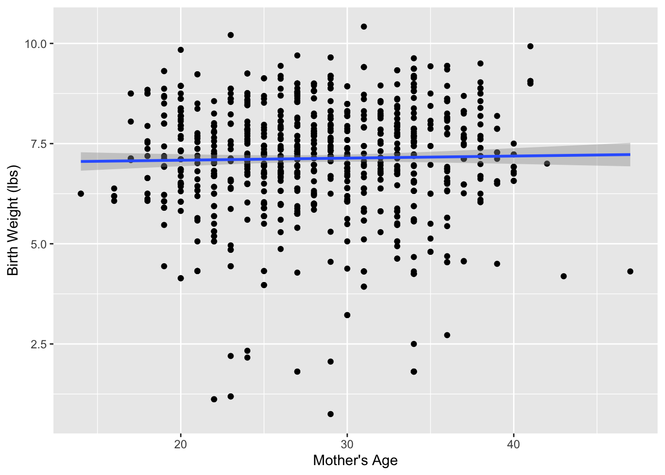
Figure 1 visualizes the relationship between mage and weight for this sample of 1,000 birth records.
ggplot(data = births14,
mapping = aes(x = mage, y = weight)) +
geom_point() +
geom_smooth(method = "lm") +
labs(x = "Mother's Age",
y = "Birth Weight of Baby (lbs)")
Table 1 displays the estimated regression coefficients for modeling the relationship between mage and weight for this sample of 1,000 birth records.
births_lm <- lm(weight ~ mage, data = births14)

get_regression_table(births_lm)| term | estimate | std_error | statistic | p_value | lower_ci | upper_ci |
|---|---|---|---|---|---|---|
| intercept | 6.793 | 0.208 | 32.651 | 0.000 | 6.385 | 7.201 |
| mage | 0.014 | 0.007 | 1.987 | 0.047 | 0.000 | 0.028 |
Based on these coefficients, the estimated regression equation is:
\[ \widehat{\text{birth weight}} = -6.793 + 0.014 \times \text{mother's age}\]
We will let \(\beta_1\) represent the slope of the relationship between baby’s birth weight and mother’s age for every baby born in the US in 2014. We will estimate \(\beta_1\) using the births14 dataset, labeling the estimate \(b_1\) (just as we did in Week 4).
A parameter is the value of the statistic of interest for the entire population.
We typically estimate the parameter using a “point estimate” from a sample of data. The point estimate is also referred to as the statistic.
This sample of 1,000 births is only one of possibly tens of thousands of possible samples that could have been taken from the large dataset released in 2014. So, then we might wonder how different our regression equation would be if we had a different sample. There is no reason to believe that \(\beta_1\) is 0.279, but there is also no reason to believe that \(\beta_1\) is particularly far away from \(b_1 =\) 0.279.
Just this week you read about how estimates, such as \(b_1\), are prone to sampling variation – the variability from sample to sample. For example, if we took a different sample of 1,000 births, would we obtain a slope of exactly 0.279? No, that seems fairly unlikely. We might obtain a slope of 0.29 or 0.26, or even 0.35!
When we studied the effects of sampling variation, we took many samples, something that was easily done with a shovel and a bowl of red and white balls. In this case, however, how would we obtain another sample? Well, we would need to go to the source of the data—the large public dataset released in 2014—and take another random sample of 1,000 observations. Maybe we don’t have access to that original dataset of 2014 births, how could we study the effects of sampling variation using our single sample? We will do so using a technique known as bootstrap resampling with replacement, which we now illustrate.
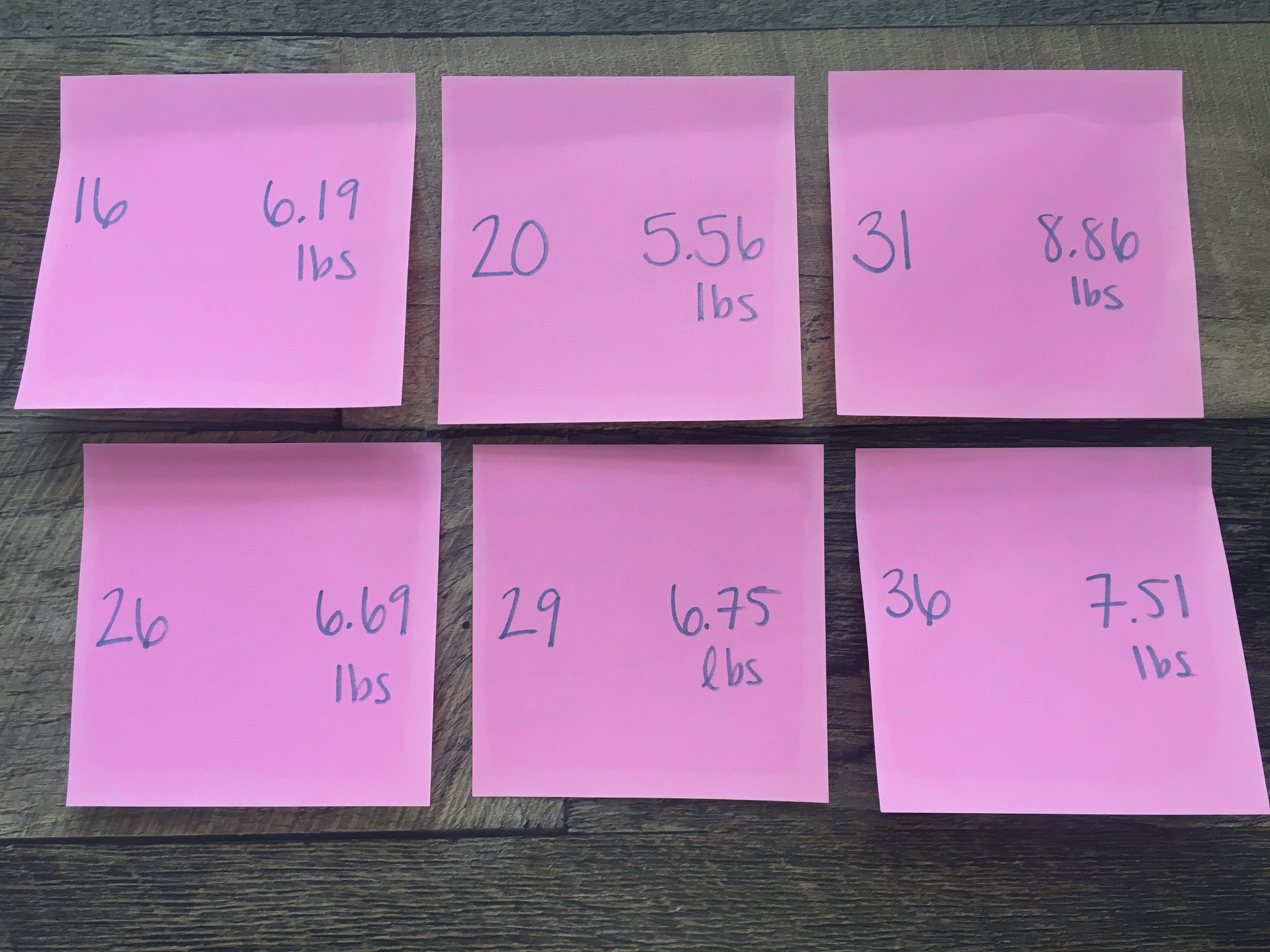
Step 1: Print out 1,000 identically sized slips of paper (or post-it notes) representing the sample of 1,000 babies in our sample. On each piece of paper, write the mother’s age and the birth weight of the baby. Figure 2 displays six of these such papers.
Step 2: Put the 1,000 slips of paper into a hat as seen in Figure 3.
Step 3: Mix the hat’s contents and draw one slip of paper at random, as seen in Figure 4. Record the mother’s age and baby’s birth weight, as printed on the paper.
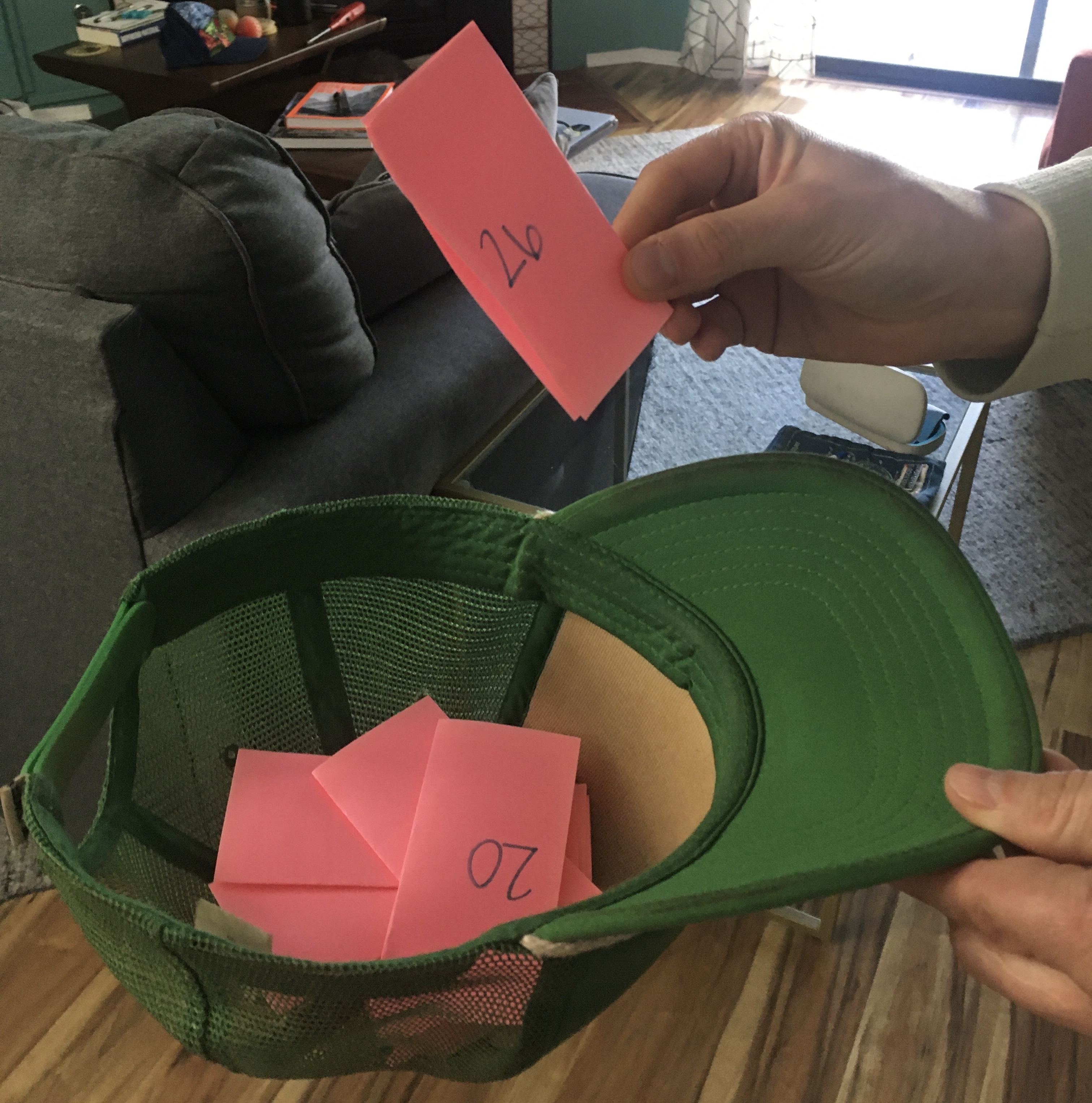
Step 4: Put the slip of paper back in the hat! In other words, replace it as seen in Figure 5.

Step 5: Repeat Steps 3 and 4 a total of 999 more times, resulting in 1,000 recorded mother’s ages and baby birth weights.
What we just performed was a resampling of the original sample of 1,000 birth records. We are not sampling 1,000 birth records from the population of all 2014 US births as we did for our original sample. Instead, we are mimicking this process by resampling 1,000 birth records from our original sample.
Now ask yourselves, why did we replace our resampled slip of paper back into the hat in Step 4? Because if we left the slip of paper out of the hat each time we performed Step 4, we would end up with the same 1,000 birth records! In other words, replacing the slips of paper induces sampling variation.
Being more precise with our terminology, we just performed a resampling with replacement from the original sample of 1,000 birth records. Had we left the slip of paper out of the hat each time we performed Step 4, this would be resampling without replacement.
Let’s study our sample of 1,000 resampled birth records. First, I’ve made a table of the number of times each observation (birth record) was resampled. Table 2 displays the birth records that were resampled the most often. Based on the table, it appears that record IDs 71 and 534 were resampled six times.
| 71 | 534 | 170 | 561 | 19 | 142 | 305 | 309 | 495 | 573 | 726 | 727 | 835 | 838 | 840 | 864 | 919 | 924 | 929 | 953 |
|---|---|---|---|---|---|---|---|---|---|---|---|---|---|---|---|---|---|---|---|
| 6 | 6 | 5 | 5 | 4 | 4 | 4 | 4 | 4 | 4 | 4 | 4 | 4 | 4 | 4 | 4 | 4 | 4 | 4 | 4 |
When sampling with replacement, not every observation is guaranteed to be sampled. So, some observations from the original sample may never appear in the resample, whereas others may appear multiple times.
Figure 6 compares the relationship between mother’s age and baby’s birth weight from our resample with the relationship in our original sample.
ggplot(data = births14,
       mapping = aes(x = mage, y = weight)) +
  geom_point() +
  geom_smooth(method = "lm") +
  labs(x = "Mother's Age",
       y = "Birth Weight (lbs)")

ggplot(data = resample1,
       mapping = aes(x = mage, y = weight)) +
  geom_point() +
  geom_smooth(method = "lm") +
  labs(x = "Mother's Age",
       y = "Birth Weight (lbs)")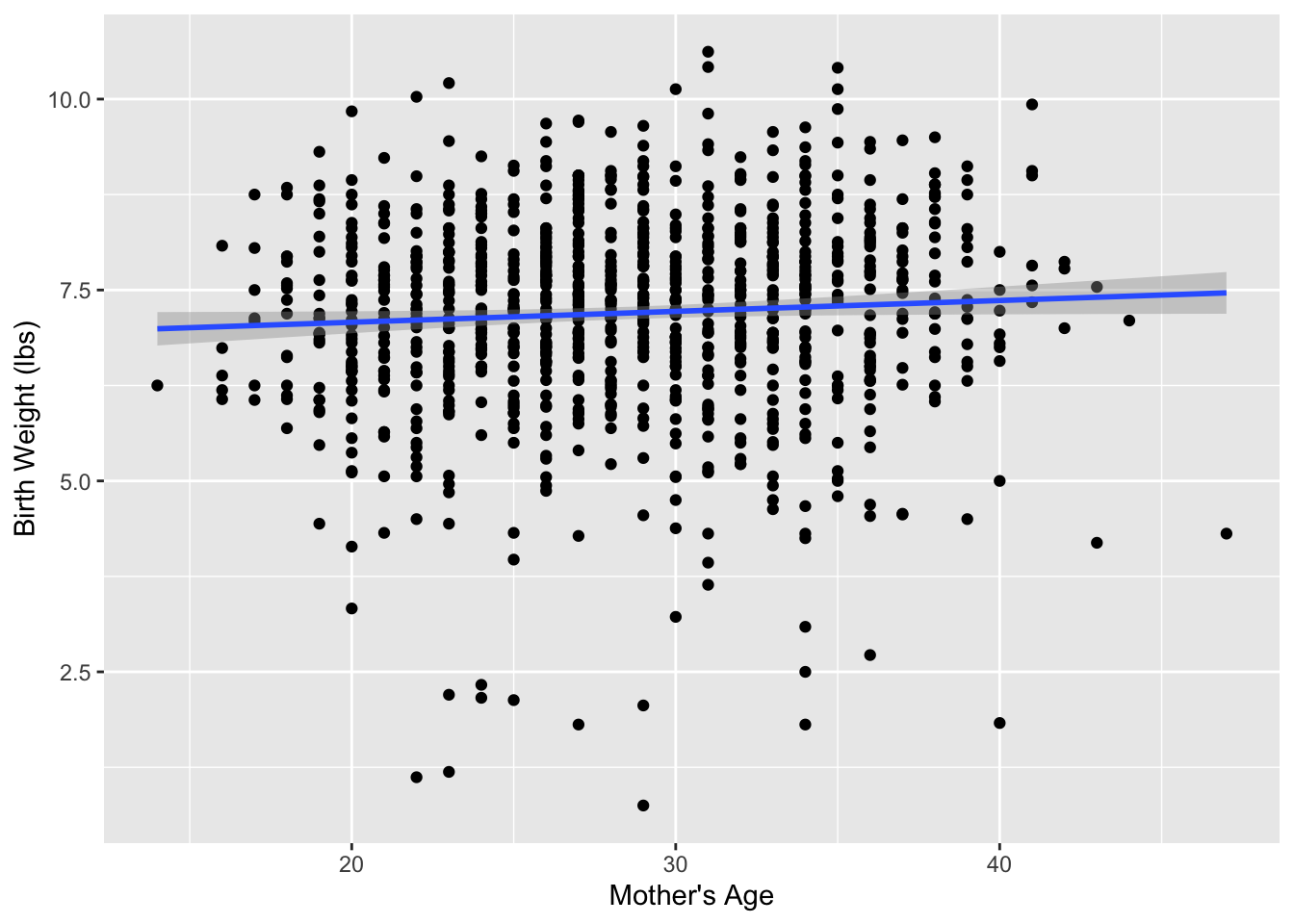
mage and weight in the resampled birth records compared to the relationship seen in the original sample of birth records.
Observed in Figure 6 that while the general shape of both relationships are similar, they are not identical.
Recall, from the previous section that the sample slope (\(b_1\)) from the original sample was . What about for our resample? Based on the scatterplot, what would your guess be? Larger than before? Smaller than before?
Let’s look at the coefficient estimates for the resampled dataset. Table 3 displays the estimated regression coefficients for modeling the relationship between mage and weight for the resample of 1,000 birth records.
resample_lm <- lm(weight ~ mage, data = resample1)

get_regression_table(resample_lm)| term | estimate | std_error | statistic | p_value | lower_ci | upper_ci |
|---|---|---|---|---|---|---|
| intercept | 6.981 | 0.220 | 31.738 | 0.000 | 6.549 | 7.413 |
| mage | 0.005 | 0.008 | 0.684 | 0.494 | -0.010 | 0.020 |
For the resampled dataset, the relationship between mother’s age and baby birth weight is much weaker than in the original sample, with an estimated slope of \(b_1 =\) 0.005.
What if we repeated this resampling exercise many times? Would we obtain the same slope each time? In other words, would our guess at the slope for the relationship between mother’s age and baby’s birth weight for all births in the US in 2014 exactly 0.005 every time?
It should be very clear that tactile resampling with a dataset with 1,000 observations would be extremely time consuming, nothing we would want to ask our friends to do. A computer, however, would be happy to do this process for us!
First, let’s perform the virtual analog of resampling once. Recall that the births14 dataset included in the openintro package contains the 1,000 birth records from the original study. Furthermore, recall in the last chapter that we used the rep_sample_n() function as a virtual shovel to sample balls from our virtual bowl of 2400 balls as follows:
Let’s modify this code to perform the resampling with replacement from the 1,000 birth records in the original sample:
virtual_resample <- rep_sample_n(births14,
                                 size = 1000,
                                 replace = TRUE,
                                 reps = 1)
Observe how we explicitly set the replace argument to TRUE in order to tell rep_sample_n() that we would like to sample birth records with replacement. Had we not kept replace = FALSE, we would have done resampling without replacement. Additionally, we changed the sample size, as we need to create a sample with the same size as the original sample which had 1,000 observations.
Let’s look at only the first 10 out of 1,000 rows of virtual_resample:
virtual_resample# A tibble: 1,000 × 15
# Groups: replicate [1]
replicate ID mage weight fage mature weeks premie visits gained
<int> <int> <dbl> <dbl> <int> <chr> <dbl> <chr> <dbl> <dbl>
1 1 333 29 7.4 31 younger mom 39 full term 13 50
2 1 595 29 0.75 NA younger mom 21 premie 4 NA
3 1 338 31 6.94 NA younger mom 39 full term 9 20
4 1 531 33 6.94 37 younger mom 39 full term 14 20
5 1 289 35 7.98 35 mature mom 38 full term 10 40
6 1 461 32 7.15 33 younger mom 39 full term 13 NA
7 1 137 26 7.69 36 younger mom 38 full term NA 25
8 1 828 36 4.54 65 mature mom 36 premie 11 10
9 1 118 26 8.31 24 younger mom 37 full term 12 25
10 1 95 38 6.04 37 mature mom 36 premie 10 32
# ℹ 990 more rows
# ℹ 5 more variables: lowbirthweight <chr>, sex <chr>, habit <chr>,
# marital <chr>, whitemom <chr>The replicate variable only takes on the value of 1 corresponding to us only having reps = 1, the ID variable indicates which of the 1,000 birth records was resampled, and mage and weight denote mother’s age and the baby’s birth weight, respectively.
Let’s now compute the slope for the relationship between mother’s age and baby’s birth weight for this resample:
virtual_resample_lm <- lm(weight ~ mage, data = virtual_resample)

get_regression_table(virtual_resample_lm)| term | estimate | std_error | statistic | p_value | lower_ci | upper_ci |
|---|---|---|---|---|---|---|
| intercept | 7.156 | 0.224 | 31.974 | 0.000 | 6.716 | 7.595 |
| mage | 0.002 | 0.008 | 0.210 | 0.834 | -0.014 | 0.017 |
As we saw when we did our tactile resampling exercise, Table 4 shows that the estimated slope is different from the slope of our original sample of 0.005.
Unfortunately, our process of virtual resampling relies on us fitting a linear regression for each replicate of our virtual_resample dataset. This gets a bit tricky coding wise, as we would need to fit 35 different linear regressions if we had 35 different resamples of our data.
Enter, infer, an R package for statistical inference. infer makes efficient use of the %>% pipe operator we learned in Week 3 to spell out the sequence of steps necessary to perform statistical inference in a “tidy” and transparent fashion. Furthermore, just as the dplyr package provides functions with verb-like names to perform data wrangling, the infer package provides functions with intuitive verb-like names to perform statistical inference.
Let’s go back to our original slope. Previously, we computed the value of the sample slope \(b_1\) using the lm() function:
births_lm <- lm(weight ~ mage, data = births14)

get_regression_table(births_lm)
We’ll see that we can also do this using infer functions specify() and calculate():
births14 %>%
  specify(response = weight,
          explanatory = mage) %>%
  calculate(stat = "slope")
You might be asking yourself: “Isn’t the infer code longer? Why would I use that code?”. While not immediately apparent, you’ll see that there are three chief benefits to the infer workflow as opposed to the lm() function workflow we had previously.
First, the infer verb names better align with the overall resampling framework you need to understand to construct confidence intervals and to conduct hypothesis tests. We’ll see flowchart diagrams of this framework in the upcoming Figure 12.
Second, you can jump back and forth seamlessly between confidence intervals and hypothesis testing with minimal changes to your code. This will become apparent next week, when we also use infer to conduct hypothesis tests for the slope statistic.
Third, the infer workflow is much simpler for conducting inference when you have more than one variable, meaning we can extend what we’ve learned for simple linear regression to multiple linear regression models.
Let’s now illustrate the sequence of verbs necessary to construct a confidence interval for \(\b_1\), the slope of the relationship between mother’s age and baby’s birth weight for all US births in 2014.
specify() variables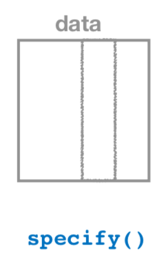
specify()ing variables.”
As shown in Figure 7, the specify() function is used to choose which variables in a data frame will be the focus of our statistical inference. We do this by specifying the response argument. For example, in our births14 data frame, the response variable of interest is weight and the explanatory variable is mage:
births14 %>%
  specify(response = weight,
          explanatory = mage)
Response: weight (numeric)
Explanatory: mage (numeric)
# A tibble: 1,000 × 2
weight mage
<dbl> <dbl>
1 6.96 34
2 8.86 31
3 7.51 36
4 6.19 16
5 6.75 31
6 6.69 26
7 6.13 36
8 6.74 24
9 8.94 32
10 9.12 26
# ℹ 990 more rowsNotice how the dataset got smaller, now there are only two columns where before there were 14. You should also notice the messages above the dataset (Response: weight (numeric) and Explanatory: mage). These are meta-data about the grouping structure of the dataset, declaring which variable has been assigned to the explanatory / response.
This is similar to how the group_by() verb from dplyr doesn’t change the data, but only adds “grouping” meta-data, as we saw in Week 3.
generate() replicates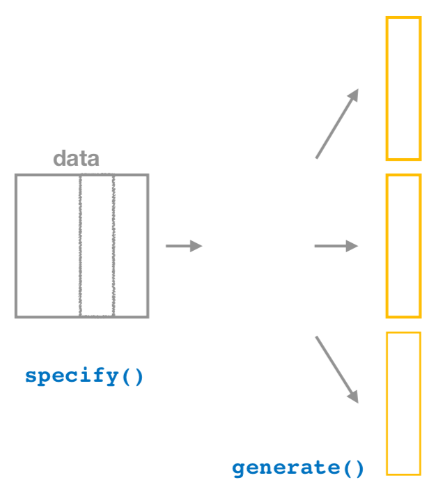
generate() replicates.”
After we specify() the variables of interest, we pipe the results into the generate() function to generate replicates. Figure 8 shows how this is combined with specify() to start the pipeline. In other words, repeat the resampling process a large number of times, similar to how we collected 35 different samples of balls from the bowl.
The generate() function’s first argument is reps, which sets the number of replicates we would like to generate. Suppose we were interested in obtaining 50 different resamples (each of 1,000 birth records). Then, we would we set reps = 50, telling infer that we are interested in obtaining 50 different resamples, each with 1,000 observations.
The second argument type determines the type of computer simulation we’d like to perform. We set this to type = "bootstrap" indicating that we want to perform bootstrap resampling, meaning the resampling should be done with replacement. You’ll see different options for type when we learn about hypothesis testing next week.
births14 %>%
  specify(response = weight,
          explanatory = mage) %>%
  generate(reps = 50,
           type = "bootstrap")
Response: weight (numeric)
Explanatory: mage (numeric)
# A tibble: 50,000 × 3
# Groups: replicate [50]
replicate weight mage
<int> <dbl> <dbl>
1 1 10.6 31
2 1 4.31 31
3 1 4.94 33
4 1 5.65 36
5 1 8 23
6 1 7.63 37
7 1 8 19
8 1 3.22 30
9 1 8.56 32
10 1 4.32 21
# ℹ 49,990 more rowsObserve that the resulting data frame has 50,000 rows. This is because we performed resampling of 1000 birth records with replacement 50 times and 1000 \(\times\) 50 = 50,000.
The variable replicate indicates which resample each row belongs to. So it has the value 1 1000 times, the value 2 1000 times, all the way through to the value 50 1000 times.
Comparing with original workflow: Note that the steps of the infer workflow so far produce the same results as the original workflow using the rep_sample_n() function we saw earlier. In other words, the following two code chunks produce similar results:
infer workflow
births14 %>%
  specify(response = weight,
          explanatory = mage) %>%
  generate(reps = 50,
           type = "bootstrap")
Original workflow
rep_sample_n(births14,
             size = 1000,
             replace = TRUE,
reps = 50)calculate() summary statistics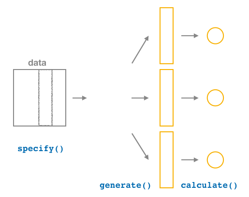
After we generate() many replicates of bootstrap resampling with replacement, we next want to summarize each of the 50 resamples of size 1000 to a single sample statistic value. As seen in Figure 9, the calculate() function does this.
In our case, we want to calculate the slope between mother’s age and baby’s birth weight for each bootstrap resample of size 1000. To do so, we set the stat argument to "slope".
You can also set the stat argument to a variety of other common summary statistics, like "median", "sum", "sd" (standard deviation), and "prop" (proportion). To see a list of all possible summary statistics you can use, type ?calculate and read the help file.
Let’s save the result in a data frame called bootstrap_distribution and explore its contents:
bootstrap_distribution <- births14 %>%
  specify(response = weight,
          explanatory = mage) %>%
  generate(reps = 50) %>%
  calculate(stat = "slope")

bootstrap_distribution
Response: weight (numeric)
Explanatory: mage (numeric)
# A tibble: 50 × 2
replicate stat
<int> <dbl>
1 1 0.0328
2 2 0.0181
3 3 0.0123
4 4 0.0106
5 5 0.0183
6 6 0.0190
7 7 0.0145
8 8 0.00824
9 9 0.0155
10 10 0.0160
# ℹ 40 more rowsObserve that the resulting data frame has 50 rows and two columns. The replicate column corresponds to the 50 replicates and the stat column corresponds to the estimated slope for each resample.
visualize() the results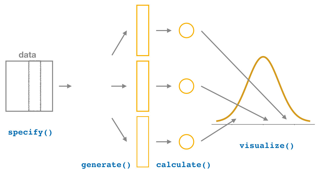
The visualize()verb provides a quick way to visualize the bootstrap distribution as a histogram of the numerical stat variable’s values. The pipeline of the main infer verbs used for exploring bootstrap distribution results is shown in Figure 11.
visualize(bootstrap_distribution)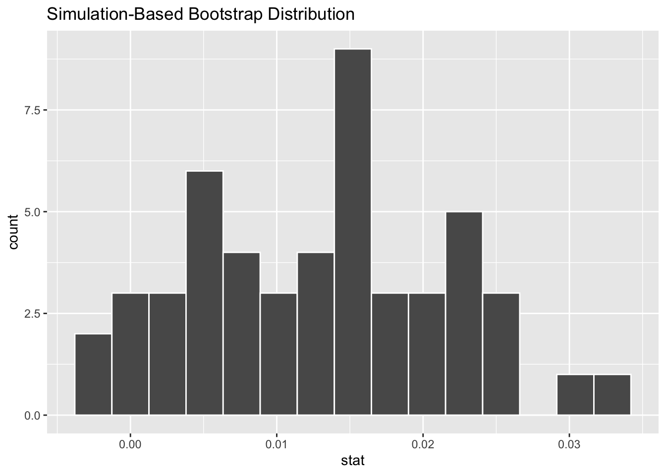
The visualize() function can take many other arguments which we’ll see momentarily to customize the plot further. It also works with helper functions to do the shading of the histogram values corresponding to the confidence interval values.
Comparing with original workflow: In fact, visualize() is a wrapper function for the ggplot() function that uses a geom_histogram() layer. That’s a lot of fancy language which means that the visualize() function does the same thing as we did previously with ggplot(), just with fewer steps.
infer workflow
visualize(bootstrap_distribution)Original workflow
ggplot(data = bootstrap_distribution,
       mapping = aes(x = stat)) +
geom_histogram()Careful! It might sound tempting to ditch the ggplot() code altogether now that you know of a simpler approach. The visualize() function only works for a specific case – a data frame containing a distribution of calculate()d statistics.
Let’s recap the steps of the infer workflow for constructing a bootstrap distribution and then visualizing it in Figure 12.
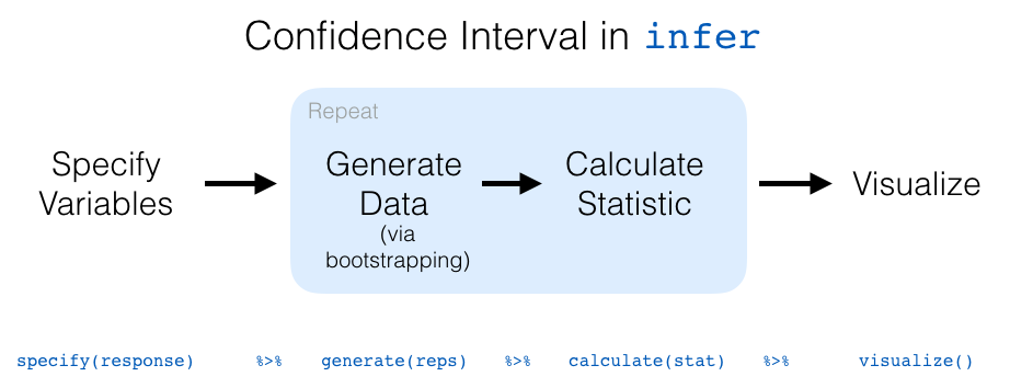
To change from resampling 50 times to resampling 1,000 times, only one line of code needs to change—the number of reps. In the code process below, we’ve chained together the entire infer pipeline, connecting the specify, generate, calculate, and visualize steps.
bootstrap_1000 <- births14 |>
  specify(response = weight,
          explanatory = mage) |>
  generate(reps = 1000,
           type = "bootstrap") |>
  calculate(stat = "slope")

visualize(bootstrap_1000) +
  labs(x = "Bootstrap Slope Statistic",
       y = "Bootstrap Distribution of 1,000 Resamples")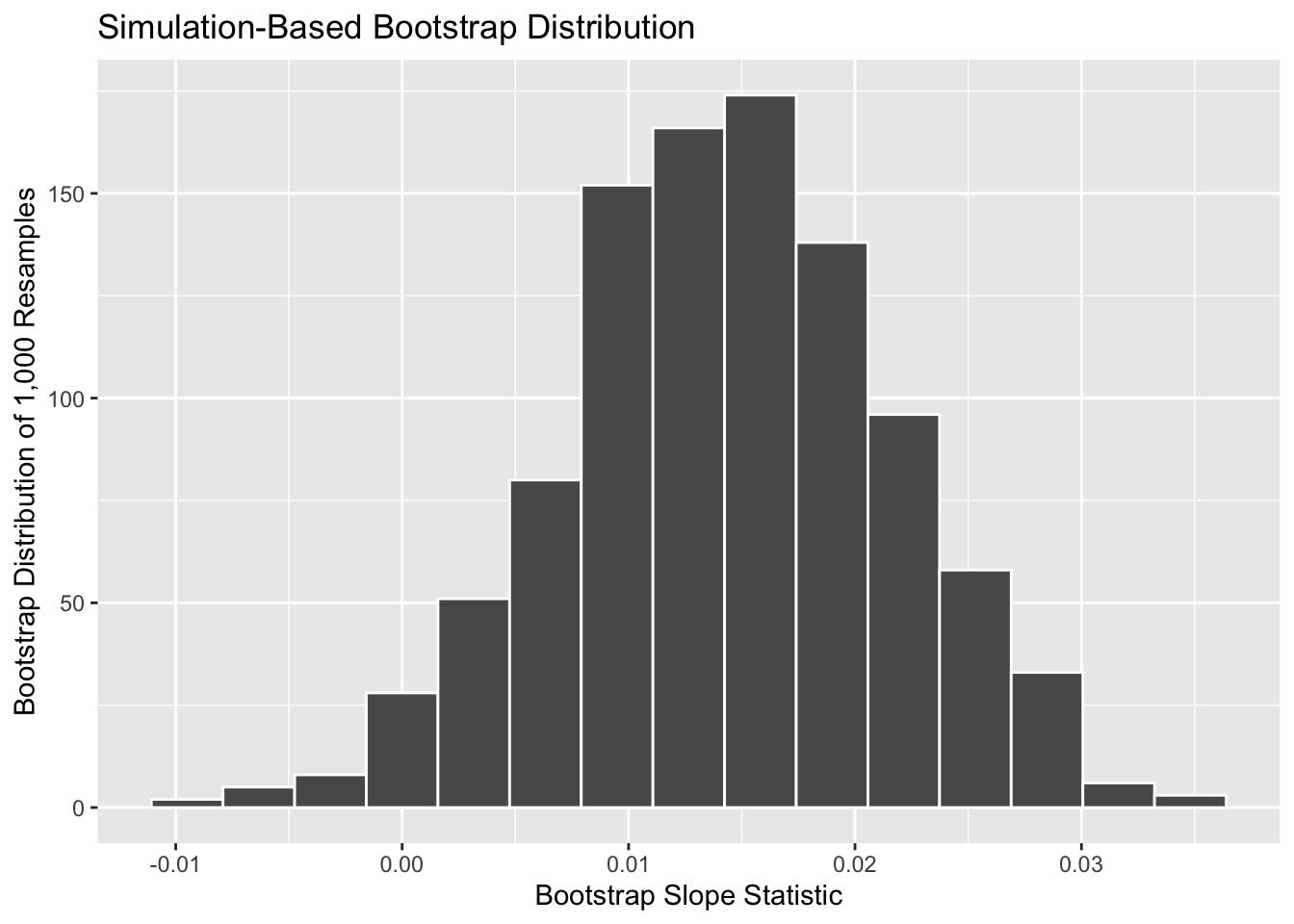
Notice you can still use the labs() function to change your axis labels. Notice that you still need to connect the axis labels with the plot using a + sign.
What do you notice about this distribution? What distribution does it resemble? Why is that the case?
The histogram of sample slopes in Figure 13 is called the bootstrap distribution. The bootstrap distribution is an approximation to the sampling distribution of sample slopes.
If you recall back to the last chapter, a sampling distribution was a distribution of statistics from repeatedly sampling from the population. However, a bootstrap distribution is a distribution of statistics from repeatedly resampling from the sample. This may seem rather strange, how can a distribution based entirely on the sample approximate a distribution based on the population? That’s a great question!
The bootstrapping process hinges on the belief that the sample is representative of the population. Meaning, there are not systematic differences between the sample and the population. For example, if there were no young mothers in the sample of 1,000 birth records in the births14 dataset. If we have a random sample, however, then on average our sample should look very similar to our population. Meaning, the individuals in the sample can “stand in” for individuals in the population with similar characteristics. So, we can think of repeatedly resampling from our sample as a similar process as sampling from the population.
The process of randomly sampling does not guarantee that smaller groups of observations will always appear in the sample. Rather, by randomly sampling from the population, on average the representation of individuals in the sample should reflect the proportion of individuals in the population.
To me, this feels rather uncomfortable as a random sample assumes that you can generalize from the sample onto the population from which it was drawn. This means you are generalizing the observations of a few individuals onto the entire population of similar individuals. For example, if you were to collect a random sample of Cal Poly students, it is likely your sample would include very few Black students (as Cal Poly is a predominantly white institution). But, if your sample was random, statistically you could infer from your small sample of Black students onto the entire population of Black students at Cal Poly. That seems kind of iffy to me.
Let’s start this section with an analogy involving fishing. Say you are trying to catch a fish. On the one hand, you could use a spear, while on the other you could use a net. Using the net will probably allow you to catch more fish!
In the births14 investigation, we are trying to estimate the population slope for the relationship between mother’s age and baby’s birth weight (\(\beta_1\)) for all babies born in the US in 2014. Think of the value of \(\beta_1\) as a fish.
On the one hand, we could use the appropriate point estimate/sample statistic to estimate \(\beta_1\), which we saw in Table 1 is the sample slope \(b_1\). Based on our sample of 1000 birth records, the sample slope was 0.014. Think of using this value as “fishing with a spear.”
What would “fishing with a net” correspond to? Look at the bootstrap distribution in Figure 13 once more. Between which values would you say that “most” sample slopes lie? While this question is somewhat subjective, saying that most sample slopes lie between 0 and 0.03 would not be unreasonable. Think of this interval as the “net.”
What we’ve just illustrated is the concept of a confidence interval, which I’ll abbreviate with “CI” throughout this chapter. As opposed to a point estimate / sample statistic that estimates the value of an unknown population parameter with a single value, a confidence interval gives what can be interpreted as a range of plausible values. Going back to our analogy, point estimates / sample statistics can be thought of as spears, whereas confidence intervals can be thought of as nets.

Our proposed interval of 0 to 0.03 was constructed by eye and was thus somewhat subjective. We now introduce two methods for constructing such intervals in a more exact fashion: the percentile method and the standard error method.
Both methods for confidence interval construction share some commonalities. First, they are both constructed from a bootstrap distribution, as you constructed in the previous section and visualized in Figure 13.
Second, they both require you to specify the confidence level. Commonly used confidence levels include 90%, 95%, and 99%. All other things being equal, higher confidence levels correspond to wider confidence intervals, and lower confidence levels correspond to narrower confidence intervals.
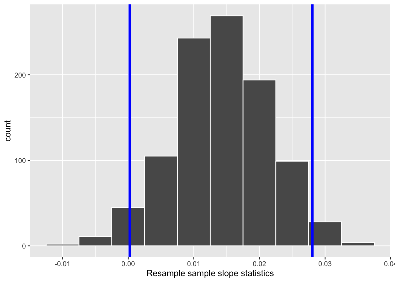
One method to construct a 95% confidence interval is to use the middle 95% of values of the bootstrap distribution. We can do this by computing the 2.5th and 97.5th percentiles, which are 0.0002 and 0.0281, respectively. This is known as the percentile method for constructing confidence intervals.
For now, let’s focus only on the concepts behind a percentile method constructed confidence interval; we’ll show you the code that computes these values in the next section.
Let’s mark these percentiles on the bootstrap distribution with vertical lines in Figure 15. About 95% of the slope variable values in bootstrap_1000 fall between 0.0002 and 0.0281, with 2.5% to the left of the leftmost line and 2.5% to the right of the rightmost line.
Recall in the last chapter we saw that if a numerical variable follows a normal distribution, or, in other words, the histogram of this variable is bell-shaped, then roughly 95% of values fall between \(\pm\) 1.96 standard deviations of the mean. Given that our bootstrap distribution based on 1000 resamples with replacement in Figure 13 is normally shaped, let’s use this fact about normal distributions to construct a confidence interval in a different way.
First, recall the bootstrap distribution has a mean equal to 0.014. This value almost coincides exactly with the value of the sample slope \(b_1\) of our original 1000 birth records 0.014. Second, let’s compute the standard deviation of the bootstrap distribution using the bootstrap slope statistics stored in the stat column of the bootstrap_1000 data frame:
bootstrap_1000 %>%
  summarize(SE = sd(stat))
# A tibble: 1 × 1
SE
<dbl>
1 0.00722What is this value? Recall that the bootstrap distribution is an approximation to the sampling distribution. Thus, the variability of the sampling distribution may be approximated by the variability of the resampling distribution. Recall also that the standard deviation of a sampling distribution has a special name: the standard error. Putting these two facts together, we can say that 0.00722 is an approximation of the standard error of \(b_1\).
Traditional theory-based methodologies for inference also have formulas for standard errors, assuming some conditions are not violated. In this method, we are not using a formula to get our standard error, but using the standard error of the bootstrap distribution. Thus, using our 95% rule of thumb about normal distributions, we can use the following formula to determine the lower and upper endpoints of a 95% confidence interval for \(\beta_1\):
\[ b_1 \pm 1.96 \times SE = (b_1 - 1.96 \times SE, b_1 + 1.96 \times SE) \]
\[ = (0.014 - 1.96 \times 0.007, 0.014 + 1.96 \times 0.007) \]
\[ = (0.00028, 0.02772) \]
To use the bootstrap standard error in this formula the bootstrap distribution must be bell shaped and symmetric. This is often the case with bootstrap distributions, especially those in which the original distribution of the sample is not highly skewed, however it is not always the case. Next week, we’ll go deeper into the explorations of model conditions.
Let’s now add the SE method confidence interval with dashed lines in Figure 16.
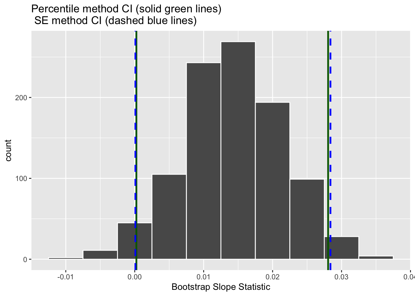
We see that both methods produce nearly identical 95% confidence intervals for \(\beta_1\) with the percentile method yielding \((0.0002, 0.0281)\) while the standard error method produces \((0.0001, 0.0284)\).
Now that we’ve introduced the concept of confidence intervals and laid out the intuition behind two methods for constructing them, let’s explore the code that allows us to construct them.
Now that we’ve covered two methods for obtaining confidence intervals, let’s now check out the infer package code that explicitly constructs these. There are also some additional neat functions to visualize the resulting confidence intervals built-in to the infer package!
Recall the percentile method for constructing 95% confidence intervals we introduced in Section 3.1. This method sets the lower endpoint of the confidence interval at the 2.5th percentile of the bootstrap distribution and similarly sets the upper endpoint at the 97.5th percentile. The resulting interval captures the middle 95% of the values of the sample mean in the bootstrap distribution.
We can compute the 95% confidence interval using the get_confidence_interval() function function from the infer package. This function takes three arguments (inputs):
calculate()d statistics (e.g., slope statistics)level (e.g., 0.95 or 0.99)type of interval to be made – "percentile" or "se"percentile_ci <- get_confidence_interval(bootstrap_distribution,
level = 0.95,
type = "percentile")
percentile_ci# A tibble: 1 × 2
lower_ci upper_ci
<dbl> <dbl>
1 -0.00185 0.0285Alternatively, we can visualize this interval by adding a shade_confidence_interval() layer to the visualize() step. This step requires the endpoints of the interval to be specified, so the previous step must come before the following step.
visualize(bootstrap_1000) +
  shade_confidence_interval(endpoints = percentile_ci)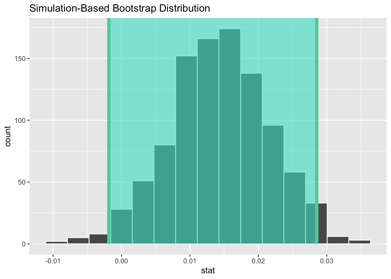
Observe in Figure 17 that 95% of the sample slopes stored in the stat variable in bootstrap_1000 fall between the two endpoints marked with the darker lines, with 2.5% of the sample means to the left of the shaded area and 2.5% of the sample means to the right.
The default colors for shade_confidence_interval() are color = "mediumaquamarine" and fill = "turquoise". You can, however, change these colors if you wish!
visualize(bootstrap_distribution) +
shade_ci(endpoints = percentile_ci, color = "hotpink", fill = "khaki")inferRecall the standard error method for constructing 95% confidence intervals we introduced in Section 3.2. From properties of the Normal Distribution, we know that for any distribution that is bell shaped and symmetric, roughly 95% of the values lie within two standard deviations of the mean. Recall that in the case of the sampling distribution, the standard deviation has a special name: the standard error. Moreover, remember that the bootstrap distribution provides us with a robust estimate of the standard error of the sampling distribution.
So in our case, 95% of values of the bootstrap distribution will lie within \(\pm 1.96\) standard errors of \(b_1\). Thus, a 95% confidence interval is
\[ b_a \pm 1.96 \times SE = (b_1 - 1.96 \times SE, b_1 + 1.96 \times SE) \]
Computation of the 95% confidence interval can once again be done by inputting the the bootstrap_1000 data frame we created into the get_confidence_interval() function, using roughly the same code as before. There are two components, however, that must change:
type argument to be "se"point_estimateTo calculate the point estimate, we need one additional step before calculating our confidence interval. Rather than using the output from the lm() function like we did in Table 1, let’s obtain our observed slope statistic using the infer pipeline! This process should look familiar, in fact the only part that has changed is we no longer have a generate() step. We are not generating any resamples, so that step is no longer needed. All we need to do is specify() our variables and calculate() the "slope" statistic.
obs_slope <- births14 |>
  specify(response = weight,
          explanatory = mage) |>
  calculate(stat = "slope")

standard_error_ci <- get_confidence_interval(bootstrap_1000,
                                             type = "se",
                                             point_estimate = obs_slope,
                                             level = 0.95)
standard_error_ci
# A tibble: 1 × 2
lower_ci upper_ci
<dbl> <dbl>
1 0.0000947 0.0284If we would like to visualize this interval, we can once again add a shade_confidence_interval() layer to our plot. However, when visualizing an interval constructed using the SE method, we need to declare the endpoints of the interval, as seen in Figure 18.
visualize(bootstrap_1000) +
  shade_confidence_interval(endpoints = standard_error_ci)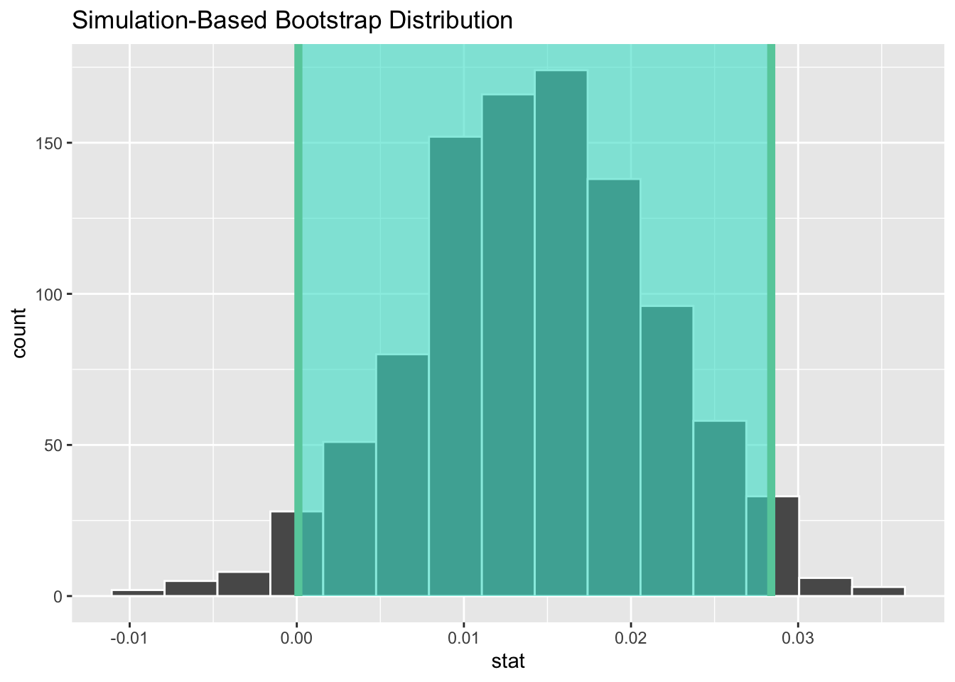
As noted in Section 3.2, both methods produce similar confidence intervals:
| type | 2.5% | 97.5% |
|---|---|---|
| Percentile | -0.0018499 | 0.0285359 |
| SE | 0.0000947 | 0.0283909 |
Now that we’ve shown you how to construct confidence intervals using a sample drawn from a population, let’s now focus on how to interpret their effectiveness. The effectiveness of a confidence interval is judged by whether or not it contains the true value of the population parameter. Going back to our fishing analogy in Section 3, this is like asking, “Did our net capture the fish?”.
So, for example, does our percentile-based confidence interval of (-0.0018, 0.0285) “capture” the slope of the relationship between mother’s age and baby’s birth weight (\(\beta_1\)) for all babies born in the US in 2014? Alas, we’ll never know, because we don’t know what the true value of \(\beta_1\) is. After all, we’re sampling to estimate it!
In order to interpret a confidence interval’s effectiveness, we need to know what the value of the population parameter is. That way we can say whether or not a confidence interval “captured” this value. In the case of births14 dataset, we have the ability to go find the original dataset, housing the birth records of every baby born in the US in 2014. I did so, and found that the slope for the relationship between mother’s age and baby’s birth weight (\(\beta_1\)) for all babies born in the US in 2014 was \(\beta_1 = 0.0007\).
Now that we know the value of \(\beta_1\), we can see if the intervals we constructed previously do in fact contain this parameter. The percentile interval of (-0.0018, 0.0285) contains \(\beta_1 = 0.0007\) and the SE interval of 0.0001, 0.0284) also contains \(\beta_1 = 0.0007\). Will our 95% confidence intervals always contain \(\beta_1\)? Let’s see!
Let’s construct 50 more confidence intervals for \(\beta_1\) using the infer workflow we learned before. We can then compare how many of these confidence intervals “captured” the true value of \(\beta_1\), which we know to be 0.0007. That is to say, “Did the net capture the fish?”.
In the code below, we create a second bootstrap distribution, also with 1,000 bootstrap resamples. Then, using this second bootstrap distribution, we use the percentile method to calculate a 95% confidence interval.
I’ve chosen to use the percentile method as we saw that the intervals had similar results and the percentile method has fewer steps. So, I’m choosing to be efficient! However, since we saw the bootstrap distribution was bell shaped and symmetric, either method would work.
bootstrap_1000_v2 <- births14 %>%
  specify(response = weight,
          explanatory = mage) %>%
  generate(reps = 1000,
           type = "bootstrap") %>%
  calculate(stat = "slope")

percentile_ci_2 <- get_confidence_interval(bootstrap_1000_v2,
                                         level = 0.95)
percentile_ci_2
# A tibble: 1 × 2
lower_ci upper_ci
<dbl> <dbl>
1 -0.0000326 0.0285Notice this interval, also contains \(\beta_1\). Let’s do this again…
bootstrap_1000_v3 <- births14 %>%
  specify(response = weight,
          explanatory = mage) %>%
  generate(reps = 1000,
           type = "bootstrap") %>%
  calculate(stat = "slope")

percentile_ci_3 <- get_confidence_interval(bootstrap_1000_v3,
                                         level = 0.95)
percentile_ci_3
# A tibble: 1 × 2
lower_ci upper_ci
<dbl> <dbl>
1 -0.000133 0.0285Again, our interval contains \(\beta_1\). Let’s scale this up and look at 50 different intervals constructed using this method. Figure 19 visualizes these 50 intervals, where:
If the interval contained \(\beta_1 = 0.0007\), the line is colored grey. If the interval did not contain \(\beta_1 = 0.0007\), the line is colored black.
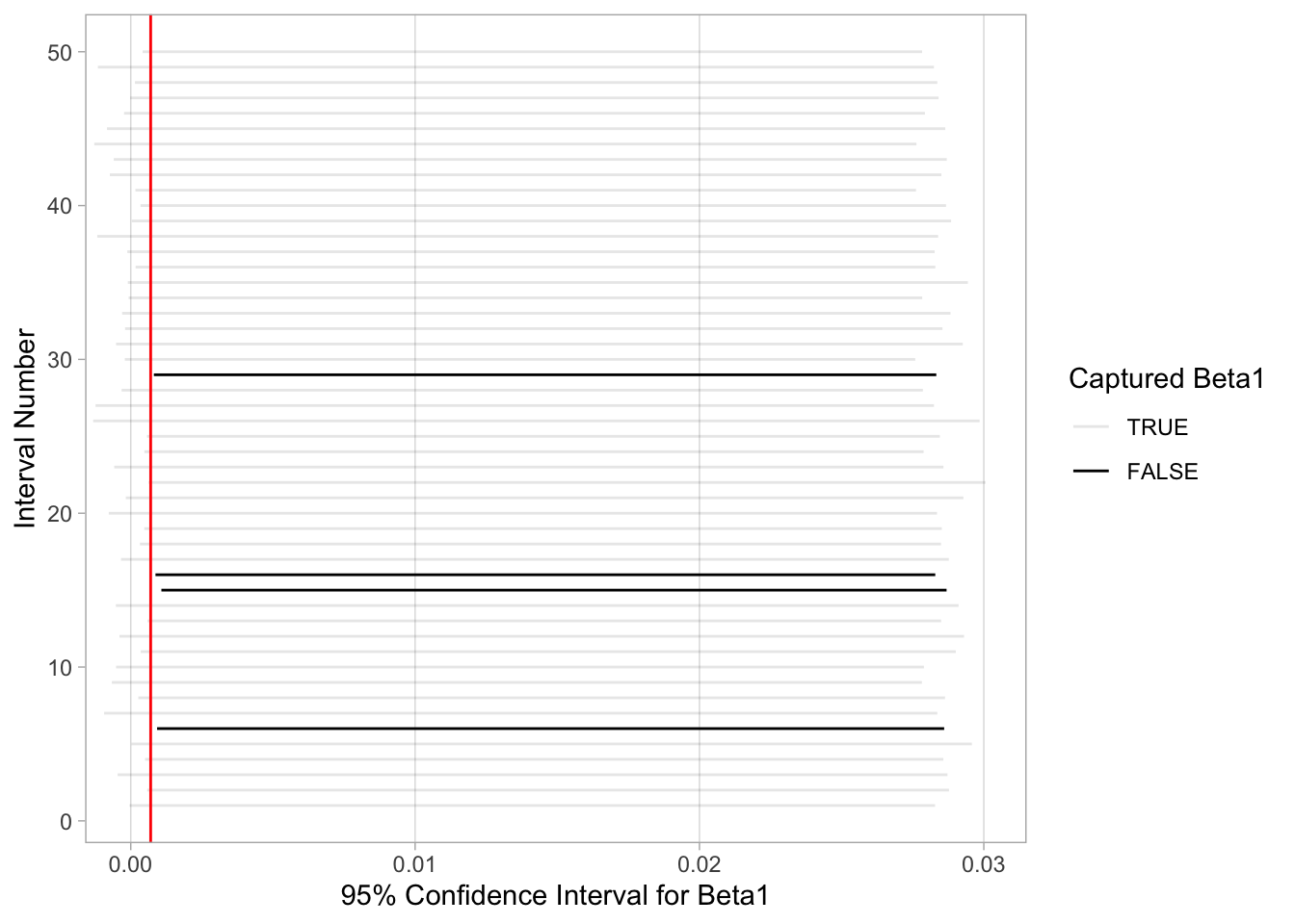
Of the 50 95% confidence intervals, 46 of them captured the true value of \(\beta_1 = 0.0007\), whereas 4 of them didn’t. In other words, 46 of our nets caught the fish, and 4 of our nets didn’t.
This is where the “95% confidence level” comes into play: for every 50 95% confidence intervals constructed, we expect that about 95% of them will capture \(\beta_1\) and 5% of them won’t. That’s a bit tricky for 50, as 95% of 50 is 47.5. Technically, we can only have either 47 or 48 intervals contain \(\beta_1\), but this should reinforce that the process is not exact. We will not always get 95% of the intervals containing \(\beta_1\), but on average we expect that 95% of them should.
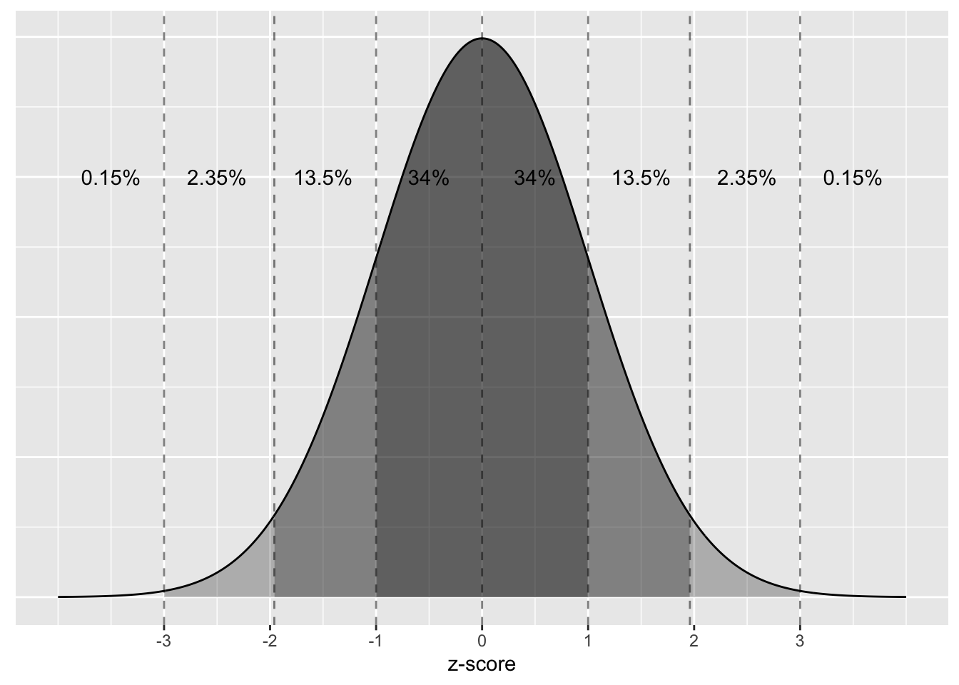
You might wonder, why do only 5% of the 95% confidence intervals miss the parameter they are estimating. This reasoning goes back to what you read on the empiracle rule for bell-shaped and symmetric curves. Namely, the rule of thumb that 95% of values will lie within approximately 2 standard deviations of the center of the distribution. The center of a sampling distribution is the value of the parameter. For our example, this value is \(\beta_1 = 0.0007\), the value of the slope for the relationship between mother’s age and baby’s birth weight for all babies born in the US in 2014.
Figure 20 displays the sampling distribution of \(b_1\), centered at \(\beta_1 = 0.0007\). Because our sampling distribution is bell-shaped and symmetric, we know that 95% of the slope statistics should fall within 2 standard errors of the center, as noted by the two dashed lines. That means, only 5% of the slope statistics should fall outside this interval. Our sample slope statistic (\(b_1\)) is always the center of our confidence interval. So, if our sample slope statistic is greater than 2 standard deviations from the center of the sampling distribution, its confidence interval will not contain \(\beta_1\).
Let’s return our attention to 95% confidence intervals. The precise and mathematically correct interpretation of a 95% confidence interval is a little long-winded:
Precise interpretation: If we repeated our sampling procedure a large number of times, we expect about 95% of the resulting confidence intervals to capture the value of the population parameter.
This is what we observed in Figure 19. Our confidence interval construction procedure is 95% reliable. That is to say, we can expect our confidence intervals to include the true population parameter about 95% of the time.
A common but incorrect interpretation is: “There is a 95% probability that the confidence interval contains \(\beta_1\).” Looking at Figure 19, each of the confidence intervals either does or doesn’t contain \(\beta_1\). In other words, the probability is either 100% or 0%.
So if the 95% confidence level only relates to the reliability of the confidence interval construction procedure and not to a given confidence interval itself, what insight can be derived from a given confidence interval? Loosely speaking, we can think of these intervals as our “best guess” of a plausible range of values for the slope of the relationship between mother’s age and baby’s birth weight \(\beta_1\) of all babies born in the US in 2014. It is typical to use the following shorthand summary of the precise interpretation:
We are 95% “confident” that a 95% confidence interval captures the value of the population parameter. We use quotation marks around “confident” to emphasize that while 95% relates to the reliability of our confidence interval construction procedure, ultimately a constructed confidence interval is our best guess of an interval that contains the population parameter. In other words, it’s our best net.
So returning to the first confidence interval we calculated, we would interpret this interval as “We are 95% ‘confident’ that the slope of the relationship between mother’s age and baby’s birth weight \(\beta_1\) of all babies born in the US in 2014 is between -0.0018 and 0.0285.
Now that we know how to interpret confidence intervals, let’s go over some factors that determine their width.
One factor that determines confidence interval widths is the pre-specified confidence level. For example, we used 95% confidence intervals for this reading, but we could have equally chosen 85% intervals. A 95% confidence interval created using the percentile method contains 95% of the values in the bootstrap distribution. An 85% confidence interval would only contain 85% of these values, so it would be a narrower confidence interval. The quantification of the confidence level should match what many expect of the word “confident.” In order to be more confident in our best guess of a range of values, we need to widen the range of values.
To elaborate on this, imagine we want to guess the forecasted high temperature in Seoul, South Korea on August 15th. Given Seoul’s temperate climate with four distinct seasons, we could say somewhat confidently that the high temperature would be between 50°F - 95°F (10°C - 35°C). However, if we wanted a temperature range we were absolutely confident about, we would need to widen it.
We need this wider range to allow for the possibility of anomalous weather, like a freak cold spell or an extreme heat wave. So a range of temperatures we could be near certain about would be between 32°F - 110°F (0°C - 43°C). On the other hand, if we could tolerate being a little less confident, we could narrow this range to between 70°F - 85°F (21°C - 30°C).
So in order to have a higher confidence level, our confidence intervals must be wider. Ideally, we would have both a high confidence level and narrow confidence intervals. However, we cannot have it both ways. If we want to be more confident, we need to allow for wider intervals. Conversely, if we would like a narrow interval, we must tolerate a lower confidence level.
The moral of the story is: Higher confidence levels tend to produce wider confidence intervals.
Pulling from what we learned about the Central Limit Theorem at the end of the last reading, we know that variability decreases when sample size increases. We quantified the sampling variation of these sampling distributions using their standard deviation, which has that special name: the standard error. So as the sample size increases, the standard error decreases.
Connecting to what you learned in this reading, if we have a large sample size, the spread of the bootstrap distribution will be smaller, which in turn leads to smaller estimated standard errors, and narrower confidence intervals. In Section 3.2 you saw directly how the standard error is used when calculating a confidence interval.