Statistical Critique 1
1 Assignment Details
In your first statistical critique will focus on critiquing a key aspect of any statistical argument—data visualization. You have explored data visualizations over the last two weeks, thinking about what makes a plot more or less clear. You will use your knowledge of data visualizations to provide a critique for two different styles of visualizations, (1) a “pop” visualization, and (2) a “scientific” visualization.
1.1 Including your Visualizations
You are expected to include the two visualizations you decide to critique. These visualizations must be included in the paragraph surrounding your critique. Please do not include the images at the end of your document.
Getting your Visualizations
For the New York Times visualization, you can left click on the image and save it to your computer.
For the visualization from your chosen research article, you may need to take screenshot of the page and crop it to only include the image.
1.2 Submission
You are allowed to use any text editing software to make your critique (e.g., Word, Pages, Google Docs), but your submission must be a PDF. If you are unsure how to save your file as a PDF, I recommend using Google!
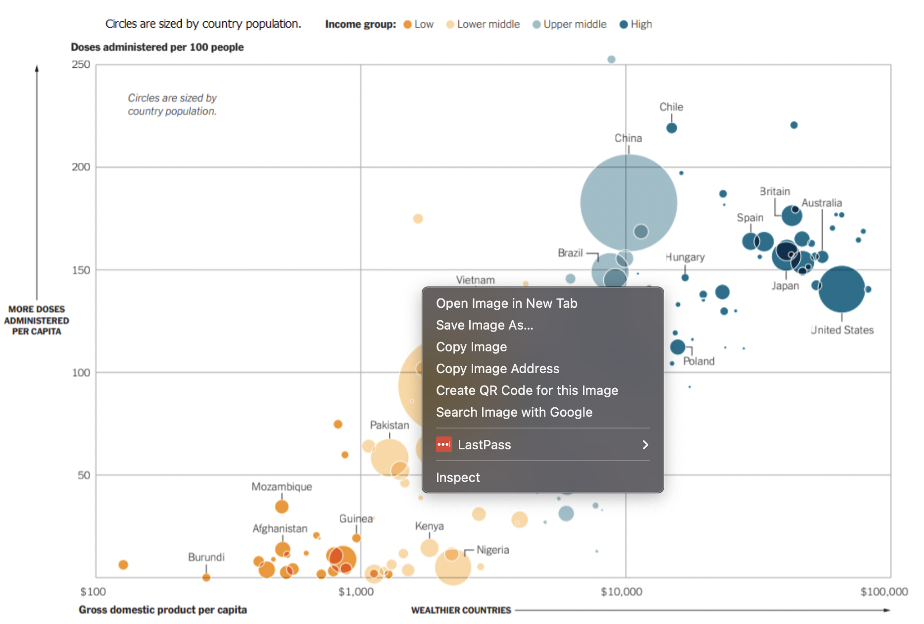
2 Part One: Pop Visualizations
It is common for blogs and online news to use visualizations to convey information to their readers. In this segment you will select a “pop” visualization and provide a critique of what the visualization does well and where it could be improved.
2.1 Getting Started
Go to the What’s Going on in This Graph website
Scroll through the weekly graphs and click on a plot that you are interested in
Save the image to your computer (as instructed above)
Insert the image in your document (before your written critique)
2.2 Visualization Critique
Your critique of the visualization you selected needs to address the following questions:
- What aesthetics are being used in the plot?
If your plot uses color, but the color is not associated with a variable (e.g., every point is yellow), then color is not an aesthetic in the plot!
Name at least two things the visualization does well — What makes the visualization clear to the reader?
Name at least two ways the visualization could be improved — What would the reader struggle to understand?
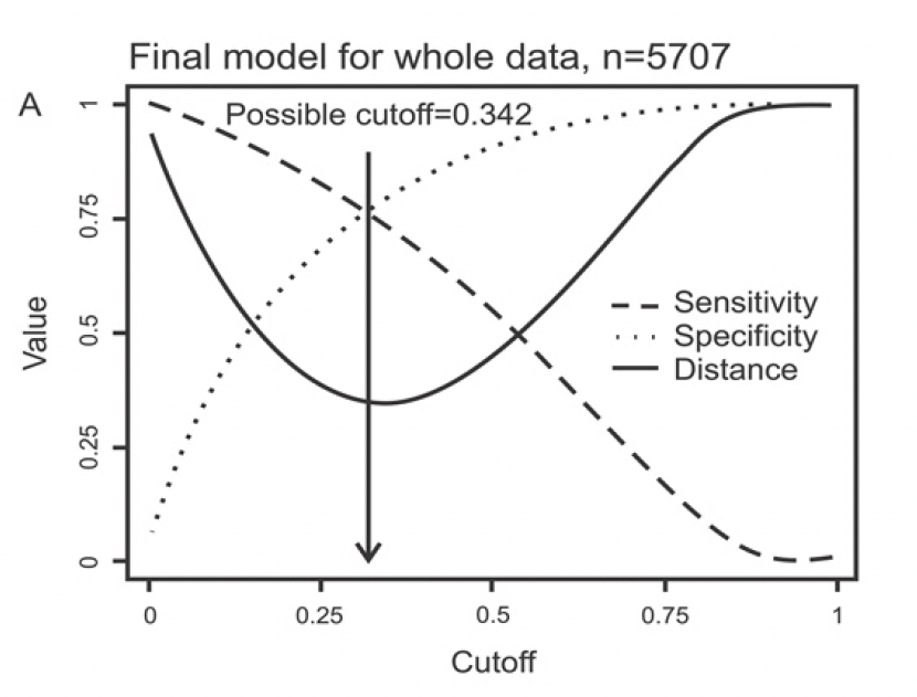
3 Part Two: Scientific Visualizations
It is becoming increasingly common for scientific articles to be required to provide visualizations of the data alongside a statistical analysis. In this segment, you will choose a scientific article from one of the three Dr. Theobold has provided and provide a critique of what the visualization does well and where it could be improved.
3.1 Choosing an Article
To save everyone time spent hunting for an interesting scientific article that has both visualizations and statistical methods taught in this course, I’ve gone ahead and found three articles from different contexts:
Abstract:
Dengue is a very common acute infectious disease in the tropical world. Health care professionals are able to better care for dengue patients if they can make an early diagnosis and make a plan for case management. This article investigated fever in 5729 children in Vietnam with 3 days or less of fever and identified 1692 dengue cases using advanced methods. We systematically collected a range of medical and laboratory findings on each patient when they entered the study and used statistical tools to determine if these medical and laboratory findings could enable early diagnosis, independent of sophisticated, gold-standard laboratory tests. Our results, called the Early Dengue Classifier, had performance characteristics suggesting it could improve the diagnostic proficiency of health care professionals. However the performance of the Early Dengue Classifier is not perfect and likely will not change the practice of experienced doctors in dengue endemic settings. Our study highlights the need for 2nd generation, easy-to-use rapid diagnostic tests that can accurately diagnose dengue in the first few days of fever.
Abstract:
The proliferation of artificial intelligence (AI) tools has transformed numerous aspects of daily life, yet its impact on critical thinking remains under explored. This study investigates the relationship between AI tool usage and critical thinking skills, focusing on cognitive offloading as a mediating factor. Utilizing a mixed-method approach, we conducted surveys and in-depth interviews with 666 participants across diverse age groups and educational backgrounds. Quantitative data were analysed using ANOVA and correlation analysis, while qualitative insights were obtained through thematic analysis of interview transcripts. The findings revealed a significant negative correlation between frequent AI tool usage and critical thinking abilities, mediated by increased cognitive offloading. Younger participants exhibited higher dependence on AI tools and lower critical thinking scores compared to older participants. Furthermore, higher educational attainment was associated with better critical thinking skills, regardless of AI usage. These results highlight the potential cognitive costs of AI tool reliance, emphasizing the need for educational strategies that promote critical engagement with AI technologies. This study contributes to the growing discourse on AI’s cognitive implications, offering practical recommendations for mitigating its adverse effects on critical thinking. The findings underscore the importance of fostering critical thinking in an AI-driven world, making this research essential reading for educators, policymakers, and technologists.
3.2 Isolating the Visualization
Locate a visualization in the article you chose. If there are multiple visualizations choose one!
Take a screenshot of the visualization.
Crop the image to only include the visualization you are critiquing.
Save the image to your computer (as instructed above).
Insert the image in your document (before your written critique).
3.3 Visualization Critique
Your critique of the visualization you selected needs to address the following questions:
What aesthetics are being used in the visualization?
Name at least two things the visualization does well — What makes the visualization clear to the reader?
Name at least two ways the visualization could be improved — What would the reader struggle to understand?