| id | name | sex | age | height | weight | team | noc | games | year | season | city | sport | event | medal |
|---|---|---|---|---|---|---|---|---|---|---|---|---|---|---|
| 121595 | Colomn Trabado Prez | M | 22 | 182 | 71 | Spain | ESP | 1980 Summer | 1980 | Summer | Moskva | Athletics | Athletics Men’s 800 metres | NA |
| 96218 | Valentina Popovov | F | 31 | 170 | 61 | Unified Team | EUN | 1992 Summer | 1992 | Summer | Barcelona | Table Tennis | Table Tennis Women’s Singles | NA |
| 45571 | Halvard Hanevold | M | 36 | 181 | 75 | Norway | NOR | 2006 Winter | 2006 | Winter | Torino | Biathlon | Biathlon Men’s 12.5 kilometres Pursuit | NA |
| 63725 | Yep Gerardus Kramer | M | 22 | 178 | 72 | Netherlands | NED | 1980 Winter | 1980 | Winter | Lake Placid | Speed Skating | Speed Skating Men’s 10,000 metres | NA |
| 129374 | Hermann Weinbuch | M | 19 | 178 | 69 | West Germany | FRG | 1980 Winter | 1980 | Winter | Lake Placid | Ski Jumping | Ski Jumping Men’s Large Hill, Individual | NA |
| 34452 | Norbert Fehr | M | 27 | 174 | 90 | Germany | GER | 1964 Summer | 1964 | Summer | Tokyo | Weightlifting | Weightlifting Men’s Middle-Heavyweight | NA |
Project Checkpoint 1 - Example
Note
This is a minimal example representing “passing” or ‘C’ level work, to give you a baseline for how to proceed. ‘B’ or ‘A’ level work will require a more thoughtful and thorough description of the data and cleaning, deeper or more complex research questions, and/or more polished visualization sketches. Some notes about areas for improvement are included in the callouts below.
Introduction
My dataset is the Olympics data from TidyTuesday. This dataset shows all the Olympic athletes ever, and gives information about their sport, the country they are from, whether they won a medal, etc.
The data comes from a Kaggle dataset created by user RGriffin, who scraped the data from www.sports-reference.com in May 2018.
Here are a few rows of the dataset:
Note
Good:
This description explains who created the data, from where, and when. It provides links to the sources so the reader can find them.
It somewhat explains what information is in the dataset; i.e., information about athletes, as opposed to scheduling information or other details.
Showing a random small snippet of the dataset is typically useful, to get a feel for what it looks like.
Bad:
This is lacking in the “why” and “how” of the data creation. It is important to know what motivated the creation and sharing of a dataset, as well as the specific process that the creator used to assemble it.
This description is unclear about the observational units, i.e., what each row represents. (It is not true that each row is a unique athlete!)
This description could give much more detail on the observed variables present, such as how they were measured and what a typical value looks like.
Data Cleaning
This data was cleaned by using janitor to reformat column names.
The user RGriffin who scraped the data also checked for misentered data in the columns Name, Gender, Height, and Weight.
Note
Good:
- We did not just look at the Tidy Tuesday cleaning and call it a day! We followed the path of the data creation to figure out what other cleaning and wrangling took place.
Bad:
- We were not specific enough about the cleaning done by RGriffin. What did they alter in those columns and why? What other anomalies did they look for?
Explorations
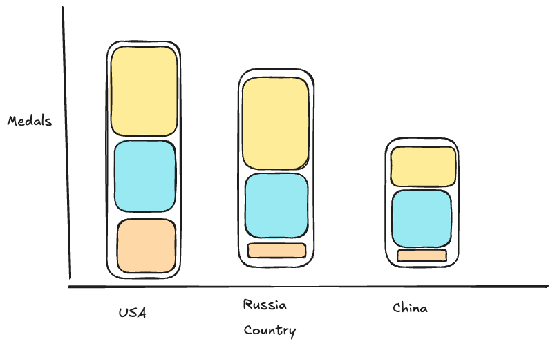
RQ 1: Olympic success by country
Which countries win the most Gold, Silver, and Bronze medals?
RQ 2: Sex over time
Are there a higher percentage of female sports over time?
Note
Good:
- These two research questions are well-defined and answerable with the dataset.
Bad:
- These are not particularly deep. “Which countries win the most?” is not going to provide a new insight beyond what most people already know, and I think we can expect from the outset that female sports have increased over time.
RQ 3: Olympic success corrected by population
Which countries win disproportionately more medals compared to their population size?
Additional Data: Populations of each country
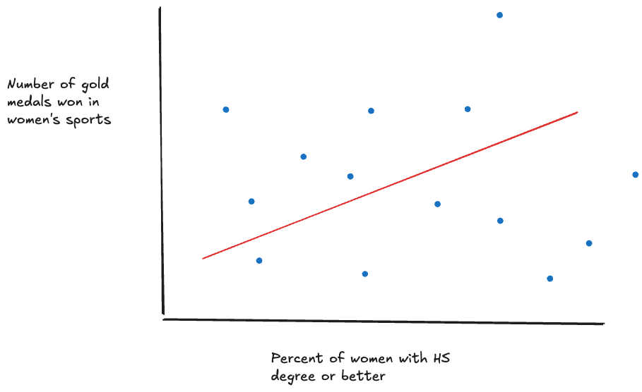
RQ 4: Correlation between female wins and education
Do countries with better support for education for women also tend to see more success in female sports categories?
Additional Data: Education trends in each country
Note
Good:
- Question 4 digs deeper into the relationships between a country’s culture and government; and outcomes at the Olympics. This is a good question.
Bad:
- Question 3 is a bit less interesting - you might uncover 1 or 2 interesting countries that win disproportionately, but you aren’t telling a rich story.
Visualizations
Note
Good:
- Plots are appropriate to data type and address RQs
Bad:
- Not a lot of thought is put into these as far as good plot design, annotation and storytelling, etc.