ggplot Extensions
Custom Colors and Themes
A huge part of making a compelling and convincing plot is your choice of color and layout.
Your first video will take you through some great core principals of visualization. Then your two short readings will show you the basics of manipulating colors and themes in ggplot.
🎥 Required Video: The Glamour of Graphics
📖 Required Reading: Colors and Palettes
📖 Required Reading: Themes
Extra Resouces
- The
jcolorspackage for color palettes - The
ggthemerpackage for setting universal themes. - Make your own theme to use!
Check-in: Extending
ggplot
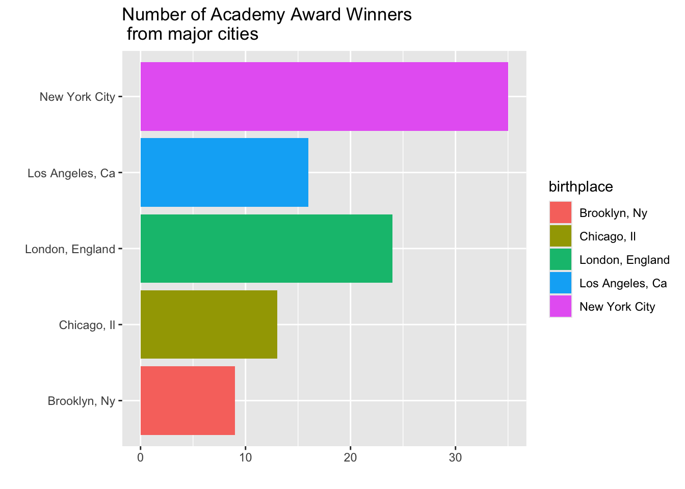
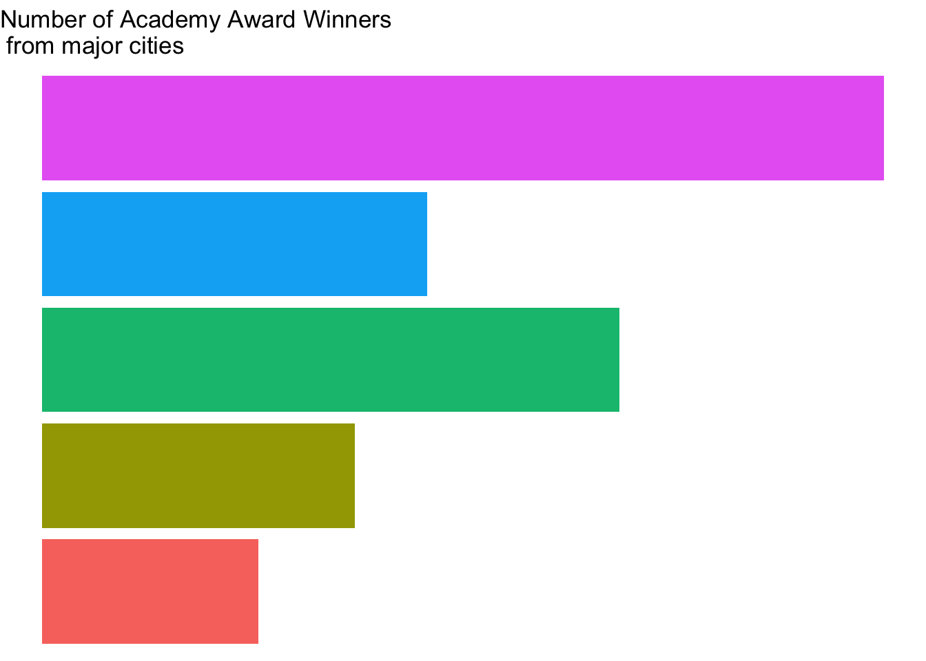
1. Which of the functions below would you use to change the colors of the bars on the following plot?
scale_color_continuous()scale_color_discrete()scale_fill_continuous()scale_fill_discrete()
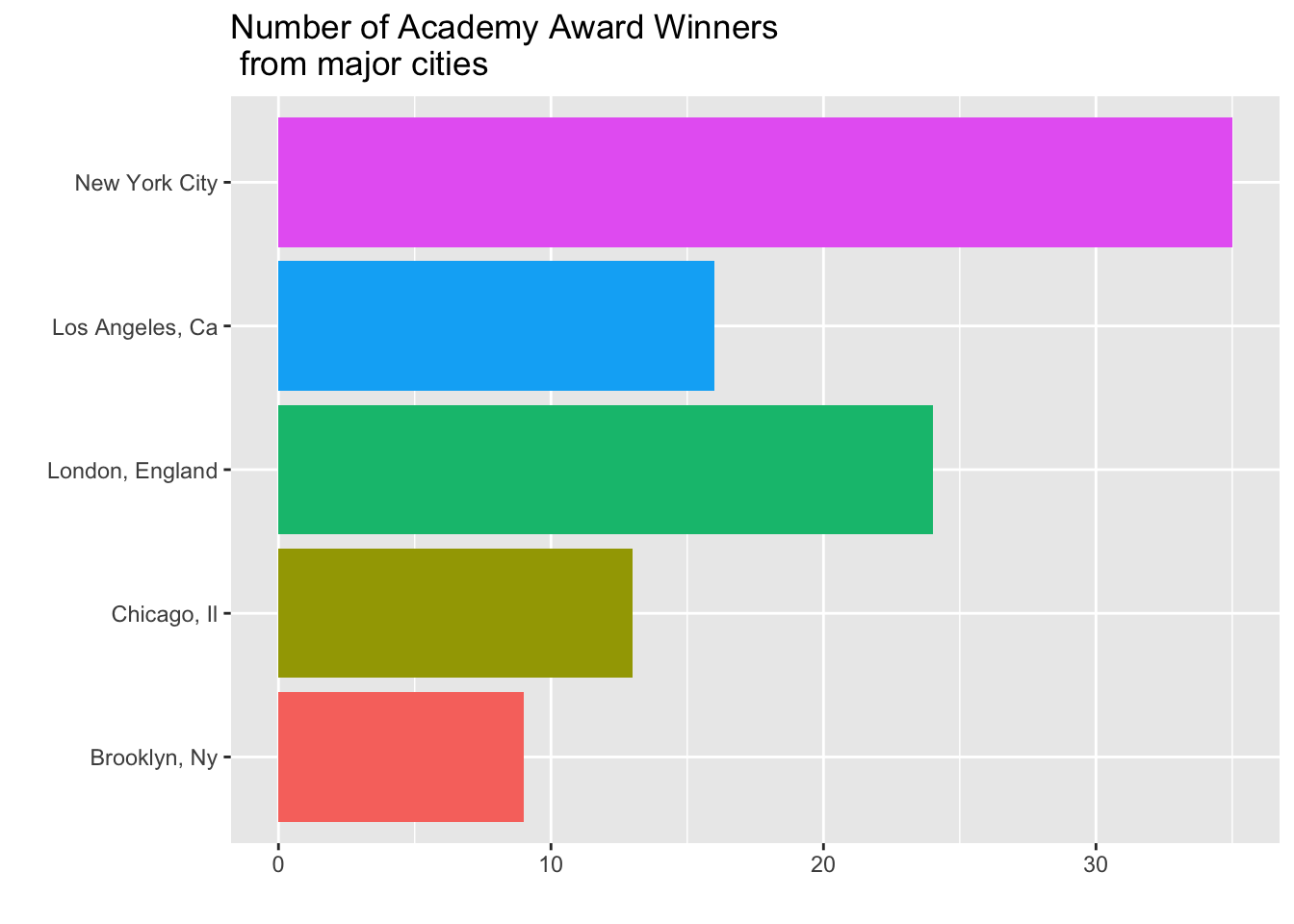
2. Consider the plot in Question 1. What change was made to it in each step below? That is, what code would go inside the function + theme( ) to produce the added change?

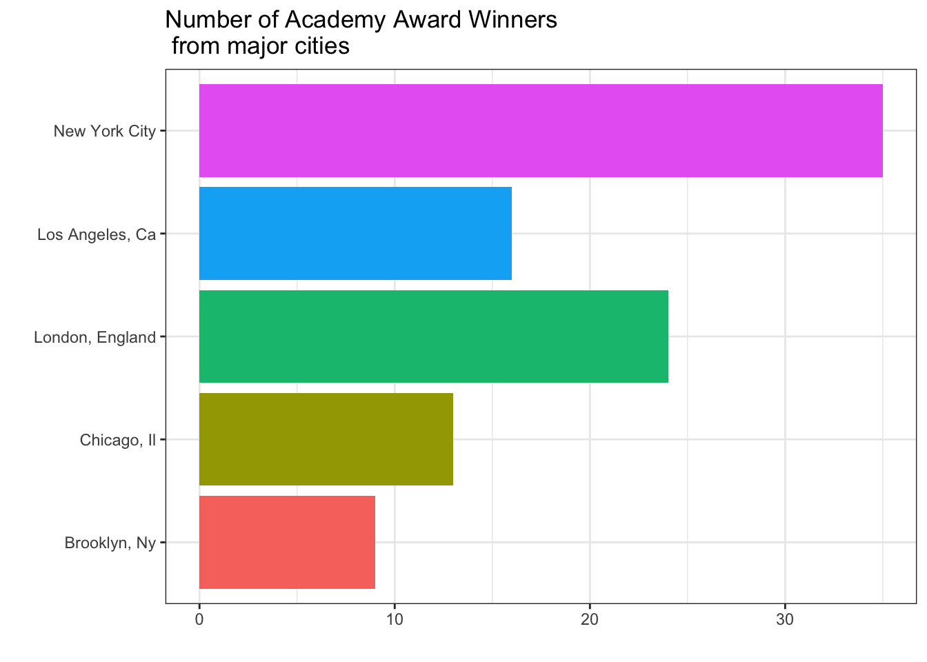
3. Which built-in theme is each of the following plots? That is, what theme_XXXX() function would produce the added change?

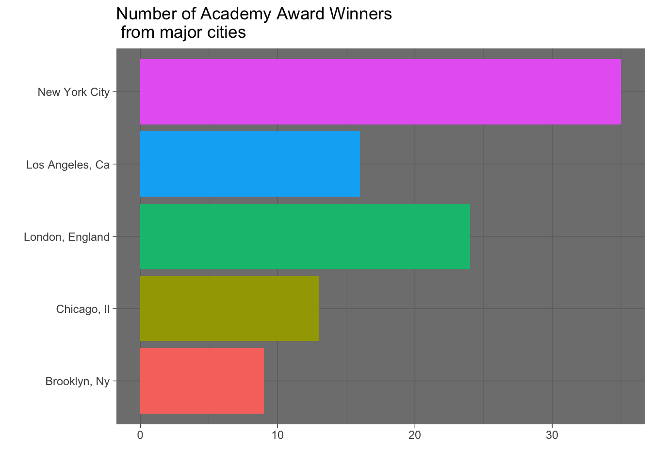
4. Which of the plots above (a, b, c, or d) best adheres to the principles outlined by Will Chase (in the Glamour of Graphics)?
gganimate
There are many, many ways to “spice up” your plots. We will focus in on one: making your plot animated! The best package for this, if you are using ggplot already, is gganimate.
Note
gganimate plot objects can sometimes take a long time to render. One way to make it quicker is to change the number of frames in your gif. Another trick is to use the cache chunk option in Quarto, so that you don’t re-render the images every time you knit your file.
📖 Required Reading: Intro to gganimate
📖 Recommended Reading: Another intro to gganimate
🎥 Recommended Video: gganimate flipbook demo (RStudio::conf 2017)
Check-in: Extending
ggplot
5. Fill in the five (5) blanks for the gganimate plot below:
___ <- oscars %>%
  filter(Award_Gender != "Ungendered") %>%
  ggplot(aes(x = Age_at_Award, fill = Award_Gender)) +
  geom_density(alpha = 0.5) +
  labs(title = "Age of Academy Award Winners ({____}s)",
       x = "",
       y = "",
       fill = "Gender of Award") +
  theme(legend.position = "top") +
  ____(Decade_of_Award)

animate(p2, nframes = ____, fps = ____)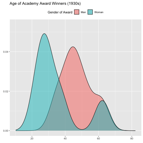
Other Extensions
Although we don’t have time to go in-depth on every single extension of ggplot, there are so many wonderful ways to up your Data Viz game.
Take a look around the links below!
📖 Required Reading: ggplot Extension Gallery
📖 Required Reading: More ggplot Extension Summaries
Check-in: Extending
ggplot
6. Which extension package would you use to… Hint: There is more than one possible answer for each question!
- Visualize a social network using twitter data?
- Add p-values to your side-by-side boxplot of treatment groups, showing the significance of the differences?
- Arrange several different plots next to each other?
- Make it so hovering over a point in your scatterplot shows the corresponding label?
Extra Resources
- Dave Robinson’s Tidy Tuesday Screencasts show a master of Data Viz at work!
- You can also search the Tidy Tuesday hashtag on twitter to see some great examples of data manipulating and visualization
- Don’t forget about the Data-to-Viz Website
- The “dataisbeautiful” subreddit shares many nice visualizations.
- This webinar, by ggplot contributor Thomas Lin Pedersen, is wonderful. It’s about 2 hours long - so more than we can fit in as required viewing - but if you want to become a
ggplotmaster, watch this!