library(tidyverse)Lab 9: Searching for Efficiency & Making Great Tables
Accessing the Lab
Download the template Lab 8 Quarto file here: lab-9-student.qmd
Important
Be sure to save this in the Lab 9 folder, inside your Week 9 folder, inside your STAT 331 folder!
Formatting Tables
In this lab, we will also practice making nice, report worthy, tables!
I would recommend you think of tables no different from the visualizations you’ve been making. We want all aspects of our tables to be clear to the reader, so the comparisons we want them to make are straightforward. You should be thinking about:
- Column headers
- Grouping headers
- Order of columns
- Order of rows
- Number of decimals included for numeric entries
- etc.
Tables are also a great avenue to display creativity! In fact, there is a yearly RStudio table contest, and here is a gallery of the award winning tables!
There are many packages for generating tables but I recommend either kable() function from the knitr package or gt() function from the gt package and their add-ons.
For simple tables
- the
kable()function from the knitr package for simple tables - the
gt()function from the gt package
For more sophisticated tables
- styling functions from the kableExtra package (e.g.,
kable_styling(),kable_classic()) - add-on functions from the gt package (e.g.,
cols_label(),tab_header(),fmt_percent())
Warning
Quarto doesn’t play nice with some options for formatting HTML tables in other packages.
To make sure that your tables render as expected, we need to specify html-table-processing: none in the YAML header. You will notice that I already included that in this lab.
I also recommend using the Source Editor for this lab.
The Data
For this week’s lab, we will be revisiting questions from previous lab assignments, with the purpose of using functions from the map() family to iterate over certain tasks. To do this, we will need to load in the data from Lab 2, Lab 3, and Lab 7.
Question 1: Edit the code below to read in the appropriate datsets that you should have saved from the previous labs!
# Data from Lab 2
surveys <- read_csv(here::here("Week 2", "Lab 2", "surveys.csv"))

# Data from Lab 3
evals <- read_csv(here::here("Week 3", "Lab3", "teacher_evals.csv")) |>
  rename(sex = gender)

# Data from Lab 7
fish <- read_csv(here::here("Week 7", "Lab 7", "BlackfootFish.csv"))
Lab 2
First up, we’re going to revisit Question 2 from Lab 2. This question asked:
What are the data types of the variables in this dataset?
Question 2: Using map_chr(), produce a table of the data type of each variable in the surveys dataset. Specifically, the table should have two columns Variable and Data Type with a row for each variable and be displayed using kable().
Tip
You will want to check out the enframe() function to help with this task.
# Q1 codeQuestion 3: Format the table nicely! Your table must use either kable() and functions in the kableExtra package or gt() and functions from the gt package to produce a table with the following qualities:
- rows are ordered to make the information easy to understand
- include a caption or header
- use bolded column names
Note that you should assign the column names when creating the table, not by renaming columns in the dataset itself because we hate variable names with spaces in them!
Lab 3
Now, were on to Lab 3 where we will revisit two questions.
In the original version of Lab 3, Question 4 asked you to:
Change data types in whichever way you see fit (e.g., is the instructor ID really a numeric data type?)
Question 4: Using map_at() or map_if(), convert the course_id, weekday, academic_degree, time_of_day, and sex columns to factors. In other words, convert all character variables into factors. DO NOT PRINT OUT YOUR NEW DATA FRAME, just show the code. Hint: You will need to use bind_cols() to transform the list output back into a data frame.
Next up, we’re going revisit Question 7 which asked:
What are the demographics of the instructors in this study? Investigate the variables
academic_degree,seniority, andsexand summarize your findings in ~3 complete sentences.
Many people created multiple tables of counts for each of these demographics, but in this exercise we are going to create one table with every demographic.
Question 5: Recreate the (mainly unformatted) table below using one pipeline. It is okay if the rows are not in the same order in your table, but the rest of the table should match mine. Meaning, you will need to do some renaming of the names of the variables and their levels.
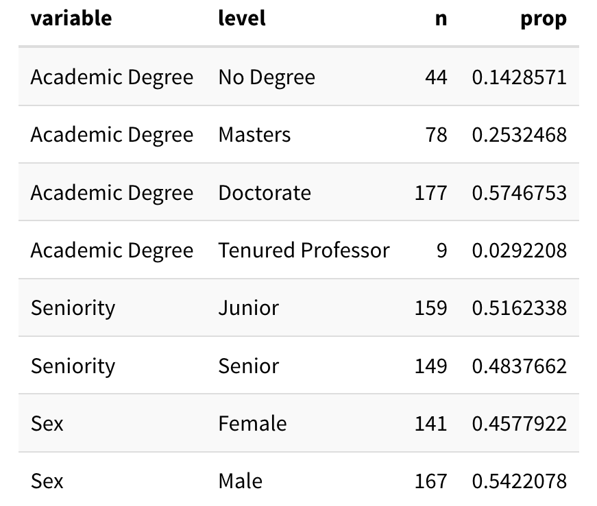
Same Data Cleaning as Lab 3
Repeat the data cleaning steps that we did before question 7 to recreate this exact table. Remember that we needed to first only keep one row per instructor!
I’m using the sen_level classification from Challenge 3:
"junior"=seniorityis 4 or less (inclusive)"senior"=seniorityis between 4 and 8 (inclusive)"very senior"=seniorityis greater than 8.
Tip
I used the following options in kable_styling() (from the kableExtra package) to output this table:
  kable_styling(full_width = FALSE,
                bootstrap_options = "striped")
Question 6: Now turn your output into a very nice table, like one of the examples below using kable() and kableExtra or gt().
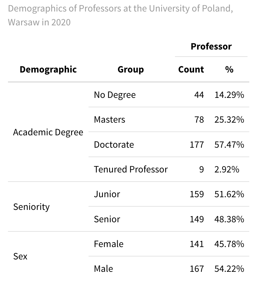
kable() function and functions from the kableExtra package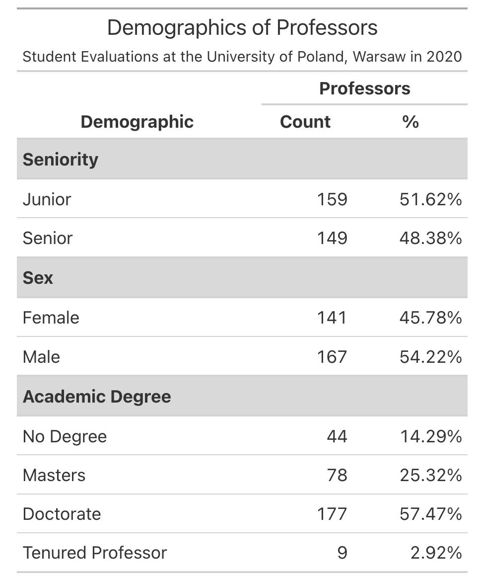
Your table does not need to copy one of these exactly but it should include all of the following:
- Some way of clearly indicating the three variable types as row groups
- Giving nice column names
- Using a column header that spans the
Countand%columns - Nicely formatting the % column to include % signs and only 1-2 digits
- Giving the table a title or a caption
Lab 7
For our last problem, we will revisit a question from the most recent lab. Question 1 asked you to use across() to make a table which summarized:
What variable(s) have missing values present?
How many observations have missing values?
Question 7: Using map_int(), produce a nicely formatted table of the number of missing values for each variable in the fish data.
Question 8: Now turn your output into a very nice table, like the example below using the gt package. Specifically, your table should color the cells with 0 missing values green and cells with > 0 missing values red.
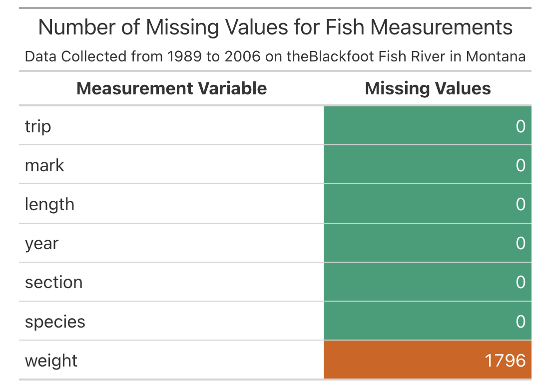
data_color()
You will find this documentation page helpful! https://gt.rstudio.com/reference/data_color.html