Here are some of the exemplary assignments from your peers!
Themes
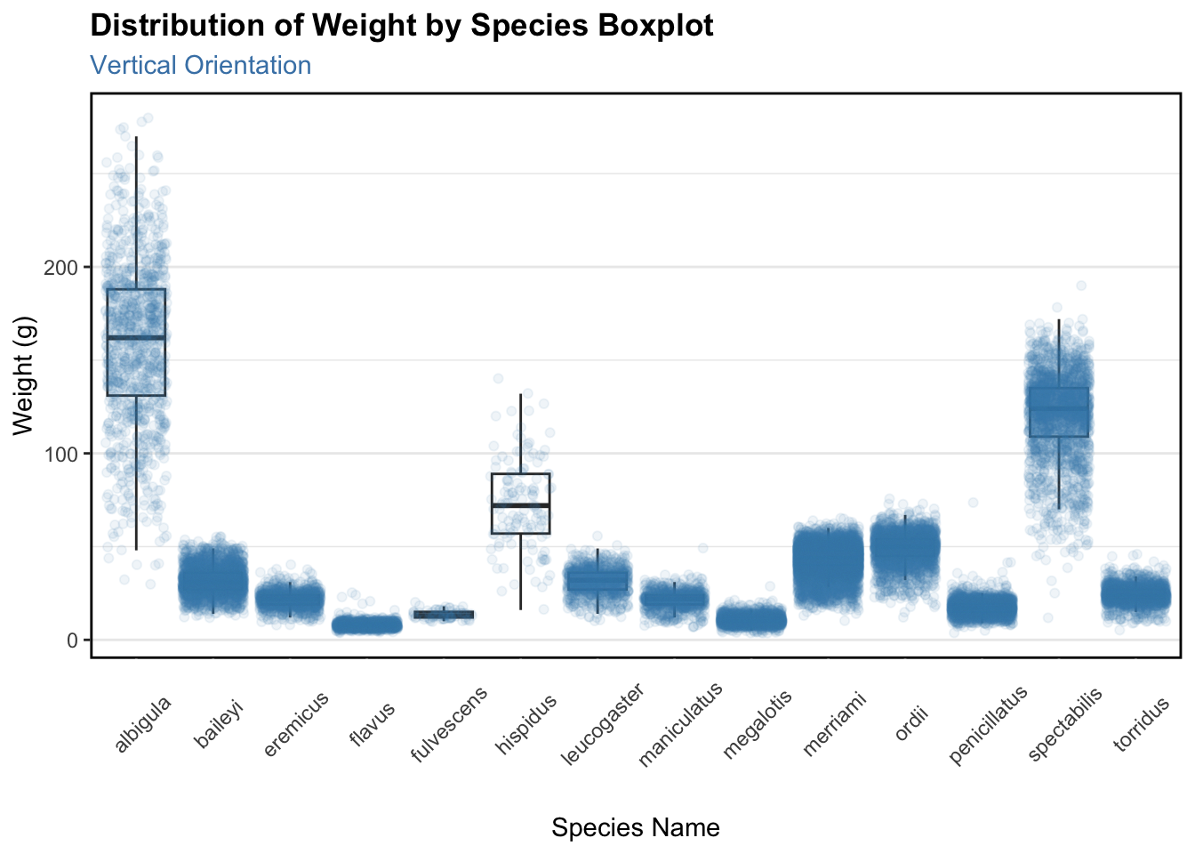
This code is brought to us by Jonathan Flores! I really appreciated the extensive themes they included and how these themes make the plot clearer to the reader.
ggplot(data = surveys,mapping =aes(x = species, y = weight)) +geom_boxplot(outliers =FALSE) +geom_jitter(color ="steel blue", alpha =0.08) +labs(title ="Distribution of Weight by Species Boxplot",subtitle ="Vertical Orientation",x ="Species Name", y ="Weight (g)") +theme_bw() +theme(axis.text.x =element_text(angle =45),axis.ticks.length.x =unit(8, "mm"),axis.ticks.x =element_line(color ="white"),panel.border =element_rect(color ="black", linewidth =1),plot.title =element_text(face ="bold"),plot.subtitle =element_text(color ="steelblue"),panel.grid.major.x =element_blank(),panel.grid.minor.x =element_blank())
Unique Colors
This code is brought to us by Fisher Fraley! I really appreciated how they found a unique color theme from a context they liked!
This code is brought to us by a student who wishes to remain anonymous! What I appreciated about this code was the use of across() when converting multiple columns to numeric. I also loved their use of the most current syntax for the across() function!
This code is brought to us by Akshat Khandelwal! I thought it was very clever how Akshat played with different combinations of variables to confirm which combination uniquely identified a row.
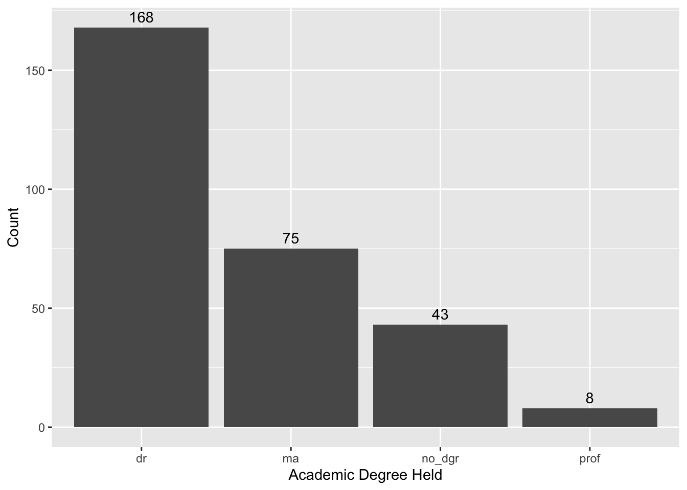
This code is brought to us by Arturo Ordaz-Gutierrez! I really appreciated how Art added the proportions to this demographic table so it is easier to see the representation of each group.
# A tibble: 8 × 4
  academic_degree sex        n percent
  <chr>           <chr>  <int>   <dbl>
1 dr              male      95    32.3
2 dr              female    73    24.8
3 ma              male      39    13.3
4 ma              female    36    12.2
5 no_dgr          female    24     8.2
6 no_dgr          male      19     6.5
7 prof            male       7     2.4
8 prof            female     1     0.3
across() + summarize()
This code is brought to us by Rachel Survilas! I loved how Rachel noticed they were using the same n_distinct() function across multiple columns and decided to use across()! Also, the syntax they are using is on point!
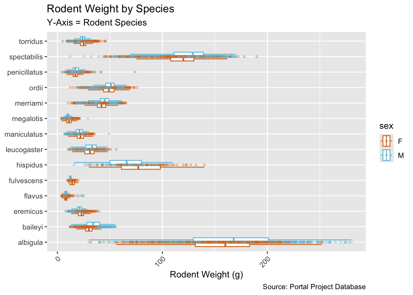
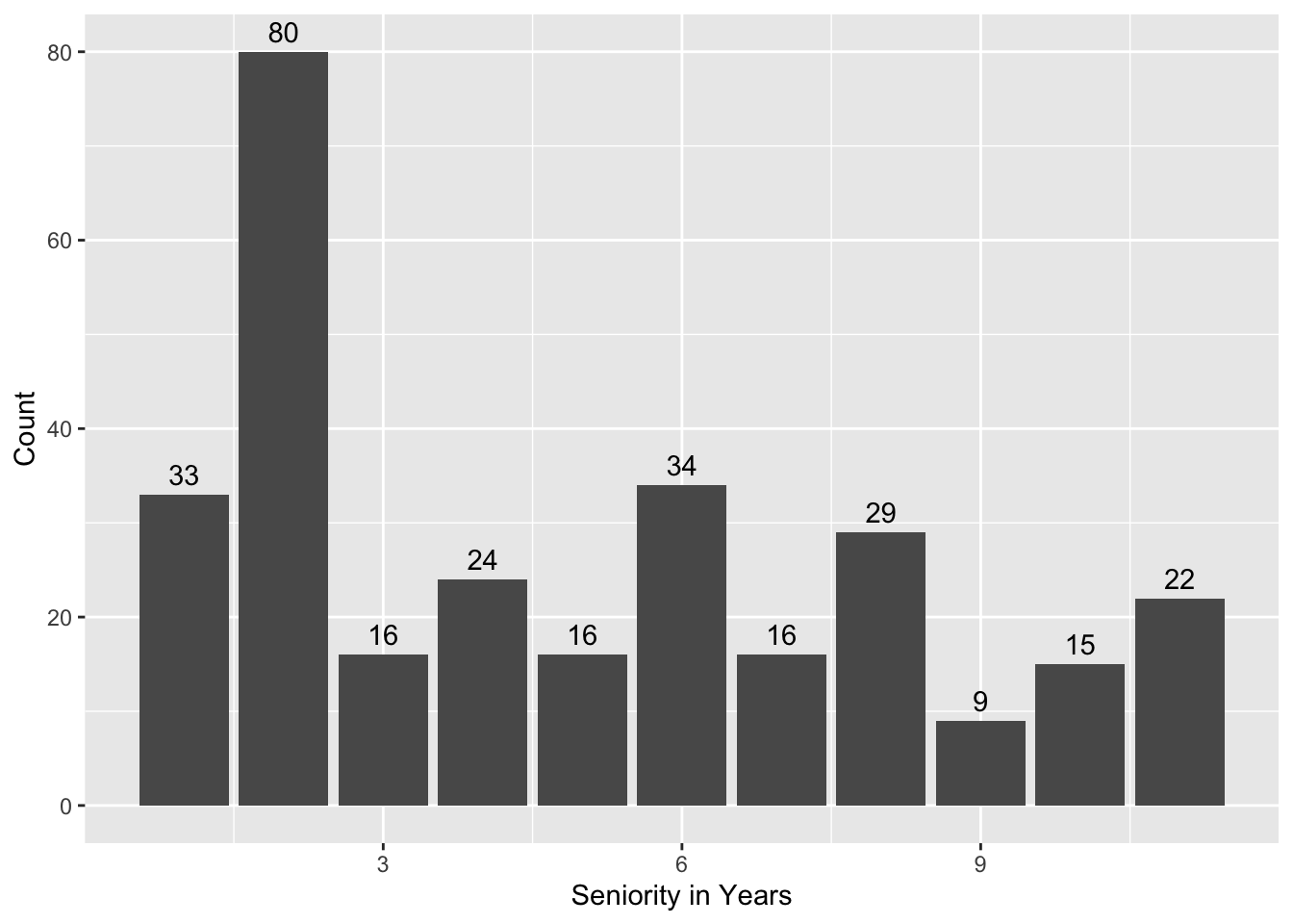
This code is brought to us by a student who wishes to remain anonymous! I thought this code was great because they chose to visualize the teacher demographics! They even added annotations to the top of their barplots!
This code is brought to us by a student who wishes to remain anonymous! I thought this code was great because they got both the maximum values and the minimum values in one pipeline. Very efficient!
This code is brought to us by a student who wishes to remain anonymous! I appreciated that they read the instructions to use the kable() function to get nicer looking tables. The code is very simple, but the tables look much nicer!
These statements are brought to us by Abel Alcala and Sebastien Montgrain! I really appreciated the context they infused into their hypothesis test conclusion!
Based on the results of the Chi-Squared test of Independence, we have a p-value of 0.006075 and a X^2 value of 10.207. Since the p-value is less than α = 0.05, we reject the null hypotheses indicating a statistically significant association between seniority level and SET evaluation results. This suggests that instructor experience across junior, senior, and very senior appears to influence how students perceive the use of engaging activities in class.
Because the p-value of our Chi-squared test of independence is less than 0.05 (0.006075), we know that there is an association between a teachers seniority and their SET scores from question 3 on if the professor used activities to make the class more engaging. Combining this Chi-squared test with the graph, we can see that more experienced teachers do a better job of implementing engaging activities is their classes.
Challenge 4
Amazing Tables
Amazing Plots
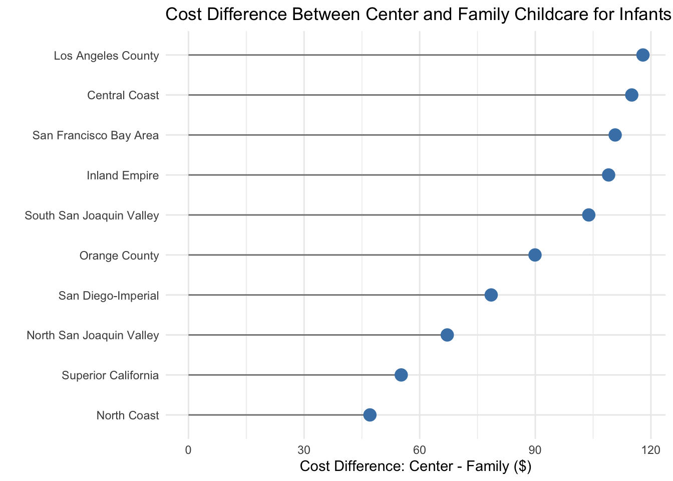
This plot is brought to us by Marietta Nikolskaya! I was really excited to see someone create a “lollipop” plot, since they are what we (Statisticians) make to compare how different a summary statistic is between groups. When plotting statistics like the mean, median, or difference, we generally advocate for this type of plot over a barplot since barplots are typically reserved for plots of counts or proportions.
Code
# Here is the data wrangling that happened to make this plot!ca_childcare_new <- ca_childcare |>filter(study_year ==2018) |>select(census_region, mc_infant, mfcc_infant) |>mutate(cost_difference = mc_infant - mfcc_infant) |>group_by(census_region) |>summarize(median_center =median(mc_infant),median_family =median(mfcc_infant),median_difference =median(cost_difference)) |>arrange(desc(median_difference))
ca_childcare_new |>ggplot(aes(y =fct_reorder(census_region, median_difference), x = median_difference)) +geom_segment(aes(yend = census_region, x =0, xend = median_difference), color ="gray50") +geom_point(size =4, color ="steelblue") +labs(y ="",x ="Cost Difference: Center - Family ($)",title ="Cost Difference Between Center and Family Childcare for Infants (2018)" ) +theme_minimal()
This plot is brought to us by Devin Hadley! I thought this plot was really creative in their use of a non-standard geometry (geom_ribbon()) to fill the space between the lines. I also appreciated that they moved the legend to the top of the plot to make it easier to see!
Code
# Here is the data wrangling that happened to make this plot!summary_table <- ca_childcare |>group_by(study_year) |>summarise(median_center_price =median(mc_infant),median_family_price =median(mfcc_infant) ) |>mutate(center_minus_family_price = median_center_price - median_family_price )summary_table_long <- summary_table |>pivot_longer(cols =c("median_center_price", "median_family_price"),names_to ="care_type",values_to ="median_price" ) |>mutate(care_type =case_when( care_type =="median_center_price"~"Center-Based", care_type =="median_family_price"~"Family-Based",TRUE~ care_type ))
ggplot(summary_table_long, aes(x = study_year, y = median_price, color = care_type)) +geom_line(linewidth =1.2) +geom_point(size =3) +geom_ribbon(data = summary_table, aes(x = study_year, ymin = median_family_price, ymax = median_center_price, group =1),fill ="skyblue", alpha =0.3, inherit.aes =FALSE) +labs(title ="Median Weekly Infant Childcare Costs in California (2008-2018)",subtitle ="Based off the aggregated median price for each care type on an annual basis in various California counties.",x ="Year",y ="Median Weekly Price (2018 Dollars)",color ="Type of Childcare" ) +scale_x_continuous(breaks =seq(2008, 2018, by =2)) +theme_minimal(base_size =14) +theme(legend.position ="top",plot.title =element_text(face ="bold"),plot.subtitle =element_text(margin =margin(b =10)),axis.title =element_text(face ="bold"),plot.background =element_rect(color ="black", linewidth =1) )
This plot is brought to us by Haley Wong! Haley also featured a non-standard geometry (geom_ribbon()) to fill the space between the lines on this plot! I really appreciated Haley’s attention to detail in making titles and labels on the plot that made the context very clear to the reader—$ on the y-axis labels and a subtitle explaining what the gap represents.
Code
# Here is the data wrangling that happened to make this plot!table <- ca_childcare |>pivot_longer(cols = mc_infant:mfcc_preschool,names_to ="type_age",values_to ="median_price" ) |>mutate(type =case_when(str_detect(type_age, "^mc_") ~"center_based",str_detect(type_age, "^mfcc_") ~"family" ),age =case_when(str_detect(type_age, "infant$") ~"infant",str_detect(type_age, "toddler$") ~"toddler",str_detect(type_age, "preschool$") ~"preschool" ) ) |>group_by(study_year, age, type) |>summarise(median_price =median(median_price, na.rm =TRUE), .groups ="drop") |>pivot_wider(names_from = type, values_from = median_price) |>mutate(difference = center_based - family)prices_long <- table |>pivot_longer(cols =c(center_based, family),names_to ="setting_type",values_to ="median_price" ) |>mutate(setting_label =fct_recode( setting_type,"Center-based"="center_based","Family (In-home)"="family" ),age =factor(age, levels =c("infant", "toddler", "preschool")) )
ggplot(prices_long, aes(x = study_year, y = median_price, color = setting_label)) +geom_ribbon(data = table |>mutate(age =factor(age, levels =c("infant", "toddler", "preschool"))),aes(x = study_year, ymin = family, ymax = center_based, fill ="Price Gap"),alpha =0.15,inherit.aes =FALSE ) +geom_line(size =1.2) +geom_point(size =2.5, alpha =0.9) +facet_wrap(~ age, nrow =1) +scale_color_brewer(palette ="Set1") +scale_fill_manual(values =c("Price Gap"="gray70")) +scale_y_continuous(labels = scales::label_dollar()) +scale_x_continuous(breaks =seq(2008, 2018, 4)) +labs(title ="Center-Based vs Family Childcare Costs Over Time",subtitle ="Shaded area shows median price gap by age group (California)",x ="Study Year",y ="Median Weekly Price (USD)",color ="Care Setting",fill ="" ) +theme_minimal(base_size =14) +theme(plot.title =element_text(face ="bold", size =16, hjust =0.5),plot.subtitle =element_text(size =13, hjust =0.5),axis.text.x =element_text(size =10),legend.position ="right" )
This plot is brought to us by Isaiah Woodard! I really appreciated how Isaiah took the skills they learned in Challenge 2 and applied them to a new setting!
Code
# Here is the data wrangling that happened to make this plot!plot_data <- ca_childcare %>%select(census_region, study_year, mfccsa, mcsa) %>%filter(study_year ==c("2008":"2018")) %>%group_by(census_region, study_year) %>%summarise(median_mcsa =median(mcsa),median_mfccsa =median(mfccsa)) %>%pivot_longer(cols =c(median_mcsa, median_mfccsa),names_to ="category",values_to ="medians")
In a similar setting, Lucy also took the ideas from Challenge 2 and applied them to make an exciting plot!
Code
# Here is the data wrangling that happened to make this plot!challenge <- ca_childcare |>rename(CenterBased = mcsa,Family = mfccsa) |>pivot_longer(cols = CenterBased:Family,names_to ="type_of_care",values_to ="Median_price")
plot_data %>%ggplot(aes(x = study_year,y = medians,color = category)) +facet_wrap(~ census_region) +geom_point() +scale_x_continuous(breaks =c(2008, 2010, 2012, 2014, 2016, 2018)) +labs(title ="Price of Childcare Over Time in California",subtitle ="Plots subdivided for <span style='color:#009e73;'>center-based</span> and <span style='color:#d55e00;'>at-home</span> childcare",x ="Study Year",y ="Median Weekly Cost of Childcare ($)") +scale_color_manual(values =c("#009e73", "#d55e00")) +theme_bw() +theme(plot.subtitle = ggtext::element_markdown(),axis.text =element_text(size =5),legend.position ="")
This plot is brought to us by Rayan Tahir! I thought Rayan’s plot was very clear and easy to understand. Moreover, their use of $ on the axis labels and moving the legend to the top of the plot made it even easier to understand what was being plotted.
Code
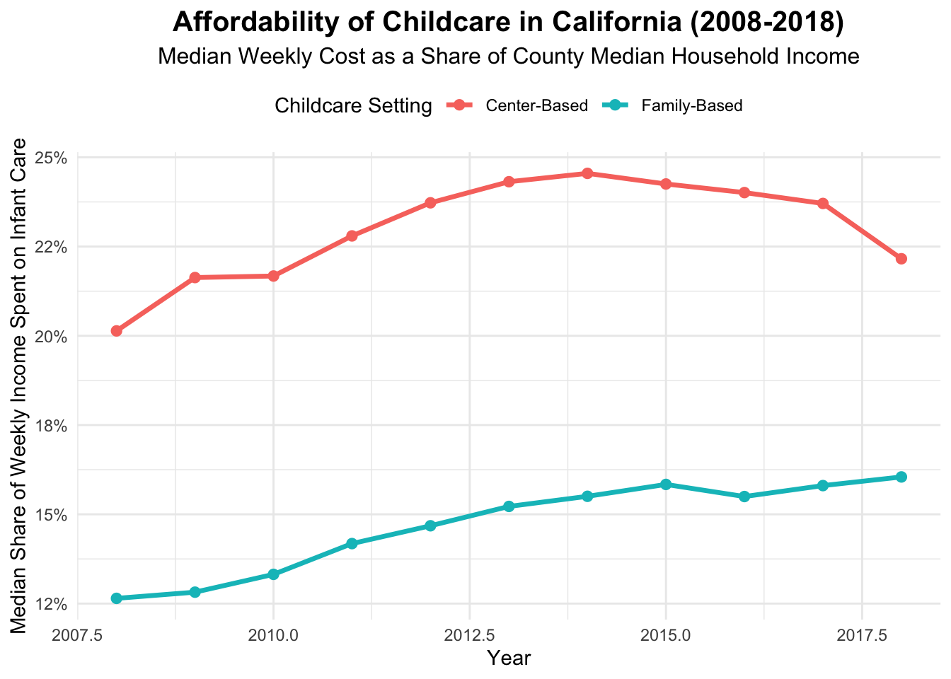
# Here is the data wrangling that happened to make this plot!ca_afford <- ca_childcare |>mutate(weekly_income = mhi_2018 /52, center_afford = mc_infant / weekly_income,family_afford = mfcc_infant / weekly_income )ca_afford_long <- ca_afford |>select(study_year, center_afford, family_afford) |>pivot_longer(cols =c(center_afford, family_afford),names_to ="Setting",values_to ="Affordability") |>mutate(Setting =recode(Setting,center_afford ="Center-Based",family_afford ="Family-Based"))
ggplot(ca_afford_long, aes(x = study_year, y = Affordability, color = Setting)) +stat_summary(fun = median, geom ="line", linewidth =1.2) +stat_summary(fun = median, geom ="point", size =2.2) +scale_y_continuous(labels = scales::label_percent(accuracy =1)) +labs(title ="Affordability of Childcare in California (2008-2018)",subtitle ="Median Weekly Cost as a Share of County Median Household Income",x ="Year",y ="Median Share of Weekly Income Spent on Infant Care",color ="Childcare Setting") +theme_minimal(base_size =11) +theme(plot.title =element_text(face ="bold", size =15, hjust =0.5),plot.subtitle=element_text(size =12, hjust=0.5),legend.position ="top")
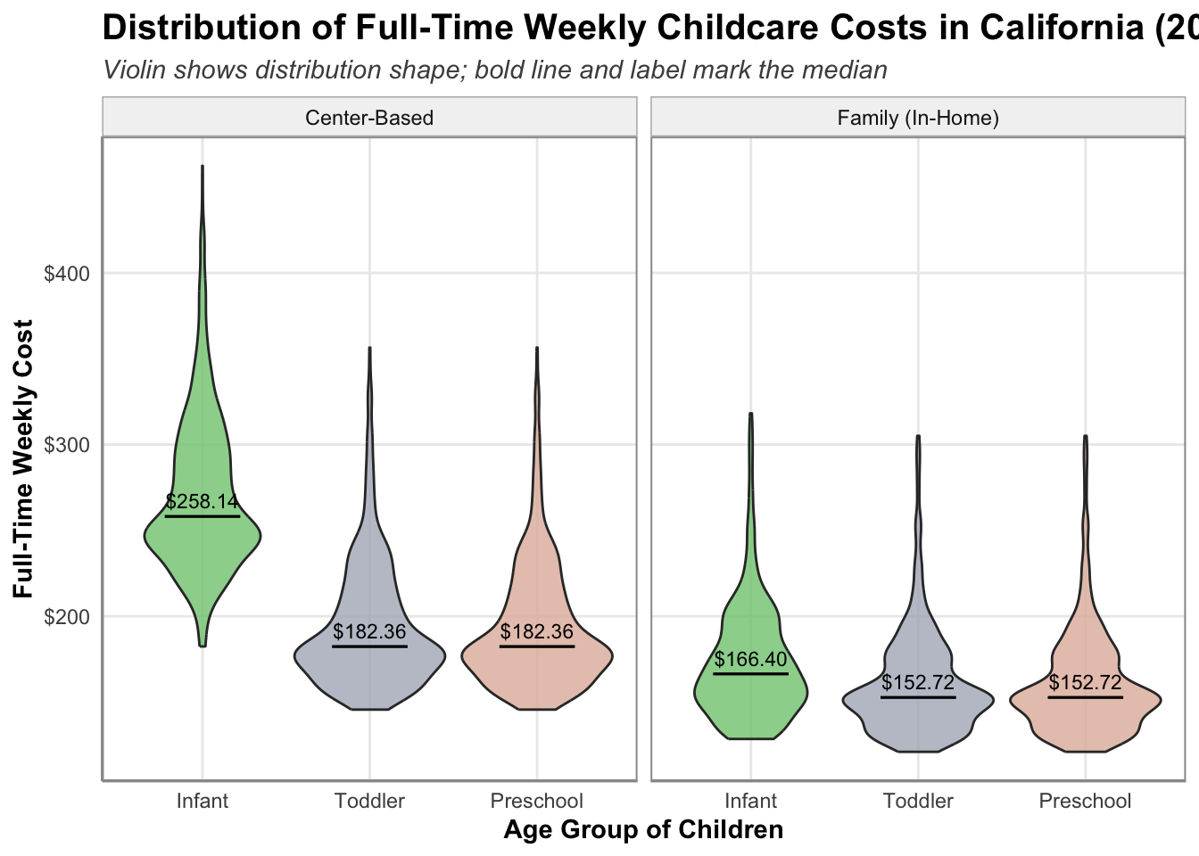
This plot is brought to us by a student who wishes to remain anonymous. I thought this plot was both incredibly clear and rather creative. They used a non-standard geom (geom_violin) which shows the density of each group’s distribution. Moreover, they plot a horizontal line at the median and annotate the median value (with dollar signs!).
Code
# Here is the data wrangling that happened to make this plot!plot_data <- ca_childcare |>select(mc_infant, mc_toddler, mc_preschool, mfcc_infant, mfcc_toddler, mfcc_preschool) |>pivot_longer(cols =everything(),names_to ="age_group",values_to ="weekly_price" ) |>mutate(age_group =recode( age_group,mc_infant ="Center_Infant",mc_toddler ="Center_Toddler",mc_preschool ="Center_Preschool",mfcc_infant ="Family_Infant",mfcc_toddler ="Family_Toddler",mfcc_preschool ="Family_Preschool" ),setting =if_else(str_detect(age_group, "Center"), "Center-Based", "Family (In-Home)"),age_group =case_when(str_detect(age_group, "Infant") ~"Infant",str_detect(age_group, "Toddler") ~"Toddler",str_detect(age_group, "Preschool") ~"Preschool" ),age_group =fct_relevel(age_group, "Infant", "Toddler", "Preschool") )
library(RColorBrewer)custom_colors <-colorRampPalette(brewer.pal(8, "Accent"))(10)ggplot(plot_data, aes(x = age_group, y = weekly_price, fill = age_group)) +geom_violin(trim =TRUE, alpha =0.8, linewidth =0.5) +stat_summary(fun = median, fun.min = median, fun.max = median,geom ="errorbar", width =0.45, color ="black", linewidth =0.5) +stat_summary(fun = median, geom ="text",aes(label = scales::dollar(after_stat(y))),vjust =-0.6, size =3, color ="black") +facet_wrap(~ setting, ncol =2) +scale_y_continuous(labels = scales::dollar) +scale_fill_manual(values = custom_colors) +scale_color_manual(values = custom_colors) +labs(title ="Distribution of Full-Time Weekly Childcare Costs in California (2008–2018)",subtitle ="Violin shows distribution shape; bold line and label mark the median",x ="Age Group of Children",y ="Full-Time Weekly Cost" ) +theme_minimal() +theme(legend.position ="none",panel.border =element_rect(color ="grey60", fill =NA, linewidth =0.7),strip.background =element_rect(fill ="grey95", color ="grey70"),plot.title =element_text(face ="bold", size =15),plot.subtitle =element_text(face ="italic", color ="grey30"),axis.title =element_text(face ="bold"),axis.line =element_line(color ="grey60"),panel.grid.minor =element_blank() )
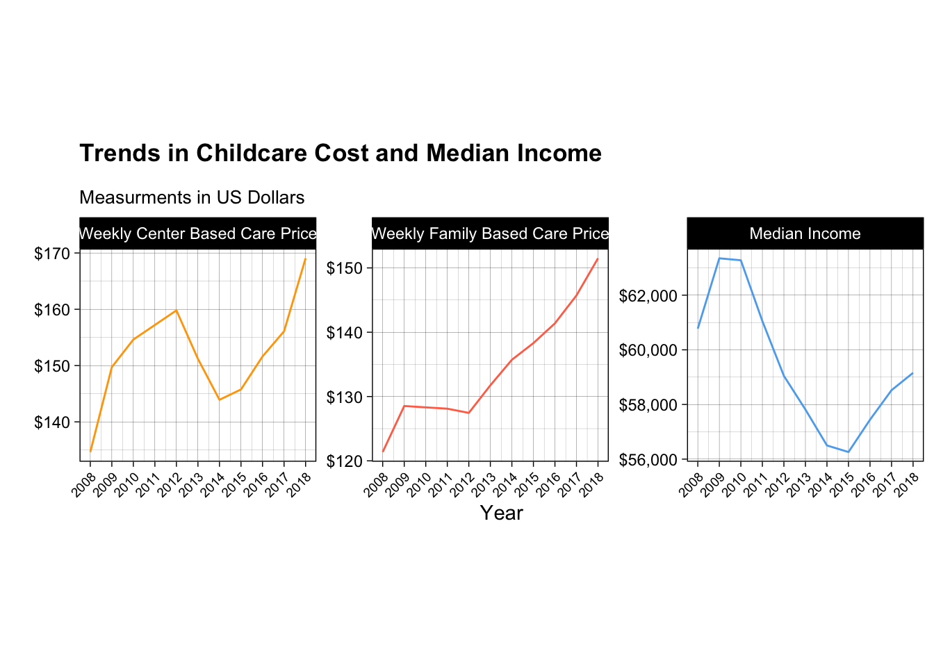
This plot is brought to us by Sebastien Montgrain! I really appreciated all the effort Sebastien put into getting the themes for the plot to be as clean as possible!
Code
# Here is the data wrangling that happened to make this plot!clean_data <- counties |>left_join(childcare_costs, join_by(county_fips_code)) |>filter(state_name =="California") |>group_by(study_year) |>summarise(mcsa =median(mcsa, na.rm =TRUE), mfccsa =median(mfccsa, na.rm =TRUE), mhi_2018 =median(mhi_2018, na.rm =TRUE)) |>select(study_year, mcsa, mfccsa, mhi_2018) |>rename('Weekly Center Based Care Price'= mcsa, 'Weekly Family Based Care Price'= mfccsa, 'Median Income'= mhi_2018) |>pivot_longer(cols =-study_year, names_to ="Variable", values_to ="value") |>mutate(Variable =fct_relevel(Variable, "Weekly Center Based Care Price", "Weekly Family Based Care Price", "Median Income") )
library(scales)ggplot(clean_data, aes(study_year, value, color = Variable)) +geom_line() +scale_y_continuous(labels =label_dollar()) +labs(x ="Year", y ="", title ="Trends in Childcare Cost and Median Income", subtitle ="Measurments in US Dollars") +facet_wrap(~ Variable, scales ="free_y", nrow =1) +theme_linedraw() +scale_x_continuous(breaks =unique(clean_data$study_year)) +theme(plot.title =element_text(margin =margin(b =13), face ="bold"), plot.subtitle =element_text(size =10),legend.position ="none",aspect.ratio =0.9,axis.text.x =element_text(size =7, angle =45, hjust =1)) +scale_color_manual(values =c("orange", "coral1", "steelblue2"))
Lab 5
Multiple Filters
This code is brought to us by a variety of students—Garrett, Jake, Liam, Lucy, and an anonymous student! I appreciated how each student managed to (efficiently) grab both witness interviews in one pipeline!
Garrett’s Version:
person |>left_join(y = interview,join_by(id == person_id)) |>filter((address_street_name =="Northwestern Dr"& address_number ==max(address_number)) |#find interview for either the person in the last house on Northwestern Dr or Annabel on Franklin Ave (address_street_name =="Franklin Ave"&str_detect(name, "Annabel"))) |>pull(name, transcript)
Jake’s Version:
# in this chunk of code I joined the interview data set with the person data set# so that I could narrow down the witnesses and extract their interviews to find more clueswitnesses <-full_join(person, interview, by =c("id"="person_id")) |>filter((str_detect(name, pattern ="Annabel") & address_street_name =="Franklin Ave") | address_street_name =="Northwestern Dr"& address_number ==max(address_number)) |>select(transcript)
Liam’s Version:
inner_join(x = person,y = interview,by =join_by(id == person_id) ) %>%# Inner join by `id` and `person_id`filter((str_detect(name, pattern ="Annabel") & address_street_name =="Franklin Ave") | (address_street_name =="Northwestern Dr"& address_number ==max(address_number)) ) %>%# Filter for witness 1 (Annabel on Franklin Ave) and witness 2 (last house on Northwestern Dr)pull(transcript) # Extract transcripts for witnesses
Lucy’s Version:
#join interview data table with person to connect their interviews to their addresses/names. Save to object to be used to interview suspects laterinterviewpeople <- interview |>inner_join(y = person,by =join_by(person_id == id)) #filter witnesses to find the ones that match the descriptions aboveinterviewpeople |>filter((str_detect(name, pattern ="Annabel") ==TRUE& address_street_name =="Franklin Ave") | (address_street_name =="Northwestern Dr"& address_number ==max(address_number))) |>pull(transcript)
This code comes to us from Karthik Balaji! I appreciated Karthik’s extensive use of functions from lubridate when filtering these data:
get_fit_now_member |>left_join(get_fit_now_check_in, by =join_by(id == membership_id)) |>mutate(check_in_date =ymd(check_in_date)) |>filter(month(check_in_date) ==1,day(check_in_date) ==9, membership_status =="gold",str_detect(id, pattern ="48Z")) |>left_join(person, by =join_by(person_id == id)) |>left_join(drivers_license, by =join_by(license_id == id)) |>filter(str_detect(plate_number, pattern ="H42W")) |>left_join(interview, by ="person_id") |>select(transcript)
This code is brought to us by Rayan Tahir and May Thu Thu Kyaw! I thought it was so cool that both of them found a way to create an interval of time and filter for dates within that interval!
Rayan’s Version:
concert_mastermind <- facebook_event_checkin |>filter( event_name =="SQL Symphony Concert", ymd(date) %within%interval(ymd("2017-12-01"), ymd("2017-12-31")) ) |>count(person_id, name ="visits") |>filter(visits >=3) |>inner_join(person, by =c("person_id"="id")) |>inner_join(drivers_license, by =c("license_id"="id")) |>filter(hair_color =="red", between(height, 65, 67))
May’s Version:
#Find people who attended SQL Symphony Concert 3 times in Dec 2017 concert_3x_dec <- facebook_event_checkin |>mutate(date =ymd(date)) |>#convert numeric dates (like 20171210) into proper Date objects filter( event_name =="SQL Symphony Concert", date %within%interval(ymd("2017-12-01"), ymd("2017-12-31")) #between these dates ) |>count(person_id, name ="n") |>filter(n ==3) |>select(person_id)
if_any()
This code is brought to us by Isaiah Woodard! I loved how Isaiah found a new setting to use if_any() in combination with !is.na() to check for missing values.
suspects <- get_fit_now_member %>%filter(membership_status =="gold", # includes only gold membersstr_detect(id, pattern ="^48Z")) %>%# includes only members whose ID starts with 48Zleft_join(y = get_fit_now_check_in,by =join_by(id == membership_id)) %>%left_join(y = interview,by =join_by(person_id)) %>%# joins to access additional datafilter(if_any(.cols = transcript,.fns =~!is.na(.x) # Checks for individuals with interviews. Removes those without. ))
Lab 7
Exemplary Plots of Missing Data
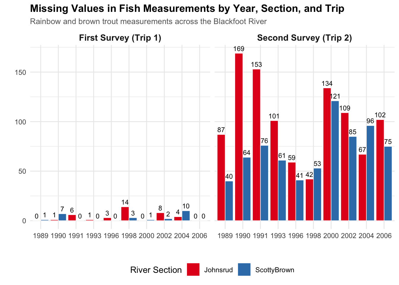
This plot is brought to us by Abel Magallon! I thought this plot was great because it (1) is easy to read, and (2) has a lot of detailed information. The annotations are great, plot title and subtitle describe the context of what is being plotted, and the facet labels are easy to understand.
Code
fish |>mutate(has_missing =if_any(weight, is.na),trip =fct_recode(factor(trip),"First Survey (Trip 1)"="1","Second Survey (Trip 2)"="2")) |>group_by(year, section, trip) |>summarize(n_missing =sum(has_missing),n_total =n(),pct_missing = (n_missing / n_total) *100,.groups ="drop" ) |>ggplot(aes(x =factor(year), y = n_missing, fill = section)) +geom_col(position ="dodge", color ="white", linewidth =0.3) +geom_text(aes(label = n_missing), position =position_dodge(width =0.9),vjust =-0.5, size =3) +facet_wrap(~trip) +labs(x ="",y ="",fill ="River Section",title ="Missing Values in Fish Measurements by Year, Section, and Trip",subtitle ="Rainbow and brown trout measurements across the Blackfoot River" ) +theme_minimal() +theme(plot.title =element_text(face ="bold", size =13),plot.subtitle =element_text(size =10, color ="gray40"),strip.text =element_text(face ="bold", size =11),legend.position ="bottom" ) +scale_fill_brewer(palette ="Set1")
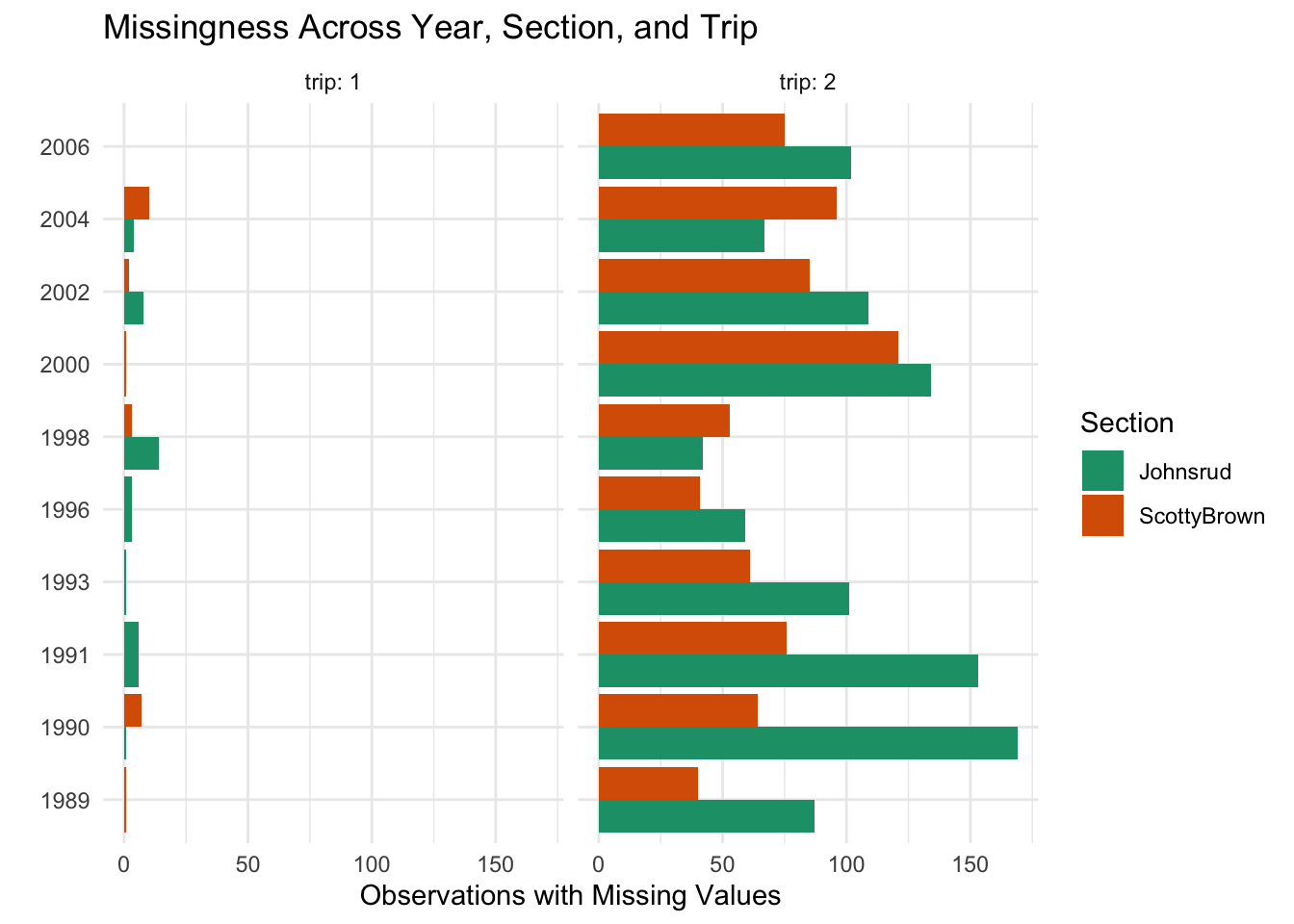
This plot is brought to us by Joaquin Arredondo! I really appreciated Joaquin’s use of descriptive facet labels and their non-standard colors. The colors almost look like Rainbow Trout!
Code
fish |>mutate(any_missing =if_any(everything(), is.na)) |>filter(any_missing) |>count(year, section, trip) |>ggplot(aes(y =factor(year), x = n, fill = section)) +geom_col(position ="dodge") +facet_wrap(~ trip, labeller = label_both) +labs(y ="",x ="Observations with Missing Values",fill ="Section",title ="Missingness Across Year, Section, and Trip" ) +theme_minimal() +theme(axis.title.y =element_text(margin =margin(t =10)) ) +scale_fill_brewer(palette ="Dark2")
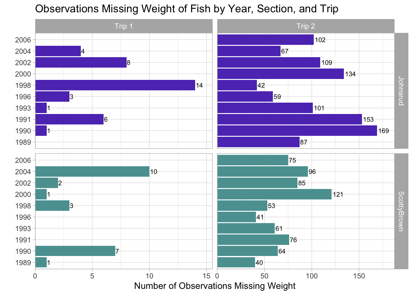
This plot is brought to us by Samanatha Frick! I appreciated Samantha’s use of a grid of facets, with great labels (and colors)!
Code
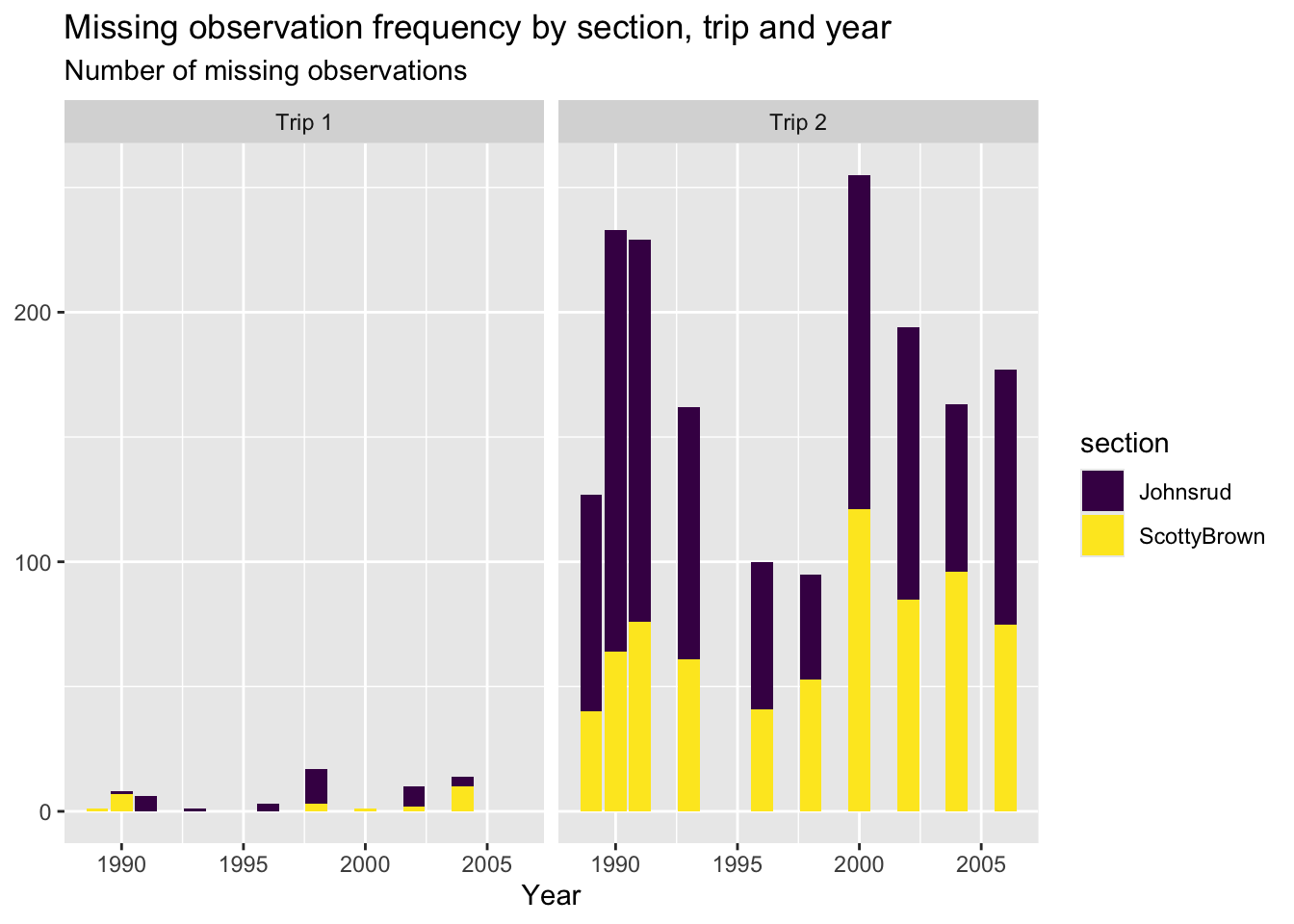
fish_missing <- fish |>filter(if_any(.cols =everything(), .fns =~is.na(.x))) |>count(year, section, trip, name ="n_missing")ggplot(data = fish_missing,mapping =aes(x = n_missing, y =factor(year), fill = section)) +geom_col() +geom_text(mapping =aes(label = n_missing), hjust =-0.1, size =2.8) +scale_x_continuous(expand =expansion(mult =c(0, 0.11))) +facet_grid(rows =vars(section),cols =vars(trip),scales ="free_x",labeller =labeller(trip =c(`1`="Trip 1", `2`="Trip 2"))) +labs(title ="Observations Missing Weight of Fish by Year, Section, and Trip",x ="Number of Observations Missing Weight",y ="" ) +scale_fill_manual(name ="Section",values =c("Johnsrud"="#603bbf", "ScottyBrown"="#5ba0a0")) +theme_light() +theme(legend.position ="none")
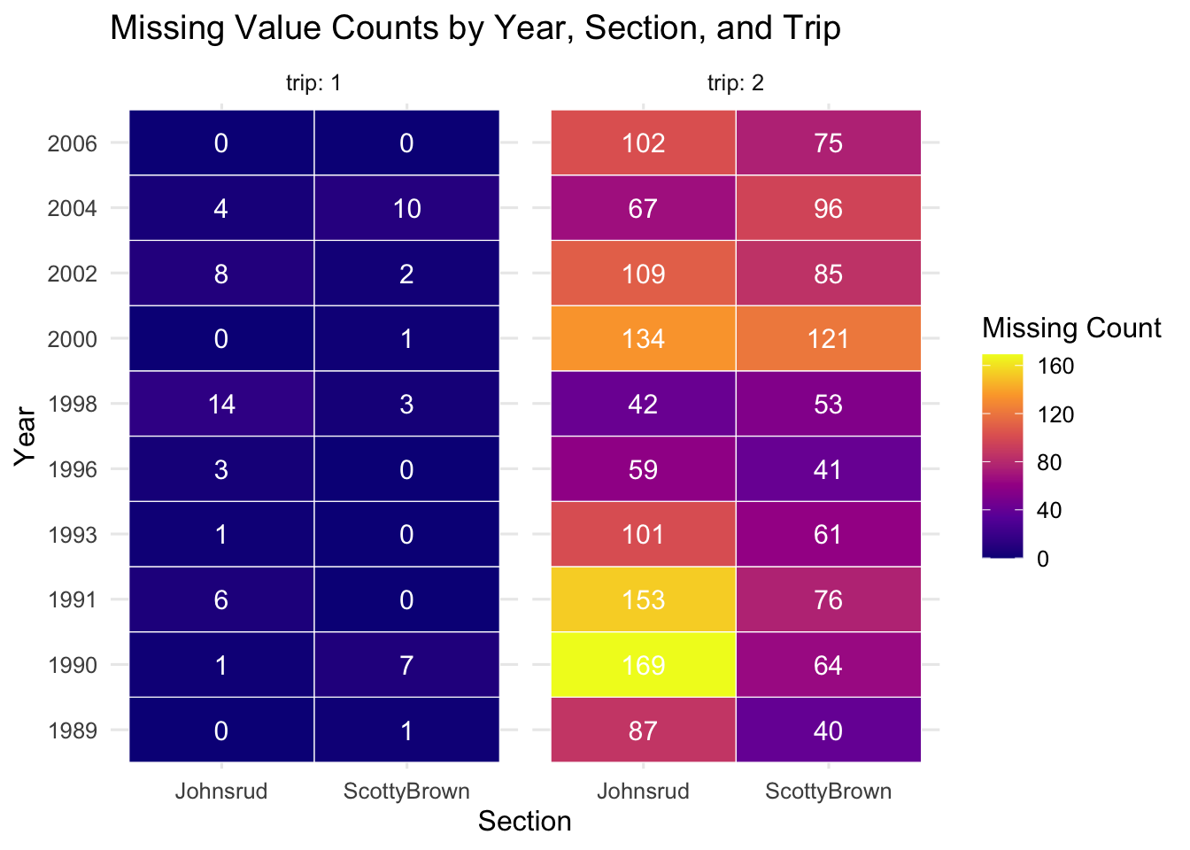
This plot is brought to us by Paco Jones! I appreciated Paco’s use of a non-standard geom to visualize the missingness in the data. They are using a geom_tile() to create a heatmap of missing values. Pretty cool!
Code
fish %>%mutate(.row_has_na =if_any(everything(), is.na)) %>%group_by(year, section, trip) %>%summarize(missing_count =sum(.row_has_na),total =n(),.groups ="drop" ) %>%ggplot(aes(x = section, y =factor(year), fill = missing_count)) +geom_tile(color ="white") +geom_text(aes(label = missing_count), size =4, color ="white") +facet_wrap(~ trip, labeller = label_both) +scale_fill_viridis_c(option ="plasma") +labs(title ="Missing Value Counts by Year, Section, and Trip",x ="Section",y ="Year",fill ="Missing Count" ) +theme_minimal(base_size =12)
Challenge 7
Great Input Checks
Cool Plots
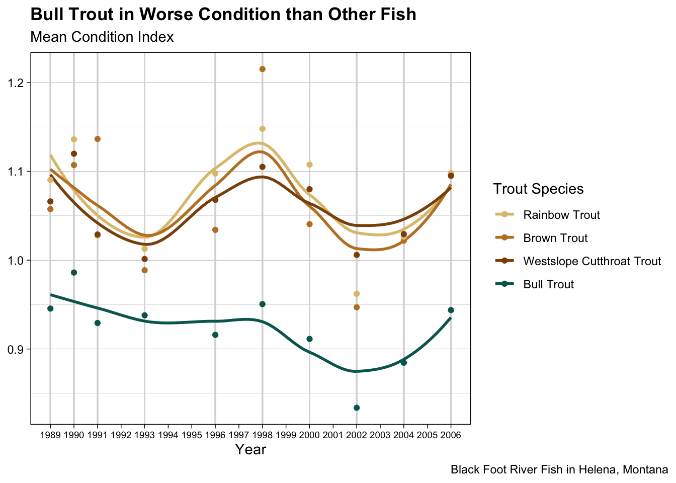
This plot is brought to us by Connie Xian! This plot blew me away. Connie made so many changes to make the plot easily understandable to the reader. The legend is in the order of the lines (fct_reorder2()!), there are vertical grey lines only on the years where data were collected, and the years a labeled to not make the reader tilt their head. The icing on the cake is the renaming of the species variable so the reader doesn’t have to guess what WCT means. 🔥
Code
mycolors <- RColorBrewer::brewer.pal(8, "BrBG")[c(3,2,1,8)] # color palettefish |>mutate(condition =condition_index(length, weight)) |>group_by(year, species) |>summarize(mean_condition =mean(condition, na.rm =TRUE),.groups ="drop") |>mutate(species =fct_reorder2(.f = species,.x = year,.y = mean_condition)) |>ggplot(mapping =aes(x = year, y = mean_condition, color = species)) +geom_rug(sides ="b", color ="gray85", lineend ="round", length =unit(100, "npc")) +geom_smooth(se =FALSE) +geom_point() +theme_linedraw() +scale_color_manual(values = mycolors,labels =c("Rainbow Trout","Brown Trout","Westslope Cutthroat Trout","Bull Trout")) +scale_x_continuous(breaks =seq(1988, 2007, by =1)) +theme(axis.text.x =element_text(size =7),panel.grid.minor.x =element_blank(),panel.grid.major.x =element_blank(),plot.title =element_text(face ="bold"),plot.caption.position ="plot") +labs(title ="Bull Trout in Worse Condition than Other Fish",subtitle ="Mean Condition Index",x ="Year",y =NULL,color ="Trout Species",caption ="Black Foot River Fish in Helena, Montana")
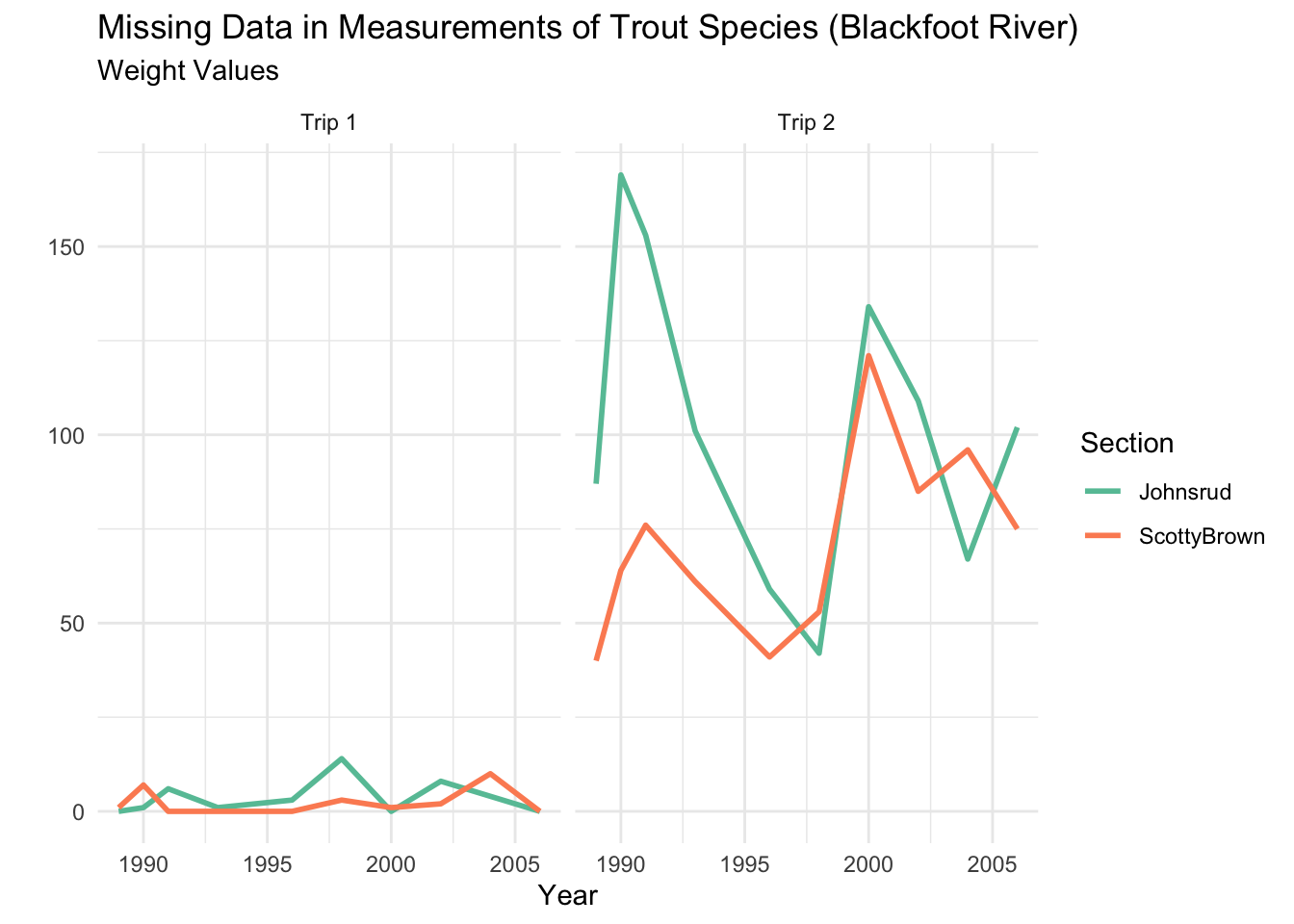
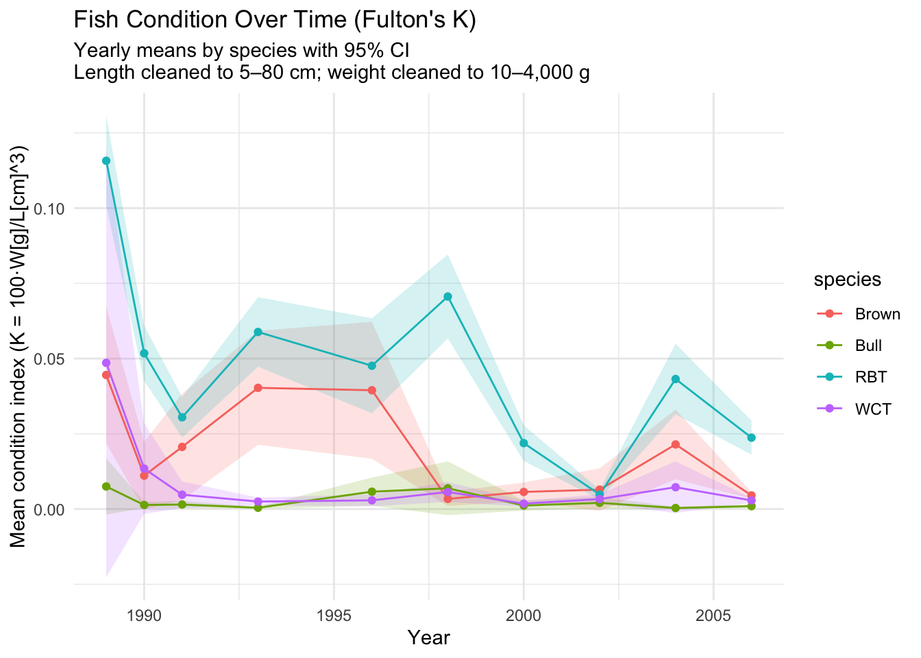
This plot is brought to us by a student who wishes to remain anonymous. I appreciated the use of a geom_ribbon() in the plot to show the range of values for the condition indices. The calculation of a 95% confidence interval around the mean condition index for each year and species was an impressive feat already!
Lab 8
Awesome Function Checks
Cool Helper Functions
I thought it was awesome to see quite a few students create “helper” functions to help make nicely formatted labels for their plot. Here are some examples!
While most students wrote a plotting function to make a specific type of plot (e.g., barplot, scatterplot), two students wrote plotting functions that decide what plot to make based on the data types of the variables input. So cool!
This function was written by Shafay Syed!
plot_two_vars <-function(data, x, y) { x_lab <-names(select(data, {{ x }})) y_lab <-names(select(data, {{ y }})) x_lab <-str_to_title(str_replace_all(x_lab, "_", " ")) y_lab <-str_to_title(str_replace_all(y_lab, "_", " ")) x_is_num <-is.numeric(pull(data, {{ x }})) y_is_num <-is.numeric(pull(data, {{ y }}))if (x_is_num && y_is_num) {ggplot(data, aes(x = {{ x }}, y = {{ y }}, color = {{ y }})) +geom_point(na.rm =TRUE, alpha =0.7) +theme(legend.position ="none") +labs(x = x_lab, y = y_lab, title =paste0(y_lab, " vs ", x_lab)) } elseif (!x_is_num && y_is_num) {ggplot(data, aes(x = {{ x }}, y = {{ y }}, fill = {{ x }})) +geom_boxplot(na.rm =TRUE, outlier.alpha =0.3) +theme(legend.position ="none") +labs(x = x_lab, y = y_lab, title =paste0(y_lab, " by ", x_lab)) } elseif (x_is_num &&!y_is_num) {ggplot(data, aes(x = {{ y }}, y = {{ x }}, fill = {{ y }})) +geom_boxplot(na.rm =TRUE, outlier.alpha =0.3) +theme(legend.position ="none") +labs(x = y_lab, y = x_lab, title =paste0(x_lab, " by ", y_lab)) } else {ggplot(data, aes(x = {{ x }}, fill = {{ y }})) +geom_bar(na.rm =TRUE, position ="dodge") +labs(x = x_lab, y ="Count", title =paste0("Counts of ", x_lab, " by ", y_lab)) }}
Getting the Right Number of Colors
For your style_plot() function I asked for you to allow the user to input a color palette to be used. But! The color palette they input might have the wrong number of colors!
Amazingly, Kristen Ho figured out how to handle just this problem! Kristen’s function inspects the plot object to see how many labels the plot has, and uses that number to create a color palette with the right number of colors (using colorRampPalette())!
There were a couple of small changes people made to their tables for Lab 9 that I thought went the extra mile. Here are a couple of them!
Consistent Capitalization
It seems like a small change, but I really appreciated how Elise Donaho changed the capitalization of the data type column so every word had consistent capitalization (instead of Date being the only capital letter).
Another small change that Nick Carboni (and few others) made was to add commas to the numbers in the missing value table. There were a couple of ways to add the colors to the table:
Using the rows argument of tab_style()
library(gt)fish |>map_int(~sum(is.na(.x))) |>enframe(name ="Variable", value ="Missing") |>arrange(desc(Missing), Variable) |>gt() |>cols_label(Variable ="Measurement Variable",Missing ="Missing Values" ) |>fmt_number(columns = Missing, decimals =0) |>tab_header(title ="Number of Missing Values for Fish Measurements",subtitle ="Data Collected from 1989 to 2006 on the Blackfoot Fish River in Montana" ) |>tab_style(style =cell_fill(color ="lightgreen"),locations =cells_body(columns = Missing,rows = Missing ==0 ) ) |>tab_style(style =cell_fill(color ="tomato"),locations =cells_body(columns = Missing,rows = Missing >0 ) ) |>opt_row_striping()
Number of Missing Values for Fish Measurements
Data Collected from 1989 to 2006 on the Blackfoot Fish River in Montana
Measurement Variable
Missing Values
weight
1,838
length
47
mark
0
section
0
species
0
trip
0
year
0
Defining a local function inside data_color()
fish |>map_int(~sum(is.na(.x))) |>enframe(name ="Measurement Variable", value ="Missing Values") |>gt() |>tab_header(title =md("**Number of Missing Values for Fish Measurements**"),subtitle =md("Data collected from 1989 to 2006 on the Blackfoot Fish River in Montana") ) |>data_color(columns ="Missing Values",fn =function(x) {case_when( x ==0~"forestgreen",TRUE~"orangered" ) } ) |>fmt_number(columns ="Missing Values", decimals =0) |>cols_align(align ="right", columns =everything()) |>tab_options(heading.title.font.size =16,heading.subtitle.font.size =12,table.font.size =14,column_labels.font.weight ="bold",table.align ="center" )
Number of Missing Values for Fish Measurements
Data collected from 1989 to 2006 on the Blackfoot Fish River in Montana