library(liver)
data(cereal)
head(cereal)Data Joins + Pivots
Tuesday, October 15
Today we will discuss…
- Discord & Tokens
- Grade Expectations
- Survey on Canvas
- New Material
- Pivoting data with
tidyr - Joining data with
dplyr
- Pivoting data with
- PA 4: Military Spending
Discord & Deadline Extension Tokens
Discord & Deadline Extension Tokens
If you answer / respond to another student’s question on Discord, you will earn one additional “token” (3-day deadline extension request).
Grade Expectations
Grade Expectations
The course syllabus has been updated to reflect the grade criteria you all proposed.
Grade Expectations
The course syllabus has been updated to reflect the grade criteria you all proposed.
You have until Sunday to vote on whether you agree with the proposed criteria, and to suggest ways these criteria could be revised.
Data Layouts
Tidy Data
Tidy data…
- is rectangular.
- has observations as rows and variables as columns.
- has different formats for different tasks.

Creating Tidy Data
We may need to transform our data to turn it into the version of tidy that is best for a task at hand.

Cereal Data
| name | manuf | type | calories | protein | fat | sodium | fiber | carbo | sugars | potass | vitamins | shelf | weight | cups | rating |
|---|---|---|---|---|---|---|---|---|---|---|---|---|---|---|---|
| 100% Bran | N | cold | 70 | 4 | 1 | 130 | 10.0 | 5.0 | 6 | 280 | 25 | 3 | 1 | 0.33 | 68.40297 |
| 100% Natural Bran | Q | cold | 120 | 3 | 5 | 15 | 2.0 | 8.0 | 8 | 135 | 0 | 3 | 1 | 1.00 | 33.98368 |
| All-Bran | K | cold | 70 | 4 | 1 | 260 | 9.0 | 7.0 | 5 | 320 | 25 | 3 | 1 | 0.33 | 59.42551 |
| All-Bran with Extra Fiber | K | cold | 50 | 4 | 0 | 140 | 14.0 | 8.0 | 0 | 330 | 25 | 3 | 1 | 0.50 | 93.70491 |
| Almond Delight | R | cold | 110 | 2 | 2 | 200 | 1.0 | 14.0 | 8 | -1 | 25 | 3 | 1 | 0.75 | 34.38484 |
| Apple Cinnamon Cheerios | G | cold | 110 | 2 | 2 | 180 | 1.5 | 10.5 | 10 | 70 | 25 | 1 | 1 | 0.75 | 29.50954 |
Creating Tidy Data
Let’s say we want to look at mean cereal nutrients based on shelf.
Currently, the data are in a wide format – a separate column for each nutrient.
Transforming the data will make plotting easier.
Tidying the Cereals Data
| shelf | calories | protein | fat | sodium | fiber | carbo | sugars | potass | vitamins |
|---|---|---|---|---|---|---|---|---|---|
| 1 | 102.5000 | 2.650000 | 0.60 | 176.2500 | 1.6850000 | 15.80000 | 4.800000 | 75.50000 | 20.00000 |
| 2 | 109.5238 | 1.904762 | 1.00 | 145.7143 | 0.9047619 | 13.61905 | 9.619048 | 57.80952 | 23.80952 |
| 3 | 107.7778 | 2.861111 | 1.25 | 158.6111 | 3.1388889 | 14.50000 | 6.527778 | 129.83333 | 35.41667 |
Code
my_colors <- c("calories_col" = "steelblue", "sugars_col" = "orange3")

cereal_wide |>
  ggplot() +
  geom_point(mapping = aes(x = shelf, y = calories, color = "calories_col")) +
  geom_line(mapping = aes(x = shelf, y = calories, color = "calories_col")) +
  geom_point(mapping = aes(x = shelf, y = sugars, color = "sugars_col")) +
  geom_line(mapping = aes(x = shelf, y = sugars, color = "sugars_col")) +
  scale_color_manual(values = my_colors, labels = names(my_colors)) +
  labs(x = "Shelf", y = "", subtitle = "Mean Amount", color = "Nutrient")
| shelf | Nutrient | mean_amount |
|---|---|---|
| 1 | calories | 102.5000000 |
| 1 | carbo | 15.8000000 |
| 1 | fat | 0.6000000 |
| 1 | fiber | 1.6850000 |
| 1 | potass | 75.5000000 |
| 1 | protein | 2.6500000 |
| 1 | sodium | 176.2500000 |
| 1 | sugars | 4.8000000 |
| 1 | vitamins | 20.0000000 |
| 2 | calories | 109.5238095 |
| 2 | carbo | 13.6190476 |
| 2 | fat | 1.0000000 |
| 2 | fiber | 0.9047619 |
| 2 | potass | 57.8095238 |
| 2 | protein | 1.9047619 |
| 2 | sodium | 145.7142857 |
| 2 | sugars | 9.6190476 |
| 2 | vitamins | 23.8095238 |
| 3 | calories | 107.7777778 |
| 3 | carbo | 14.5000000 |
| 3 | fat | 1.2500000 |
| 3 | fiber | 3.1388889 |
| 3 | potass | 129.8333333 |
| 3 | protein | 2.8611111 |
| 3 | sodium | 158.6111111 |
| 3 | sugars | 6.5277778 |
| 3 | vitamins | 35.4166667 |
Pivoting Data


Manual Method
Consider daily rainfall observed in SLO in January 2023.
- The data is in a human-friendly form (like a calendar).
- Each week has a row, and each day has a column.

How would you manually convert this to long format?
Manual Method: Steps
- Keep the column
Week. - Create a new column
Day_of_Week. - Create a new column
Rainfall(hold daily rainfall values). - Now we have three columns – move Sunday values over.

Manual Method: Steps
- Keep the column
Week. - Create a new column
Day_of_Week. - Create a new column
Rainfall(hold daily rainfall values). - Now we have three columns – move Sunday values over.
- Duplicate
Week1-5 and copy Monday values over.

Manual Method: Steps
- Keep the column
Week. - Create a new column
Day_of_Week. - Create a new column
Rainfall(hold daily rainfall values). - Now we have three columns – move Sunday values over.
- Duplicate
Week1-5 and copy Monday values over. - Duplicate
Week1-5 and copy Tuesday values over.
Manual Method: Steps
- Keep the column
Week. - Create a new column
Day_of_Week. - Create a new column
Rainfall(hold daily rainfall values). - Now we have three columns – move Sunday values over.
- Duplicate
Week1-5 and copy Monday values over. - Duplicate
Week1-5 and copy Tuesday values over. - Continue for the rest of the days of the week.
Computational Approach

We can use pivot_longer() to turn a wide dataset into a long(er) dataset.
pivot_longer()
Take a wide dataset and turn it into a long dataset.
cols– specify the columns that should be pivoted.- Do not include the names of ID columns (columns to not be pivoted).
names_to– the name of the new column containing the old column names.values_to– the name of the new column containing the old column values.
pivot_longer()
| Week | Day_of_Week | Daily_Rainfall |
|---|---|---|
| 1 | Sunday | 0.00 |
| 1 | Monday | 0.12 |
| 1 | Tuesday | 0.00 |
| 1 | Wednesday | 1.58 |
| 1 | Thursday | 0.91 |
| 1 | Friday | 0.00 |
| 1 | Saturday | 0.05 |
| 2 | Sunday | 0.27 |
| 2 | Monday | 4.26 |
| 2 | Tuesday | 0.43 |
| 2 | Wednesday | 0.00 |
| 2 | Thursday | 0.00 |
| 2 | Friday | 0.16 |
| 2 | Saturday | 1.41 |
| 3 | Sunday | 0.34 |
| 3 | Monday | 0.33 |
| 3 | Tuesday | 0.00 |
| 3 | Wednesday | 0.00 |
| 3 | Thursday | 0.13 |
| 3 | Friday | 0.00 |
| 3 | Saturday | 0.00 |
| 4 | Sunday | 0.00 |
| 4 | Monday | 0.00 |
| 4 | Tuesday | 0.00 |
| 4 | Wednesday | 0.00 |
| 4 | Thursday | 0.00 |
| 4 | Friday | 0.00 |
| 4 | Saturday | NA |
| 5 | Sunday | NA |
| 5 | Monday | NA |
| 5 | Tuesday | NA |
| 5 | Wednesday | NA |
| 5 | Thursday | NA |
| 5 | Friday | NA |
| 5 | Saturday | NA |
pivot_wider()
Take a long dataset and turn it into a wide dataset.
id_cols– specify the column(s) that contain the ID for unique rows in the wide dataset.names_from– the name of the column containing the new column names.values_from– the name of the column containing the new column values.
pivot_wider()
Let’s say we calculate the mean amount of protein for cereals on each shelf and for each manuf.
| manuf | shelf | mean_protein |
|---|---|---|
| A | 2 | 4.000000 |
| G | 1 | 3.000000 |
| G | 2 | 1.285714 |
| G | 3 | 2.666667 |
| K | 1 | 2.750000 |
| K | 2 | 2.142857 |
| K | 3 | 2.916667 |
| N | 1 | 2.666667 |
| N | 2 | 2.500000 |
| N | 3 | 4.000000 |
| P | 1 | 1.500000 |
| P | 2 | 1.000000 |
| P | 3 | 3.000000 |
| Q | 1 | 5.000000 |
| Q | 2 | 2.000000 |
| Q | 3 | 2.500000 |
| R | 1 | 2.000000 |
| R | 3 | 3.000000 |
pivot_wider()
We can make this dataset more easily readable…
| manuf | 1 | 2 | 3 |
|---|---|---|---|
| G | 3.000000 | 1.285714 | 2.666667 |
| K | 2.750000 | 2.142857 | 2.916667 |
| N | 2.666667 | 2.500000 | 4.000000 |
| P | 1.500000 | 1.000000 | 3.000000 |
| Q | 5.000000 | 2.000000 | 2.500000 |
| R | 2.000000 | NA | 3.000000 |
| A | NA | 4.000000 | NA |
Better names in pivot_wider()
| manuf | Shelf_1 | Shelf_2 | Shelf_3 |
|---|---|---|---|
| G | 3.000000 | 1.285714 | 2.666667 |
| K | 2.750000 | 2.142857 | 2.916667 |
| N | 2.666667 | 2.500000 | 4.000000 |
| P | 1.500000 | 1.000000 | 3.000000 |
| Q | 5.000000 | 2.000000 | 2.500000 |
| R | 2.000000 | NA | 3.000000 |
| A | NA | 4.000000 | NA |
Data Joins
Relational Data
Multiple, interconnected tables of data are called relational.
- It is the relation between datasets, not just the individual datasets themselves, that are important.

IMDb movie relational data
Data Joins
We can combine (join) data tables based on their relations.
Mutating joins
Add variables from a new dataframe to observations in an existing dataframe.
full_join(), left_join(), right_join(), inner_join(), outer_join()
Filtering Joins
Filter observations based on values in new dataframe.
semi_join(), anti_join()
Keys
A key uniquely identifies an observation in a data set.
- To combine (join) two datasets, the key needs to be present in both.

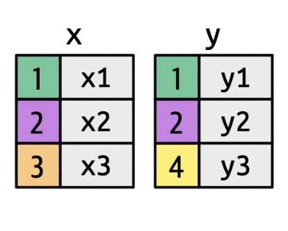
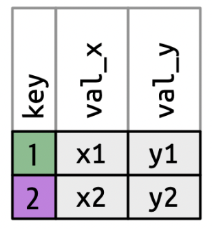
inner_join()
Keeps observations when their keys are present in both datasets.
inner_join(): IMDb Example
| director_id | genre | prob |
|---|---|---|
| 429 | Adventure | 0.750000 |
| 429 | Fantasy | 0.750000 |
| 2931 | Drama | 0.714286 |
| 2931 | Action | 0.428571 |
| 11652 | Sci-Fi | 0.500000 |
| 11652 | Action | 0.500000 |
| 14927 | Animation | 1.000000 |
| 14927 | Family | 1.000000 |
| 15092 | Comedy | 0.545455 |
| 15092 | Crime | 0.545455 |
ID: 429, 2931, 11652, 14927, 15092 ID: 429, 9247, 11652, 14927, 15092
| director_id | genre | prob | movie_id |
|---|---|---|---|
| 429 | Adventure | 0.750000 | 300229 |
| 429 | Fantasy | 0.750000 | 300229 |
| 11652 | Sci-Fi | 0.500000 | 10920 |
| 11652 | Sci-Fi | 0.500000 | 333856 |
| 11652 | Action | 0.500000 | 10920 |
| 11652 | Action | 0.500000 | 333856 |
| 14927 | Animation | 1.000000 | 192017 |
| 14927 | Family | 1.000000 | 192017 |
| 15092 | Comedy | 0.545455 | 109093 |
| 15092 | Comedy | 0.545455 | 237431 |
| 15092 | Crime | 0.545455 | 109093 |
| 15092 | Crime | 0.545455 | 237431 |
ID: 429, 2931, 9247, 11652, 14927, 15092
inner_join(): IMDb Example
What if our key does not have the same name?
| director_id | genre | prob |
|---|---|---|
| 429 | Adventure | 0.750000 |
| 429 | Fantasy | 0.750000 |
| 2931 | Drama | 0.714286 |
| 2931 | Action | 0.428571 |
| 11652 | Sci-Fi | 0.500000 |
| 11652 | Action | 0.500000 |
| 14927 | Animation | 1.000000 |
| 14927 | Family | 1.000000 |
| 15092 | Comedy | 0.545455 |
| 15092 | Crime | 0.545455 |
| id | first_name | last_name | genre | prob |
|---|---|---|---|---|
| 429 | Andrew | Adamson | Adventure | 0.750000 |
| 429 | Andrew | Adamson | Fantasy | 0.750000 |
| 11652 | James (I) | Cameron | Sci-Fi | 0.500000 |
| 11652 | James (I) | Cameron | Action | 0.500000 |
| 14927 | Ron | Clements | Animation | 1.000000 |
| 14927 | Ron | Clements | Family | 1.000000 |
| 15092 | Ethan | Coen | Comedy | 0.545455 |
| 15092 | Ethan | Coen | Crime | 0.545455 |
Piping Joins
Remember: the dataset you pipe in becomes the first argument of the function you are piping into!
- So if you are using a pipe, you will only be specifying the right dataset inside the
joinfunction.
More Mutating Joins
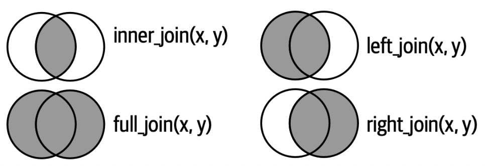
left_join()– keep only (and all) observations present in the left data setright_join()– keep only (and all) observations present in the right data setfull_join()– keep only (and all) observations present in both data sets
More Mutating Joins
Which directors would remain for each of the following?
left_join(directors_genres, movies_directors)right_join(directors_genres, movies_directors)full_join(directors_genres, movies_directors)
Filtering Joins: semi_join()
Keeps observations when their keys are present in both datasets, but only keeps variables from the first dataset.

→

Filtering Joins: semi_join()
| director_id | genre | prob |
|---|---|---|
| 429 | Adventure | 0.750000 |
| 429 | Fantasy | 0.750000 |
| 11652 | Sci-Fi | 0.500000 |
| 11652 | Action | 0.500000 |
| 14927 | Animation | 1.000000 |
| 14927 | Family | 1.000000 |
| 15092 | Comedy | 0.545455 |
| 15092 | Crime | 0.545455 |
Movie Directors: 429, 2931, 11652, 14927, 15092
Filtering Joins: anti_join()
Removes observations when their keys are present in both datasets, and only keeps variables from the first dataset.

→

Filtering Joins: anti_join()
PA 4: Military Spending
Today you will be tidying messy data to explore the relationship between countries of the world and military spending.
This activity will require knowledge of:
- function documentation
- function arguments
- locating missing values
- character vectors
- keys joining two datasets
- searching / iterating over multiple columns
- pivoting data from wide to long
- creating side-by-side boxplots
- locating the median on a boxplot
- estimating the variability from a boxplot
None of us have all these abilities. Each of us has some of these abilities.
dplyr Resources
Every group should have a dplyr cheatsheet!
On the Back: The Combine Tables section gives advice on joining two datasets
- The “Filtering Join” section will be helpful when performing an
anti_join()!

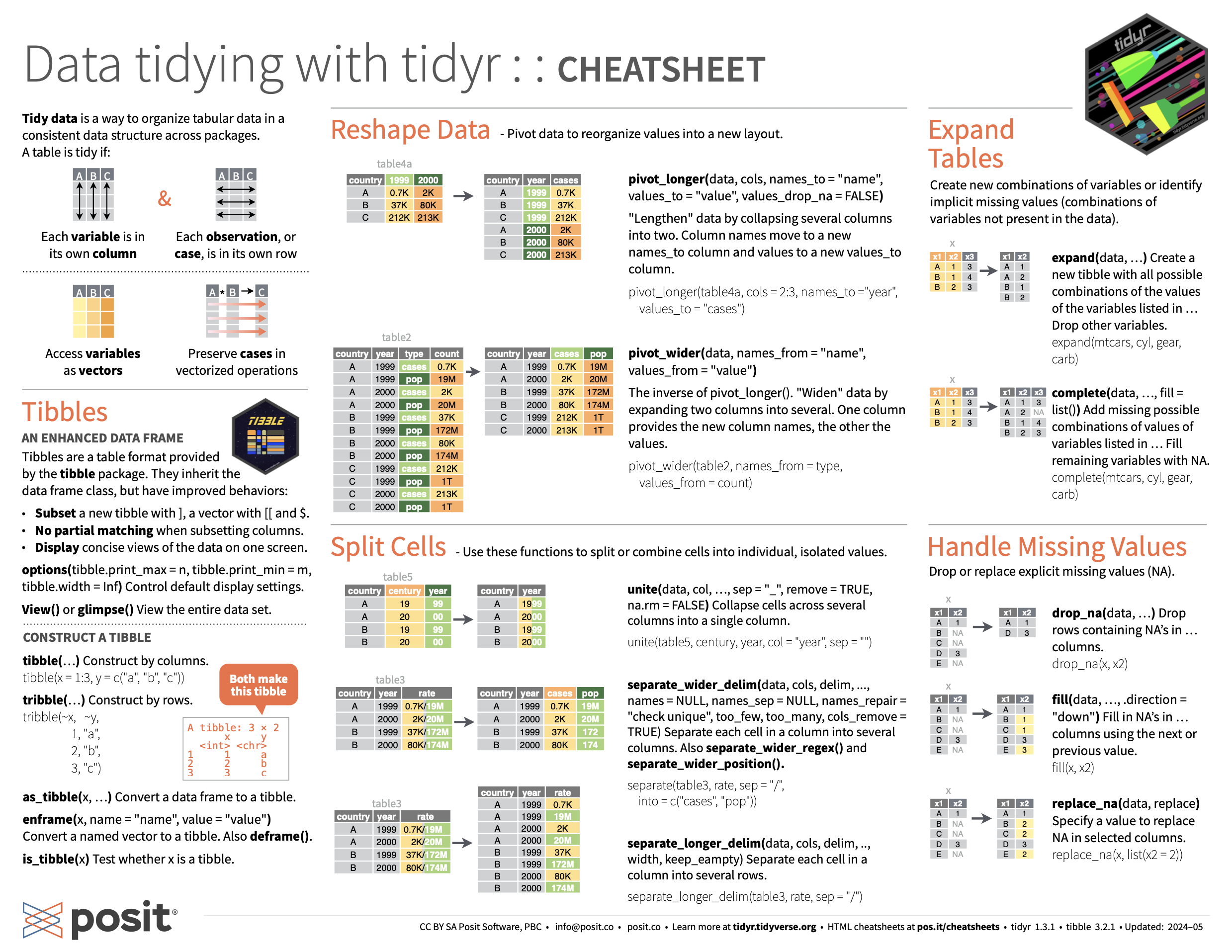
tidyr Resources
Every group should have a tidyr cheatsheet!
On the Front: The Reshape Data section gives advice on pivoting a dataset from wide to long
Task Card
Every group should have a task card!
On the Front
- the expectations of each role
- the norms of collaborating
On the Back
- code and pictures for performing an
anti_join() - code and pictures for pivoting a dataset from wide to long
- guidelines for formatting
dplyrandtidyrcode
Pair Programming Expectations
Developer
- Reads prompt and ensures Coder understands what is being asked.
- Types the code specified by the Coder into the Quarto document.
- Runs the code provided by the Coder.
- Works with Coder to debug the code.
- Evaluates the output.
- Works with Coder to write code comments.
Coder
- Reads out instructions or prompts
- Directs the Developer what to type.
- Talks with Developer about their ideas.
- Manages resources (e.g., cheatsheets, textbook, slides).
- Works with Developer to debug the code.
- Works with Developer to write code comments.
Getting Started
First, both of you will do the following:
- Join your Practice Activity workspace in Posit Cloud
- You are in a new group, so you should have a new workspace!
- Log-in to Posit Cloud
- Open the PA 4: Military Spending project
- Open the
PA4-dplyr.qmdfile
Then, the partner who woke up the earliest today starts as the Developer (typing and listening to instructions from the Coder)!
- The Coder does not type.
- The collaborative editing feature should allow you to track what is being typed.
- The Developer only types what they are told to type.
External Resources
During the Practice Activity, you are not permitted to use Google or ChatGPT for help.
You are permitted to use:
- the
dplyrcheatsheet, - the
tidyrcheatsheet, - the course textbook, and
- the course slides.
Submission
- Each person will input your responses to Canvas Questions 1, 2, and 3 into the PA4 Canvas quiz.
- The person who last occupied the role of Developer will download and submit the
PA-4.htmlfile for the group.- Only one submission per group!
