Tidy Data, Importing Data & More Advanced Graphics
Thursday, October 1
Today we will…
- Debrief PA 1
- Debrief Lab 1
- Content Related to Lab 2
- New Material
- Tidy Data
- Load External Data
- Graphical Perception
- Colors in ggplot
- Lab 2: Exploring Rodents with ggplot2
- Using External Resources
PA 1: Using Data Visualization to Find the Penguins
Multiple Categorical Variables
Somethings I also noticed…
- Code chunk options need to have a space before the option (
#| label:not#|label:). - Make sure your code is visible (
echo: true)! - Make sure you remove the
messagesandwarningsfrom your final document!
Did you notice that your figures were not included in the HTML your group submitted to Canvas?
By default, Quarto does not embed plots in the HTML document. Instead, it creates a “PA-2-files” folder which stores all your plots.
So, when you submit your HTML file, your plots are not included! How do we fix this????
Add an embed-resources: true line to your YAML (at the beginning of your document)!
---
title: "PA 2: Using Data Visualization to Find the Penguins"
author: "Dr. T!"
format: html
editor: source
embed-resources: true
---
Lab 1
Grading / Feedback
- Each question will earn a score of “Success” or “Growing”.
- Questions marked “Growing” will receive feedback on how to improve your solution.
- These questions can be resubmitted for additional feedback.
- Earning a “Success” doesn’t necessarily mean your solution is without error.
- You may still receive feedback on how to improve your solution.
- These questions cannot be resubmitted for additional feedback.
Growing Points
- Q2: All your code should be visible!
- Q9: Captions should include more information than what is already present in the plot!
- Q11: There’s no need to save intermediate objects if they are never used later!
How this translates into Lab 2…
- Every lab and challenge is expected to use code-folding.
- There should be no messages / warnings output in your final rendered HTML.
- You should reduce the amount of “intermediate object junk” in your workspace.
- Ask yourself, do I need to use this later?
- If the answer is no, then you should not save that object.
Tidy Data
Tidy Data
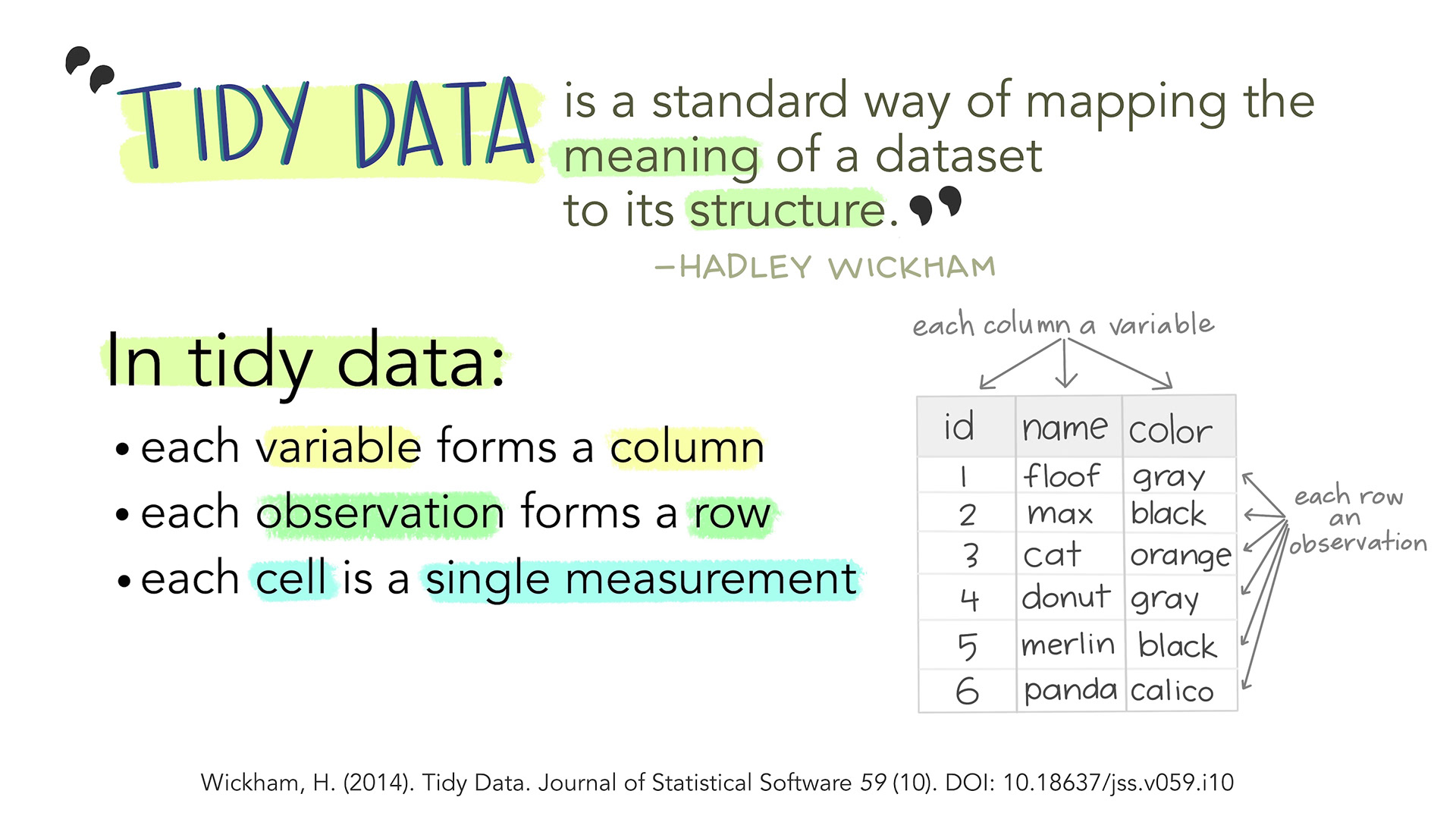
Artwork by Allison Horst
Same Data, Different Formats
Different formats of the data are tidy in different ways.
Connection to ggplot
Let’s make a plot of each team’s statistics!
Code
ggplot(data = bb_wide,
       mapping = aes(x = Team)
       ) +
  geom_point(mapping = aes(y = Points,
                           color = "Points"),
             size = 4) +
  geom_point(mapping = aes(y = Assists,
                           color = "Assists"),
             size = 4) +
  geom_point(mapping = aes(y = Rebounds,
                           color = "Rebounds"),
             size = 4) +
  scale_colour_manual(
    values = c("darkred", "steelblue", "forestgreen")
  ) +
labs(color = "Statistic")Tidy Data
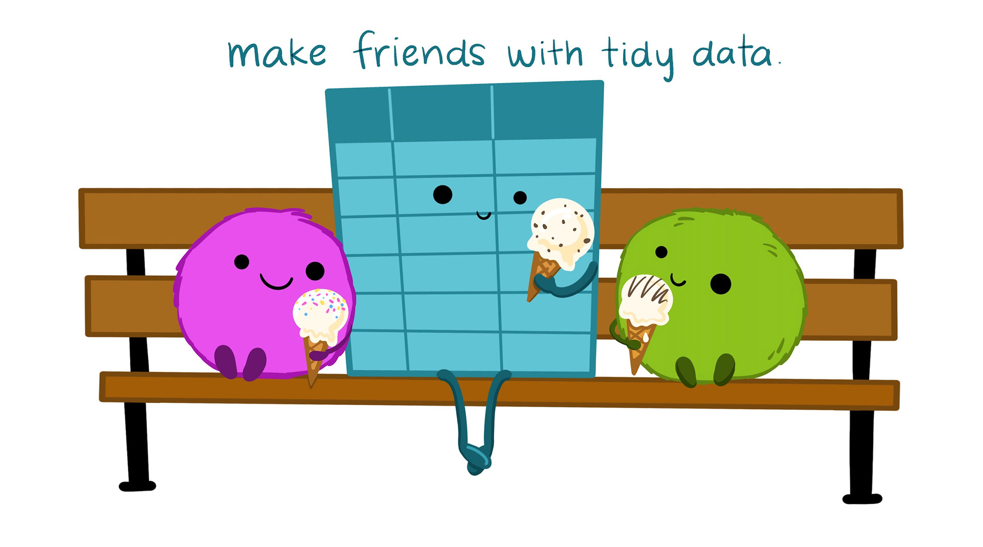
Artwork by Allison Horst
Working with External Data
Common Types of Data Files
Look at the file extension for the type of data file.
.csv : “comma-separated values”
Name, Age
Bob, 49
Joe, 40.xls, .xlsx: Microsoft Excel spreadsheet
- Common approach: save as
.csv - Nicer approach: use the
readxlpackage
.txt: plain text
- Could have any sort of delimiter…
- Need to let R know what to look for!
Common Types of Data Files
Loading External Data
Using base R functions:
read.csv()is for reading in.csvfiles.read.table()andread.delim()are for any data with “columns” (you specify the separator).
Loading External Data
The tidyverse has some cleaned-up versions in the readr and readxl packages:
read_csv()is for comma-separated data.read_tsv()is for tab-separated data.read_table()is for white-space-separated data.read_delim()is any data with “columns” (you specify the separator). The above are special cases.read_xls()andread_xlsx()are specifically for dealing with Excel files.
Remember to load the readr and readxl packages first!
What’s the difference?

Graphics
Graphics
Structure: boxplot, scatterplot, etc.
Aesthetics: features such as color, shape, and size that map other variables to structural features.
Both the structure and aesthetics should help viewers interpret the information.
Pre-attentive Features
Pre-attentive Features
The next slide will have one point that is not like the others.
Raise your hand when you notice it.
Pre-attentive Features
Pre-attentive Features
Pre-attentive Features
features that we see and perceive before we even think about it
They will jump out at us in less than 250 ms.
E.g., color, form, movement, spatial location.
There is a hierarchy of features:
- Color is stronger than shape.
- Combinations of pre-attentive features may not be pre-attentive due to interference.
Gestalt Principles
| Gestalt Hierarchy | Graphical Feature |
|---|---|
| 1. Enclosure | Facets |
| 2. Connection | Lines |
| 3. Proximity | White Space |
| 4. Similarity | Color/Shape |
Implications for practice:
- Know that we perceive some groups before others.
- Design to facilitate and emphasize the most important comparisons.
Double Encoding
No Double Encoding
Color
Color
- Color, hue, and intensity are pre-attentive features, and bigger contrasts lead to faster detection.
- Hue: main color family (red, orange, yellow…)
- Intensity: amount of color
Color Guidelines
Do not use rainbow color gradients!
Be conscious of what certain colors “mean”.
- Good idea to use red for “good” and green for “bad”?
Color Guidelines
For categorical data, try not to use more than 7 colors:
If you need to, you can use colorRampPalette() from the RColorBrewer package to produce larger palettes:
Color Guidelines
- For quantitative data, use mappings from data to color that are numerically and perceptually uniform.
- Relative discriminability of two colors should be proportional to the difference between the corresponding data values.
Color Guidelines
To make your graphic color deficiency friendly…
- use double encoding - when you use color, also use another aesthetic (line type, shape, facet, etc.).
Color Guidelines
To make your graphic color deficiency friendly…
- with a unidirectional scale (e.g., all + values), use a monochromatic color gradient.
- with a bidirectional scale (e.g., + and - values), use a purple-white-orange color gradient. Transition through white!
Color Guidelines
To make your graphic color deficiency friendly…
- print your chart out in black and white – if you can still read it, it will be safe for all users.
Color in ggplot2
There are several packages with color scheme options:
- Rcolorbrewer
- ggsci
- viridis
- wesanderson
These packages have color palettes that are aesthetically pleasing and, in many cases, color deficiency friendly.
You can also take a look at other ways to find nice color palettes.
Lab 2: Exploring Rodents with ggplot2 & Challenge 2: Spicing things up with ggplot2
Peer Code Review
Starting with Lab 2, your labs will have an appearance / code format portion.
Review the code formatting guidelines before you submit your lab!
Each week, you will be assigned one of your peer’s labs to review their code formatting.
On the Use of External Resources…
Part of learning to program is learning from a variety of resources. Thus, I expect you will use resources that you find on the internet.
In this class the assumed knowledge is the course materials, including the course textbook, coursework pages, and course slides. Any functions / code used outside of these materials require direct references.
- If you used Google:
- paste the link to the resource in a code comment next to where you used that resource
- If you used ChatGPT:
- indicate somewhere in the problem that you used ChatGPT
- paste the link to your chat (using the Share button from ChatGPT)
Things You Should Know About ChatGPT…
- GPT uses machine learning to predict what words to give you
- This method is entirely probabilistic, meaning, the same question may produce different answers for different people.
- The answers GPT gives rely a lot on the context you provide (or don’t provide)
- It is good to give lots of background information (e.g., what R package you are using)
- ChatGPT is a pretty decent tutor.
- Did you use GPT to help you with some code?
- Do you not understand what the code is doing?
- Ask GPT to explain code to you!
Nicely Formatted Code
ggplot Code
It is good practice to put each geom and aes on a new line.
- This makes code easier to read!
- Generally: no line of code should be over 80 characters long.
To do…
- Lab 2: Exploring rodents with ggplot2
- due Sunday, October 6 at 11:59pm
- Lab 2: Spicing things up with ggplot2
- due Sunday, October 6 at 11:59pm
- Complete Week 3 Coursework: Data Wrangling with dplyr
- Check-ins 3.1 and 3.2 due Tuesday, October 8 at 12pm
:::
Faceting
Extracts subsets of data and places them in side-by-side plots.
Faceting
facet_wrap(~ b): facets by one variablenrowcontrols the number of rows the facets are output intoncolcontrols the number of columns the facets are output into
facet_grid(a ~ b): facet by two variables- variable
awill be assigned to the rows - variable
bwill be assigned to the columns into both rows and columns
- variable