ggplot(
  data = <DATA>,
  mapping = aes(<MAPPINGS>)
  ) +
  <GEOM FUNCTION>() +
any other arguments...Basics of Graphics
Tuesday, October 1
Today we will…
- Accessing Practice Activities
- New Material
- Tidy Data
- Load External Data
- Graphics (and
ggplot2)
- PA 2: Using Data Visualization to Find the Penguins
- Peer Programming
Accessing Practice Activities
We are using Posit Cloud for collaborative coding, so you and your partner can type in the same document at the same time.
Take 3-minutes to:
- Open the email you were sent (from me and / or Posit Cloud)
- Click on the link to join your workspace
- Log-in to Posit Cloud
Grammar of Graphics
Grammar of Graphics
The Grammar of Graphics (GoG) is a principled way of specifying exactly how to create a particular graph from a given data set. It helps us to systematically design new graphs.
Think of a graph or a data visualization as a mapping…
…FROM variables in the data set (or statistics computed from the data)…
…TO visual attributes (or “aesthetics”) of marks (or “geometric elements”) on the page/screen.
Why GoG?
- It’s more flexible than a “chart zoo” of named graphs.
- The software understands the structure of your graph.
- It easily automates graphing of data subsets.
Components of GoG
data: dataframe containing variablesaes: aesthetic mappings (position, color, symbol, …)geom: geometric element (point, line, bar, box, …)stat: statistical variable transformation (identity, count, linear model, quantile, …)scale: scale transformation (log scale, color mapping, axes tick breaks, …)coord: Cartesian, polar, map projection, …facet: divide into subplots using a categorical variable
Using ggplot2
How to Build a Graphic
Complete this template to build a basic graphic:
Notice, every + adds another layer to our graphic.
Also notice that I’m using named arguments to make my code easier to read.
Aesthetics
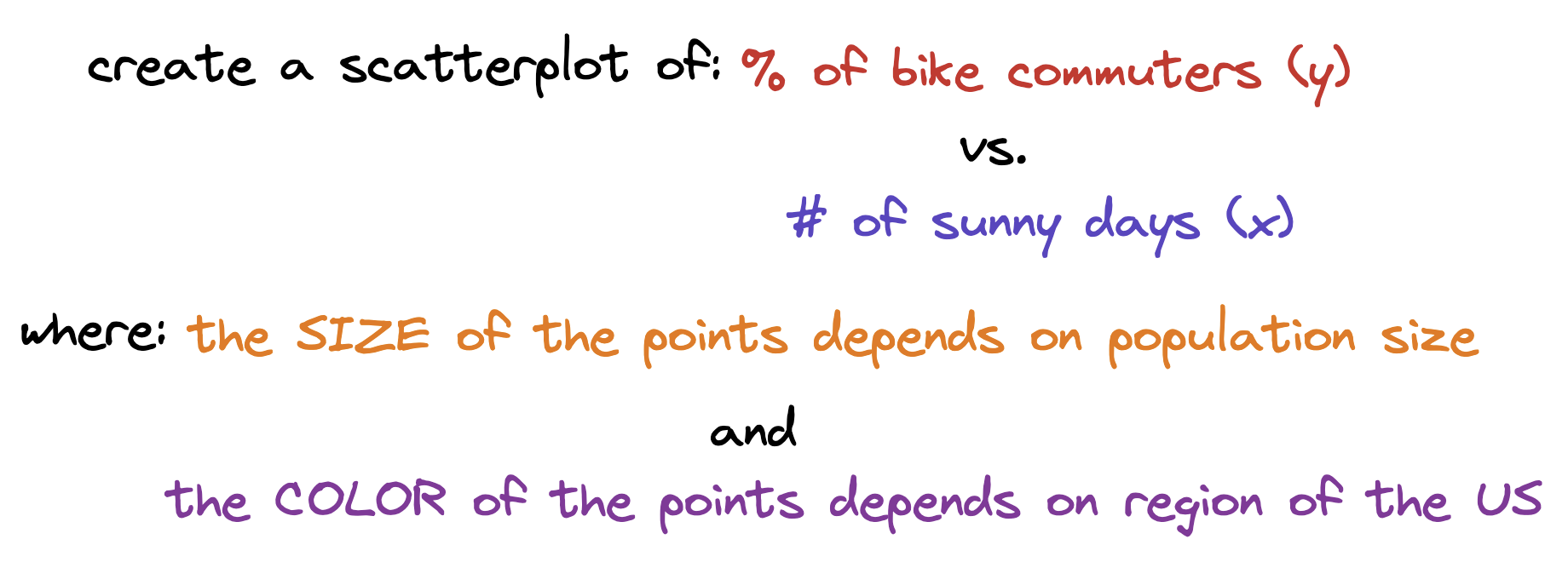
We map variables (columns) from the data to aesthetics on the graphic using the aes() function.
What aesthetics can we set (see ggplot2 cheat sheet for more)?
- x, y
- color, fill
- linetype
- size
- shape
Aesthetics
We map variables (columns) from the data to aesthetics on the graphic using the aes() function.
What aesthetics can we set (see ggplot2 cheat sheet for more)?
- x, y
- color, fill
- linetype
- size
- shape
Special Properties of Aesthetics
Special Properties of Aesthetics
Geometric Objects
Wee use a geom_XXX() function to represent data points.
one variable
geom_density()geom_dotplot()geom_histogram()geom_boxplot()
two variable
geom_point()geom_line()geom_density_2d()
three variable
geom_contour()geom_raster()
This is not an exhaustive list – see ggplot2 cheat sheet.
Creating a Graphic
To create a specific type of graphic, we will combine aesthetics and geometric objects.
Let’s try it!
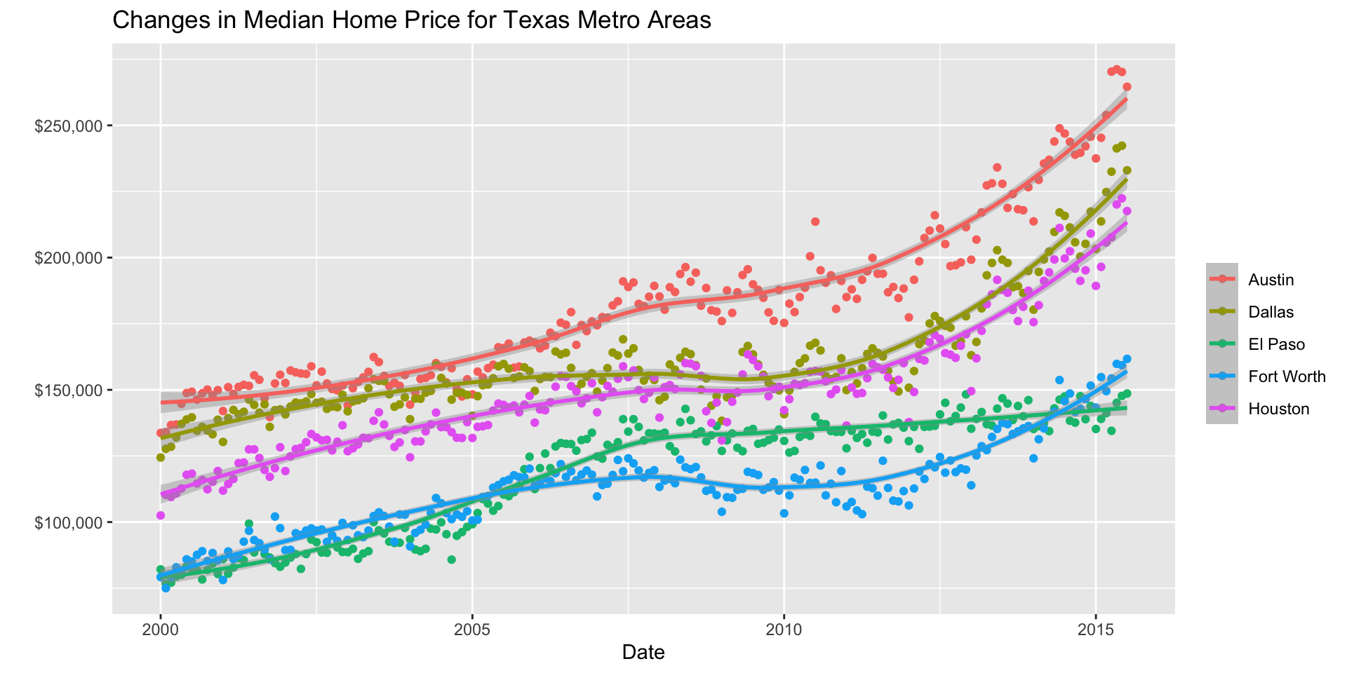
Start with the TX housing data.

Make a plot of median house price over time (including both individual data points and a smoothed trend line), distinguishing between different cities .

Faceting
Extracts subsets of data and places them in side-by-side plots.

Faceting
facet_wrap(~ b): facets by one variablenrowcontrols the number of rows the facets are output intoncolcontrols the number of columns the facets are output into
facet_grid(a ~ b): facet by two variables- variable
awill be assigned to the rows - variable
bwill be assigned to the columns into both rows and columns
- variable
You can set scales to let axis limits vary across facets:
facet_grid(y ~ x, scales = ______)
"free"– both x- and y-axis limits adjust to individual facets"free_x"– only x-axis limits adjust"free_y"– only y-axis limits adjust
Statistical Transformation: stat
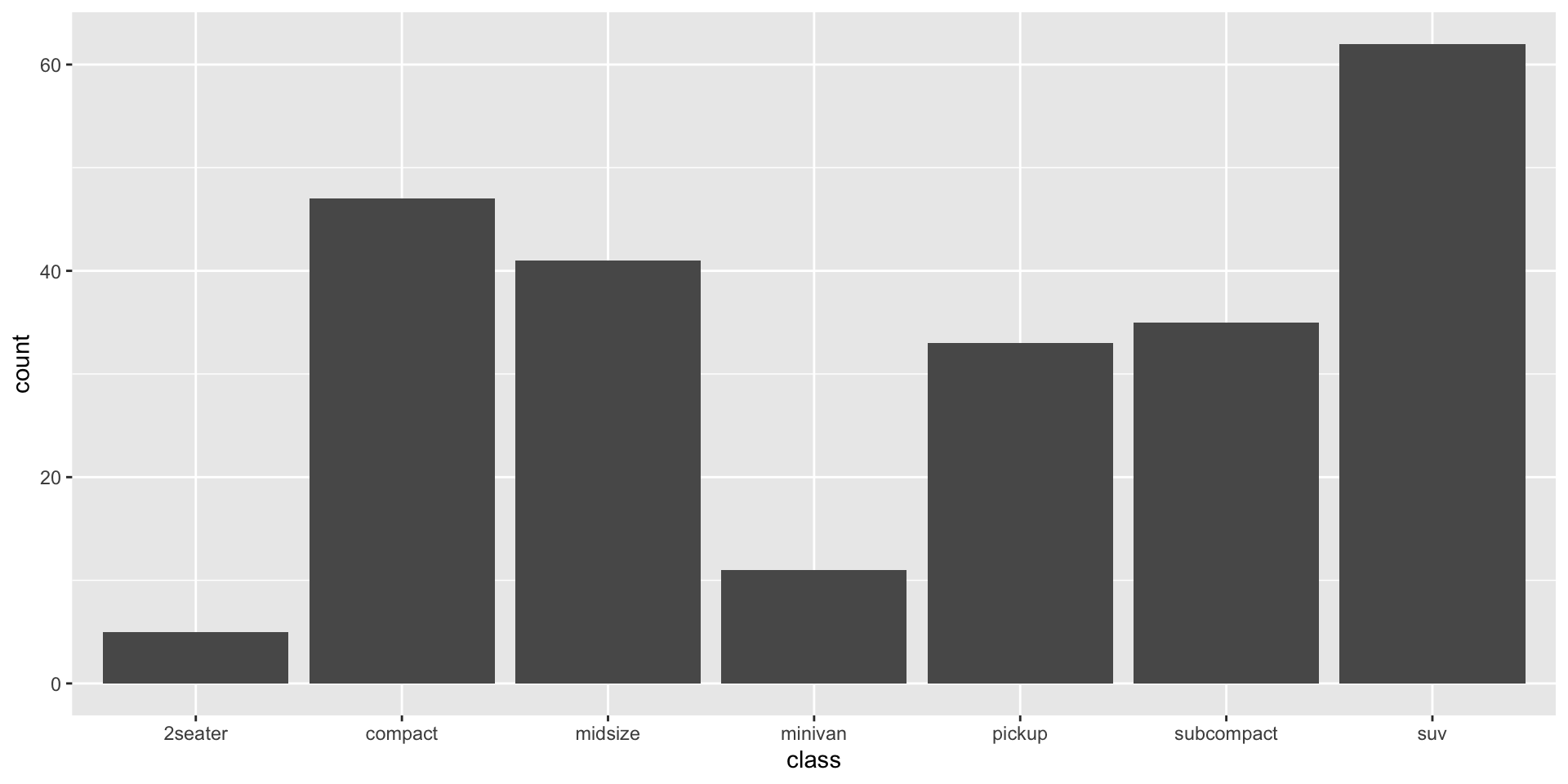
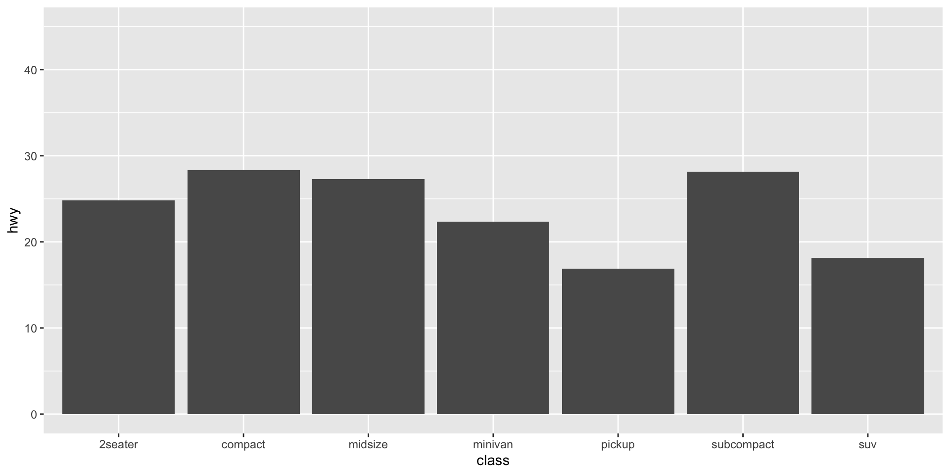
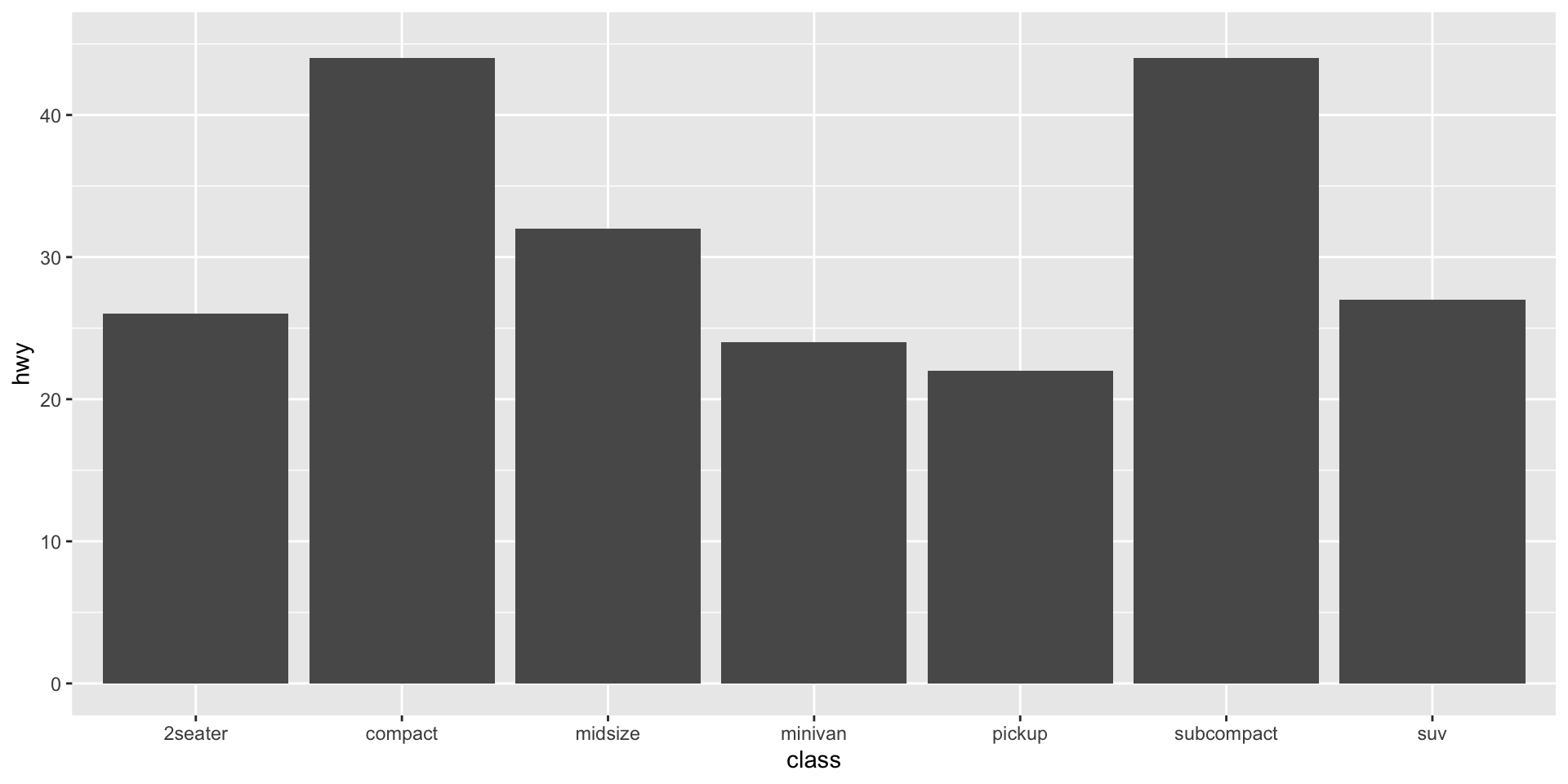
A stat transforms an existing variable into a new variable to plot.
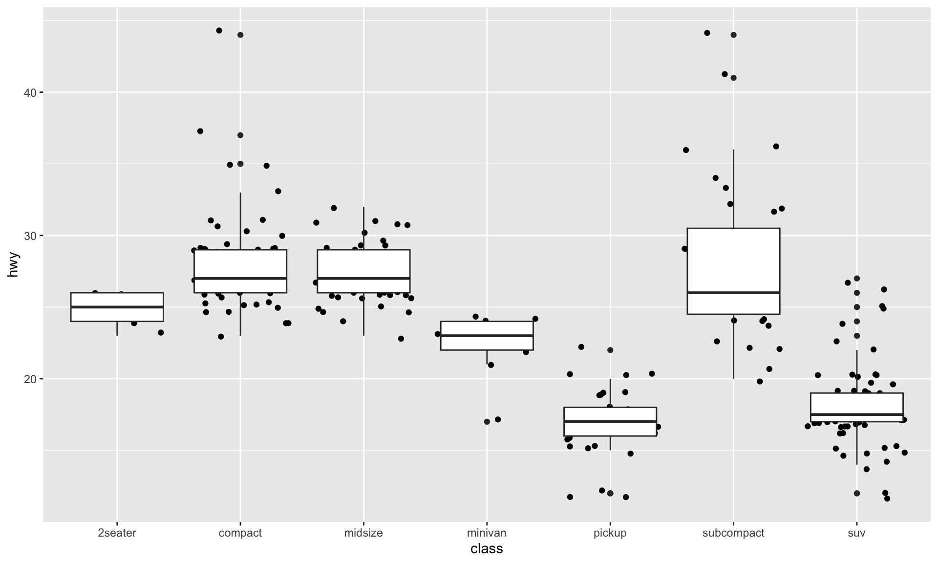
identityleaves the data as is.countcounts the number of observations.summaryallows you to specify a desired transformation function.
Sometimes these statistical transformations happen under the hood when we use a specific geom_XXX().
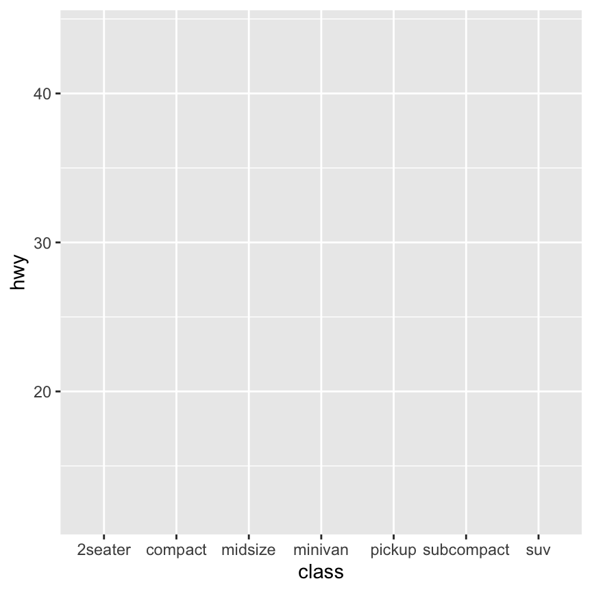
Statistical Transformation: stat
Position Adjustements
Position adjustments determine how to arrange geom’s that would otherwise occupy the same space.
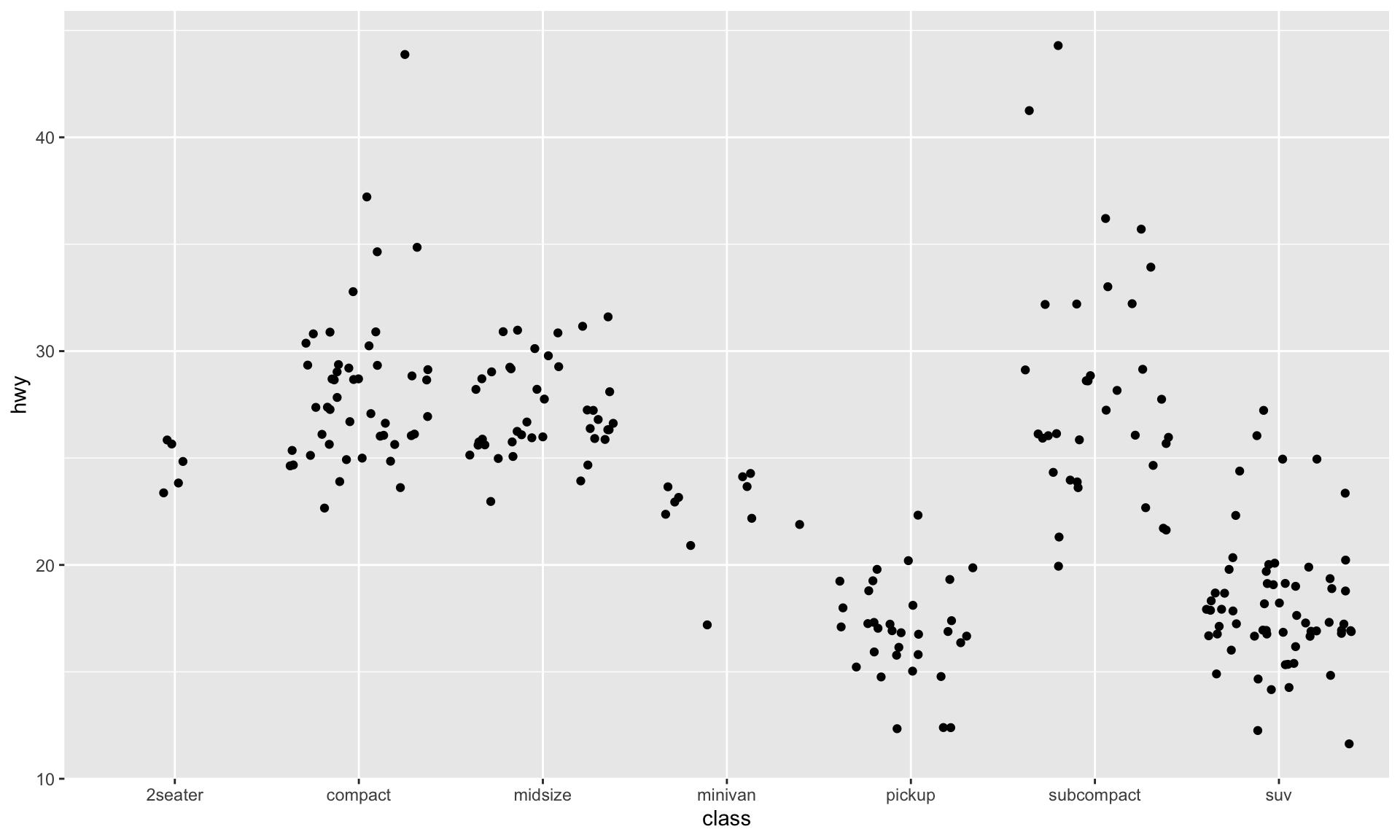
position = "dodge": Arrange elements side by side.position = "fill": Stack elements on top of one another + normalize height.position = "stack": Stack elements on top of one another.position = "jitter": Add random noise tox&yposition of each element to avoid overplotting (seegeom_jitter()).
Position Adjustements

Plot Customizations
Code
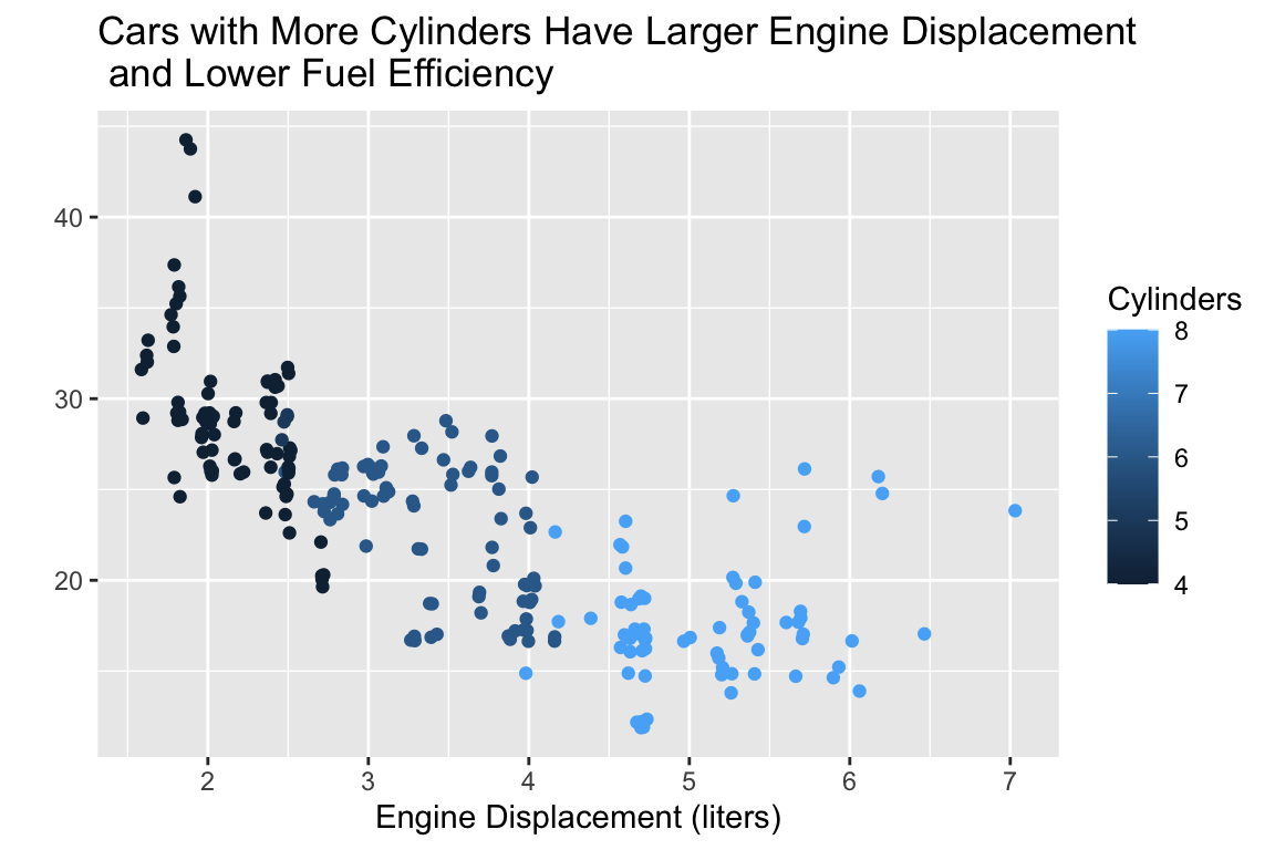
ggplot(data = mpg,
       mapping = aes(x = displ, y = hwy, color = cyl)
       ) +
  geom_jitter() +
  labs(x = "Engine Displacement (liters)",
       y = " ",
       color = "Cylinders",
title = "Cars with More Cylinders Have Larger Engine Displacement\n and Lower Fuel Efficiency") +
theme_bw() +
theme(legend.position = "bottom")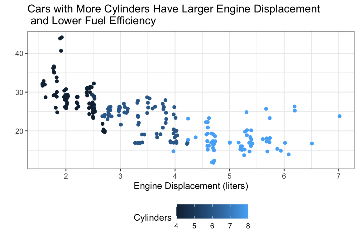
Code
ggplot(data = mpg,
       mapping = aes(x = displ, y = hwy, color = cyl)
       ) +
  geom_jitter() +
  labs(x = "Engine Displacement (liters)",
       y = " ",
       color = "Cylinders",
       title = "Cars with More Cylinders Have Larger Engine Displacement\n and Lower Fuel Efficiency") +
  scale_y_continuous(limits = c(0, 50),
                     breaks = seq(from = 0, to = 50, by = 5)
                     )
Code
ggplot(data = mpg,
       mapping = aes(x = displ, y = hwy, color = cyl)
       ) +
  geom_jitter() +
  labs(x = "Engine Displacement (liters)",
       y = " ",
       color = "Cylinders",
       title = "Cars with More Cylinders Have Larger Engine Displacement\n and Lower Fuel Efficiency") +
  scale_color_gradient(low = "white", high = "green4")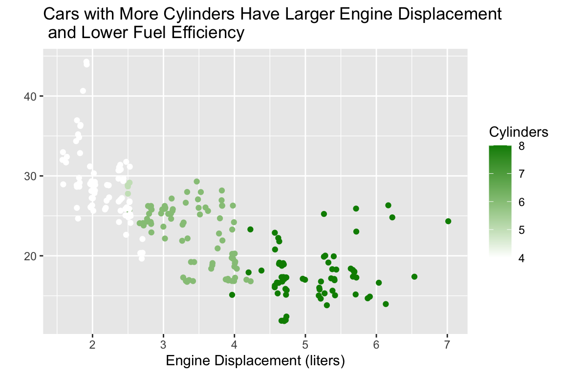
Nicely Formatted Code
ggplot Code
It is good practice to put each geom and aes on a new line.
- This makes code easier to read!
- Generally: no line of code should be over 80 characters long.
Let’s Make Some Visualizations!
PA 2: Using Data Visualization to Find the Penguins
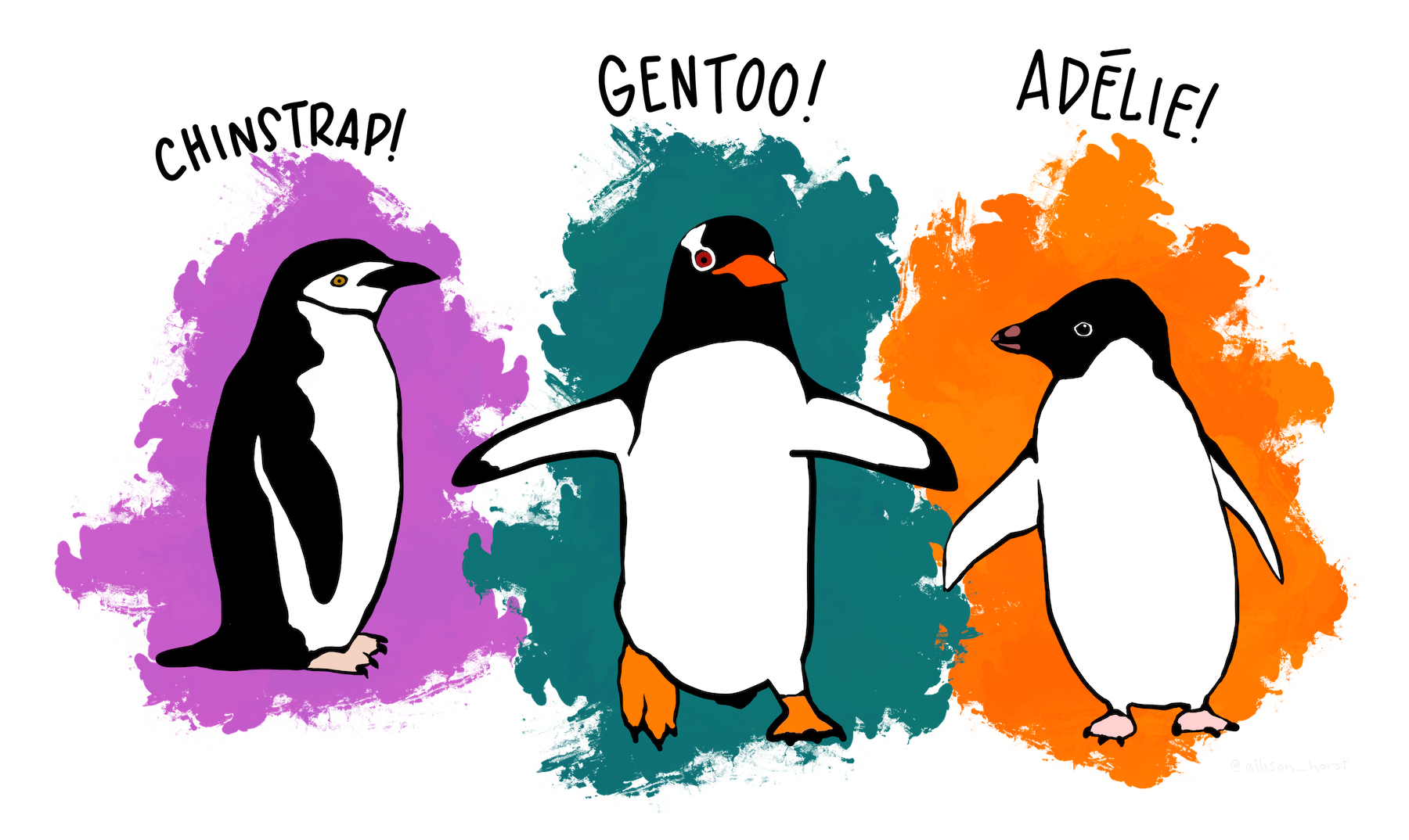
Artwork by Allison Horst
Using Data Visualization to Find the Penguins
This puzzle activity will require knowledge of:
- installing and loading packages in R
- formatting code chunks in Quarto
- interpreting the context of a dataset
- data types / variable types
- different types of visualizations
- what visualization(s) go with different data types
- how to make visualizations with ggplot2
- choosing between different aesthetic options
None of us have all these abilities. Each of us has some of these abilities.
Pair Programming Expectations
During your collaboration, you and your partner will alternate between two roles:
Developer
- Reads prompt and ensures Coder understands what is being asked.
- Types the code specified by the Coder into the Quarto document.
- Runs the code provided by the Coder.
- Works with Coder to debug the code.
- Evaluates the output.
- Works with Coder to write code comments.
Coder
- Reads out instructions or prompts
- Directs the Developer what to type.
- Talks with Developer about their ideas.
- Manages resources (e.g., cheatsheets, textbook).
- Works with Developer to debug the code.
- Works with Developer to write code comments.
Group Norms
- Think and work together. Do not divide the work.
- You are smarter together.
- Be open minded.
- No cross-talk with other groups.
- Communicate with each other!
ggplot2 Resources
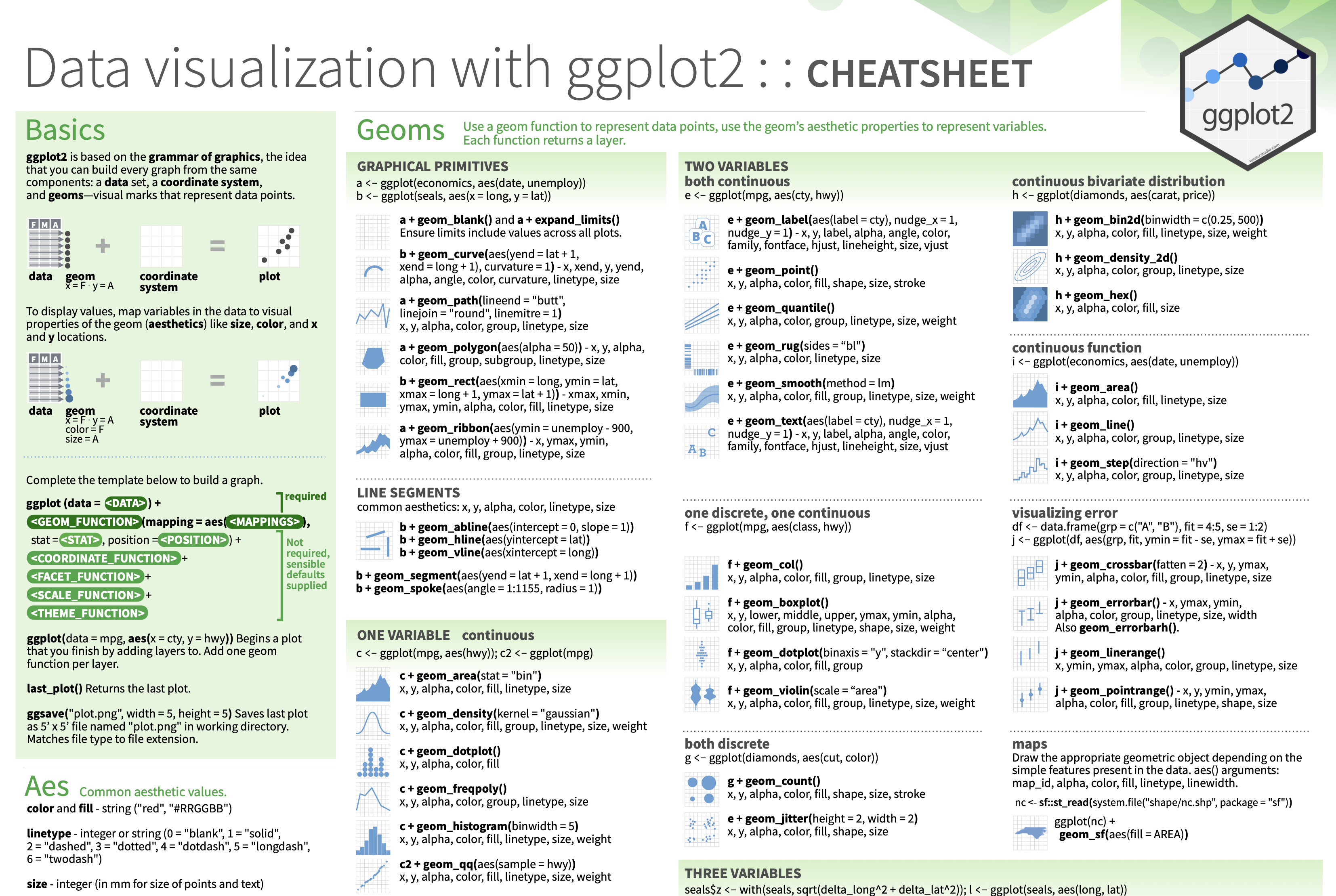
Every group should have a ggplot2 cheatsheet!
On the Front
- Column 1: the “template” for making a ggplot
- Column 3: creating plots for two continuous variables
- Column 4: creating plots for one discrete or one continuous variable
On the Back
- Column 4: adding facets and labels to your plot
- Column 3: adding themes to your plot (if you have extra time)
Opening the Practice Activity in Posit Cloud
The partner whose family name starts first alphabetically starts as the Developer!
Both of you need to do the following:
- Open the email you were sent (from me and / or Posit Cloud)
- Click on the link to join your workspace
- Log-in to Posit Cloud
- Open the PA 2: Using Data Visualization to Find the Penguins project
- Open the
PA2-ggplot.qmdfile - Get started!
Submission
When you have completed the visualization tasks, you will work as a group to answer the five questions posed at the end of the document.
Each person will input the answers to these questions in the PA2 Canvas quiz.
The person who last occupied the role of Developer will download and submit the
PA-2.htmlfile for the group.- Only one submission per group!

