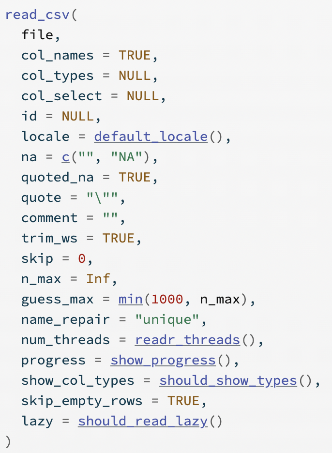
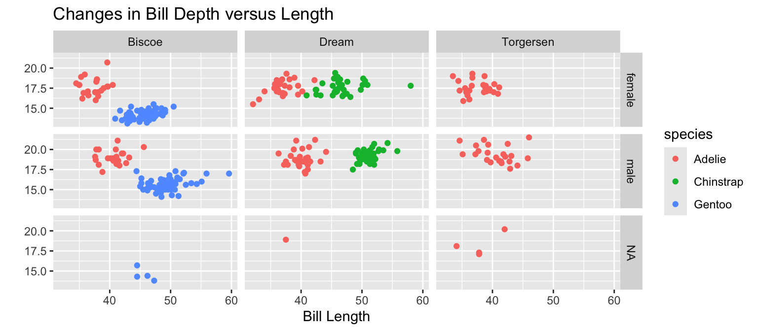
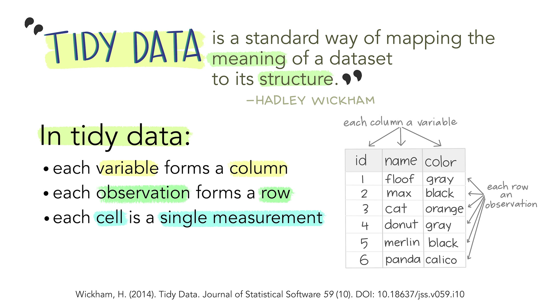
Code
Extracts subsets of data and places them in side-by-side plots.
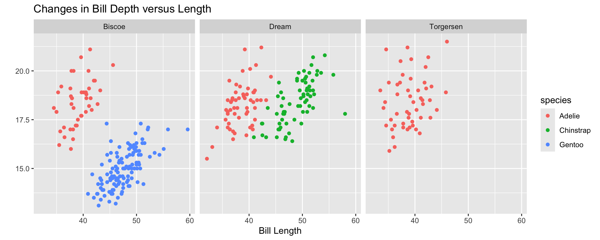
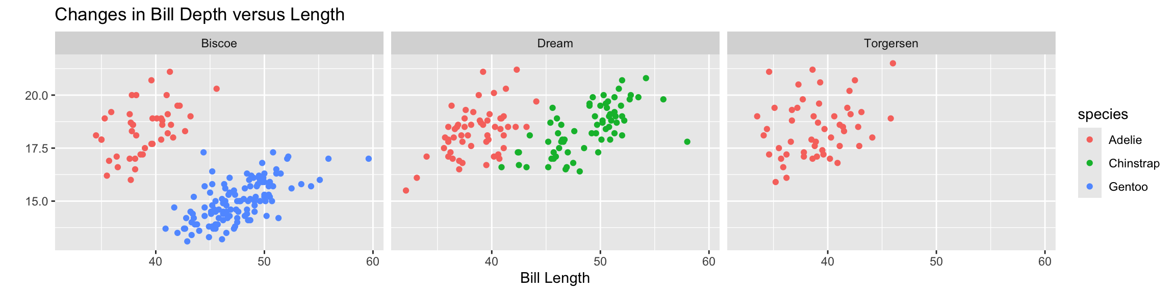
You can set scales to let axis limits vary across facets using the scales argument.
The x-axis limits adjust to individual facets.
"free_y" – only y-axis limits adjust to individual facets.
Artwork by Allison Horst

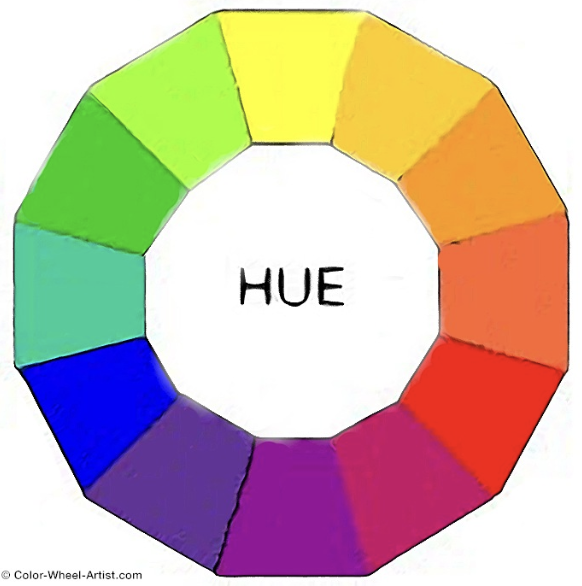

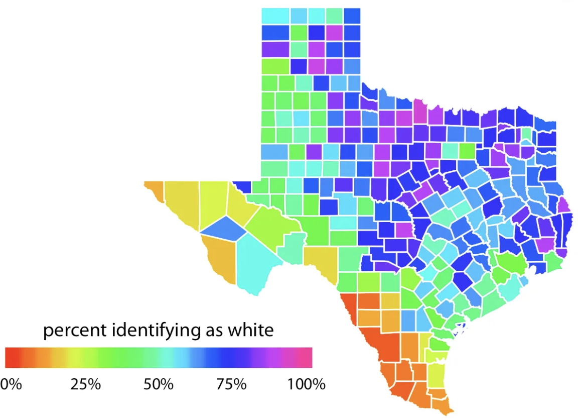
Do not use rainbow color gradients!
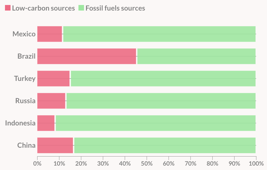
Be conscious of what certain colors “mean”.
For categorical data, try not to use more than 7 colors:

If you need to, you can use colorRampPalette() from the RColorBrewer package to produce larger palettes:

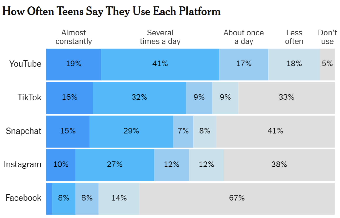
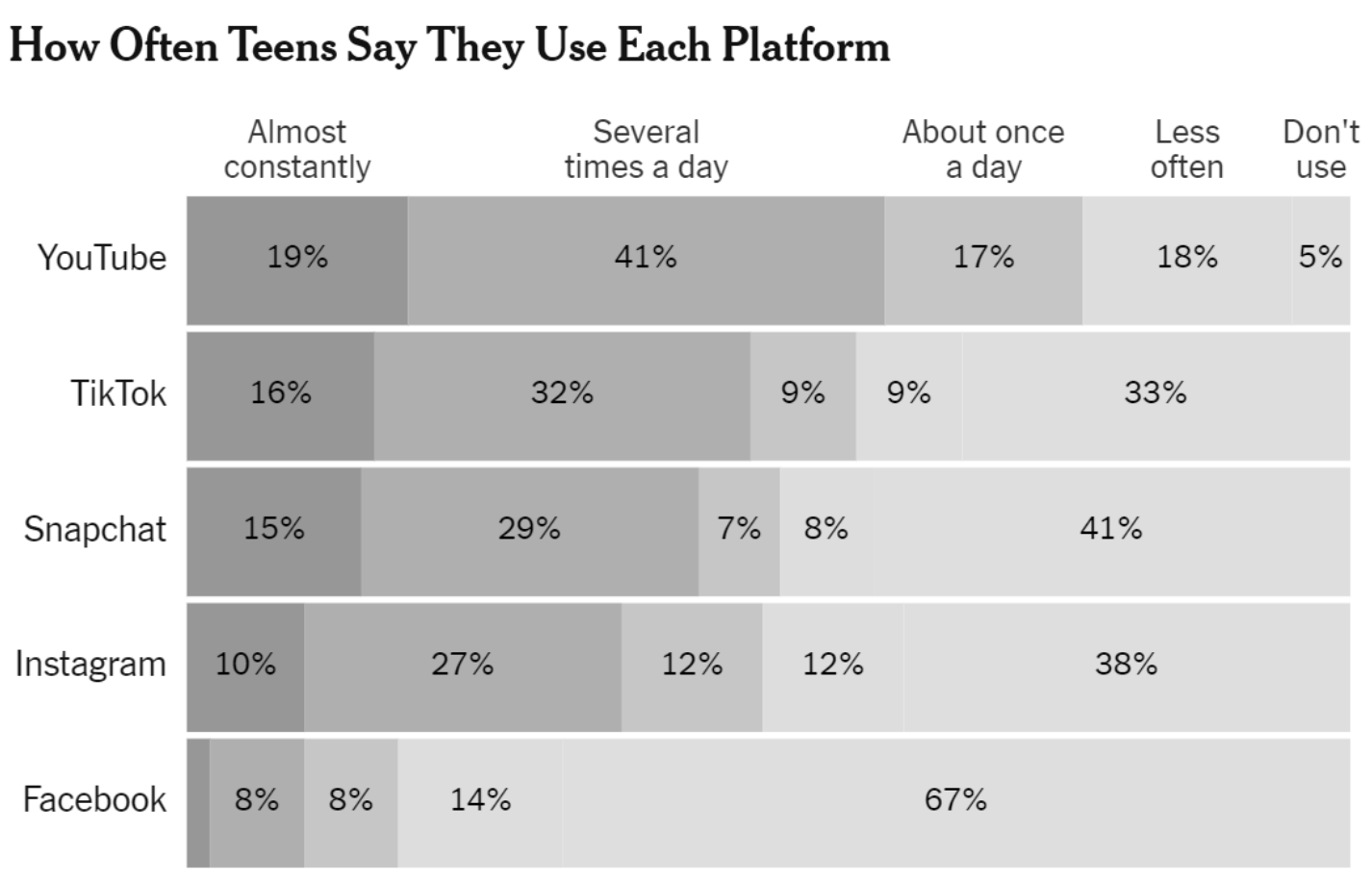
To make your graphic friendly for people with different color vision deficiencies…
To make your graphic friendly for people with different color vision deficiencies…


To make your graphic friendly for people with different color vision deficiencies…
custom_labels <- c(
Dream = "Dream Island",
Torgersen = "Torgersen Island",
Biscoe = "Biscoe Island"
)
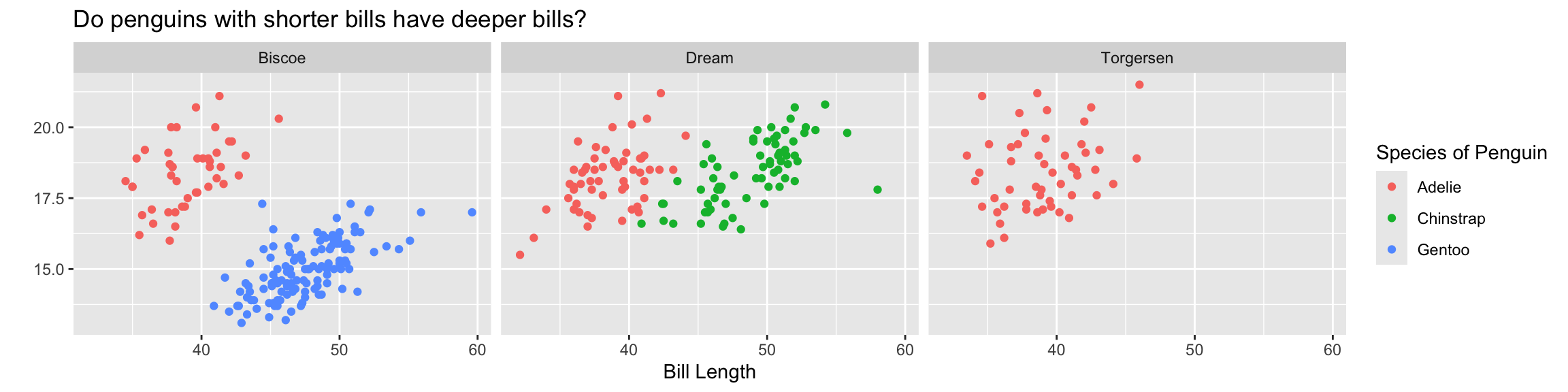
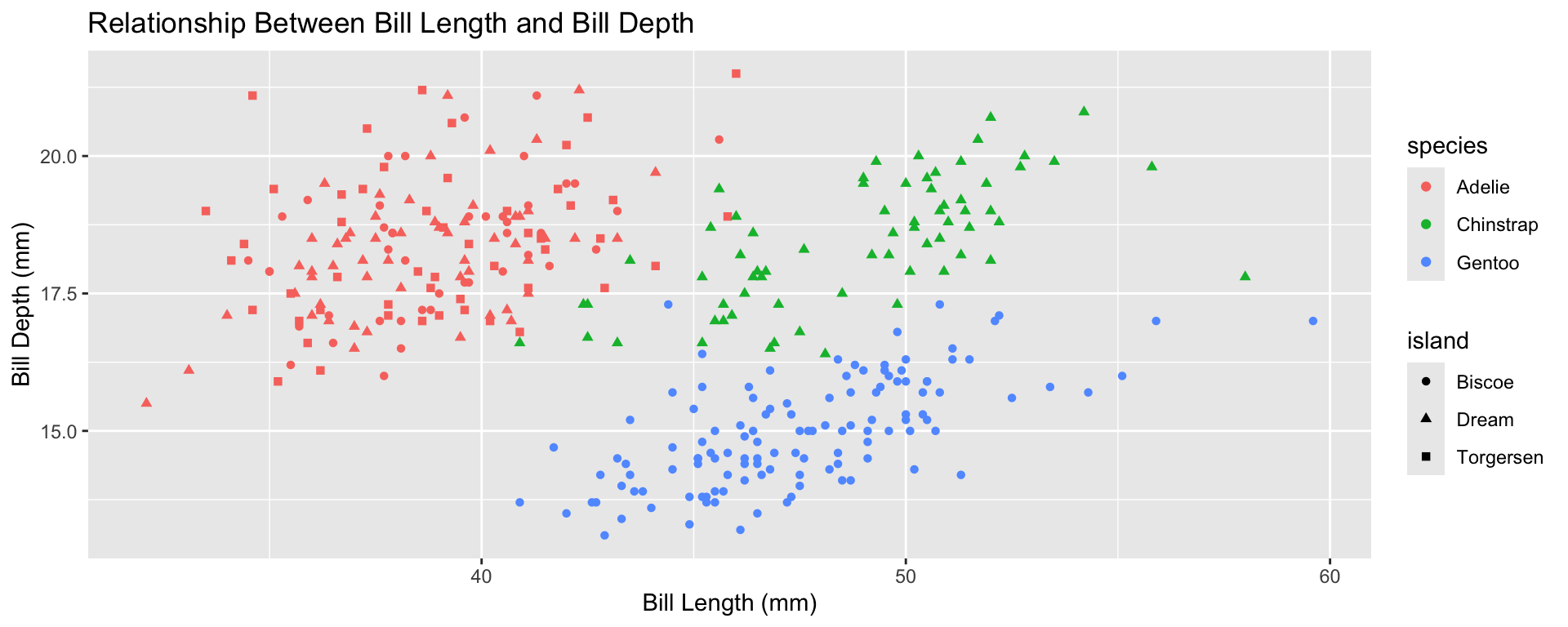
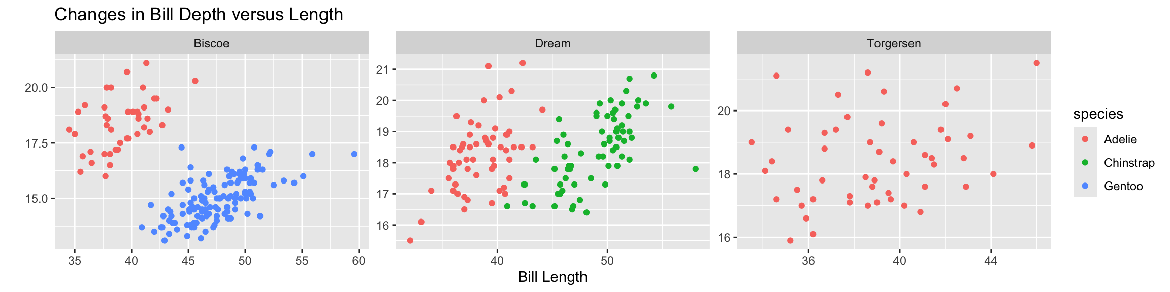
ggplot(data = penguins,
mapping = aes(x = bill_length_mm,
y = bill_depth_mm,
color = species)) +
geom_point() +
facet_wrap(~island, labeller = as_labeller(custom_labels)) +
labs(x = "Bill Length",
y = "",
color = "Species of Penguin",
title = "Do penguins with shorter bills have deeper bills?")
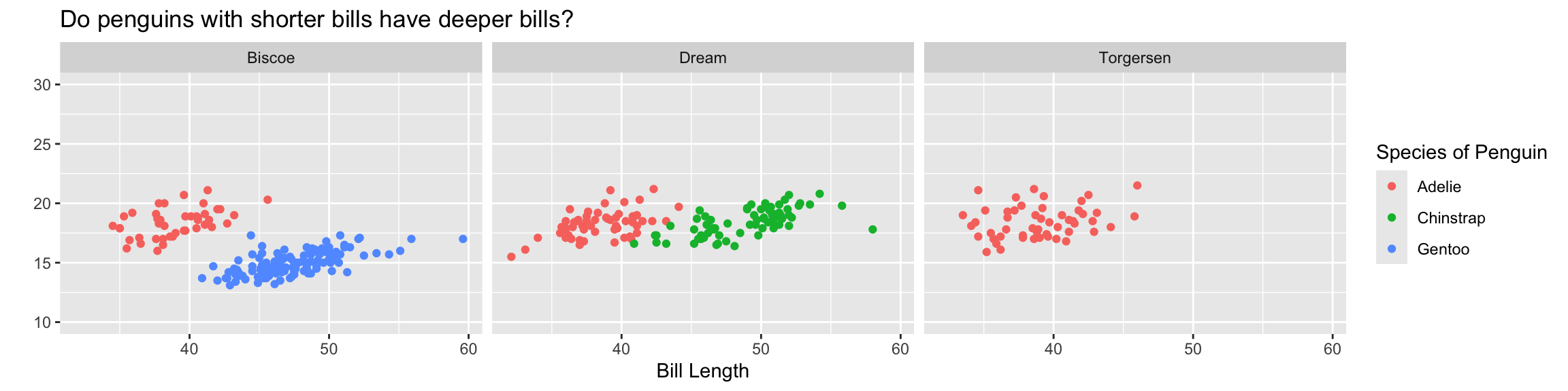
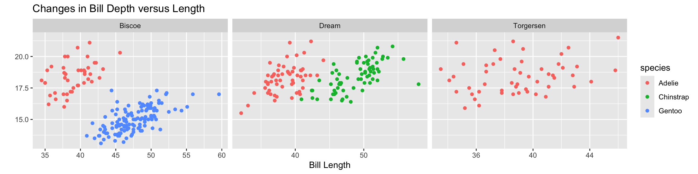
ggplot(data = penguins,
       mapping = aes(x = bill_length_mm,
                     y = bill_depth_mm,
                     color = species)) +
  geom_point() +
  facet_wrap(~island) +
  labs(x = "Bill Length",
       y = "",
       color = "Species of Penguin",
title = "Do penguins with shorter bills have deeper bills?") +
theme_bw() +
theme(legend.position = "top")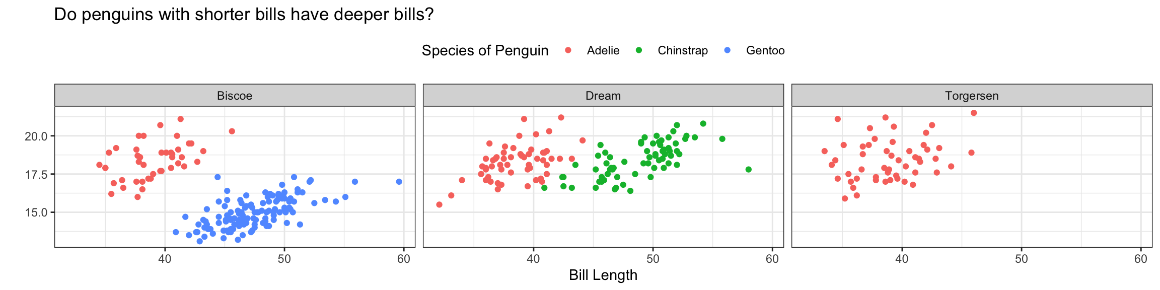
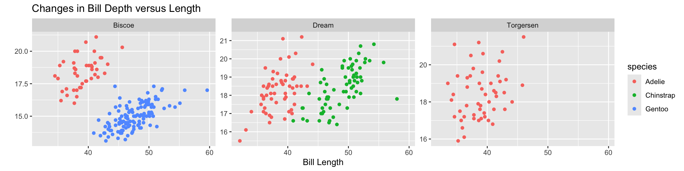
ggplot(data = penguins,
       mapping = aes(x = bill_length_mm,
                     y = bill_depth_mm,
                     color = species)) +
  geom_point() +
  facet_wrap(~island) +
  labs(x = "Bill Length",
       y = "",
       color = "Species of Penguin",
       title = "Do penguins with shorter bills have deeper bills?") +
  scale_y_continuous(limits = c(10, 30),
                     breaks = seq(from = 10, to = 30, by = 5)
                     )
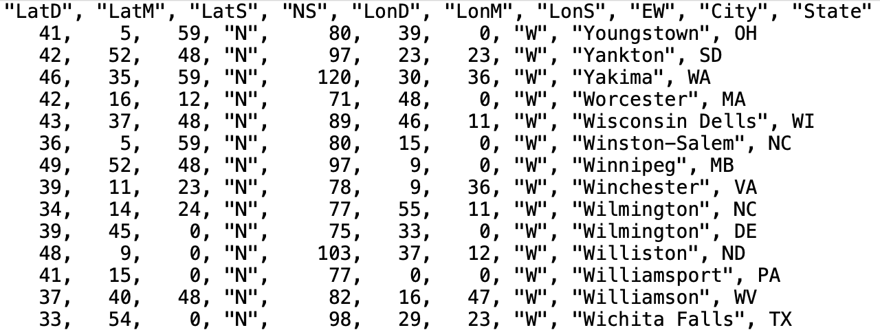 What is the delimiter for this file?
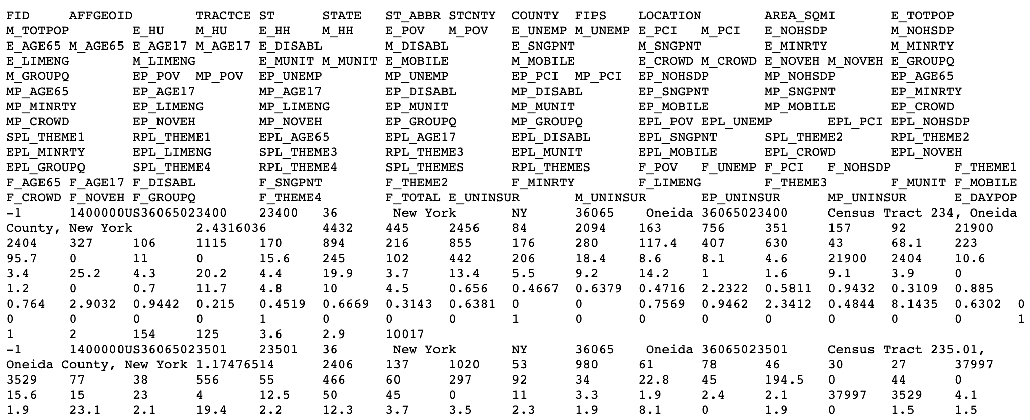 What is the delimiter for this file?
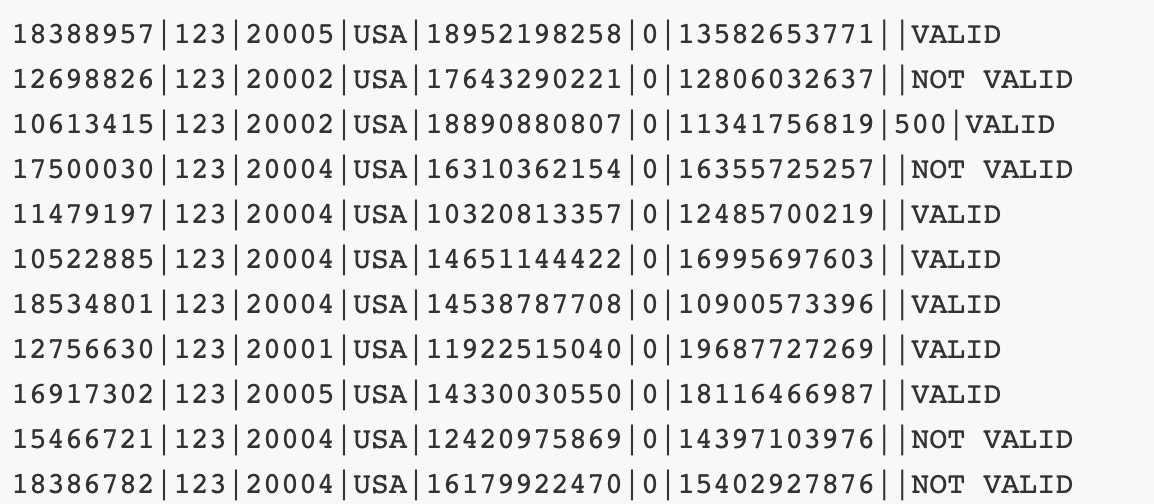 What is the delimiter for this file?