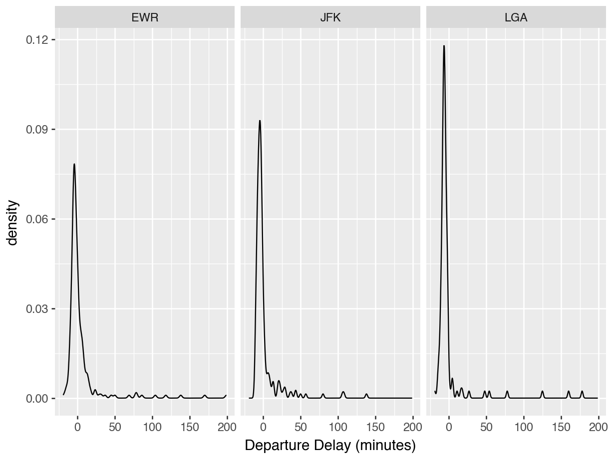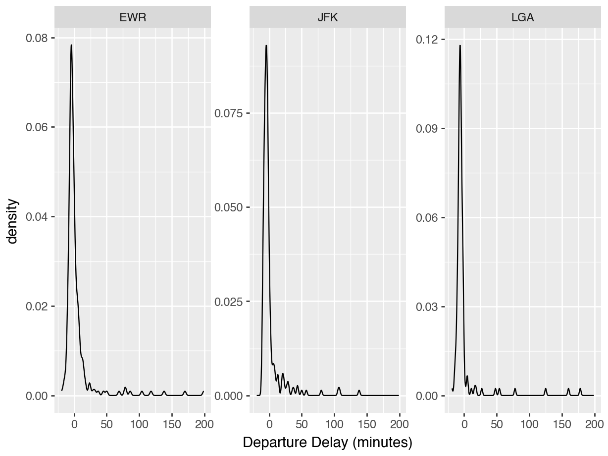
data_dir = "https://datasci112.stanford.edu/data/"
df = pd.read_csv(data_dir + "flights_nyc_20131116.csv")
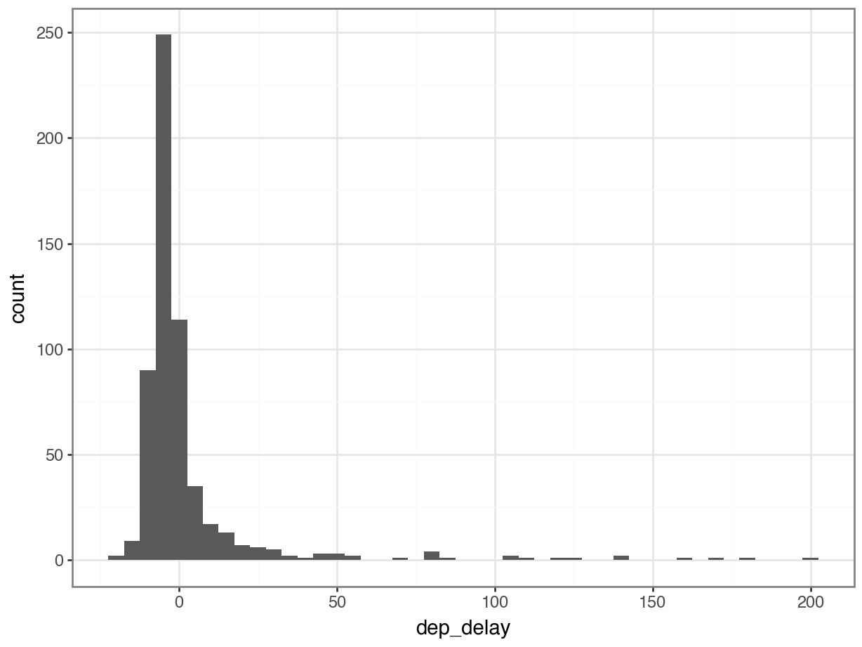
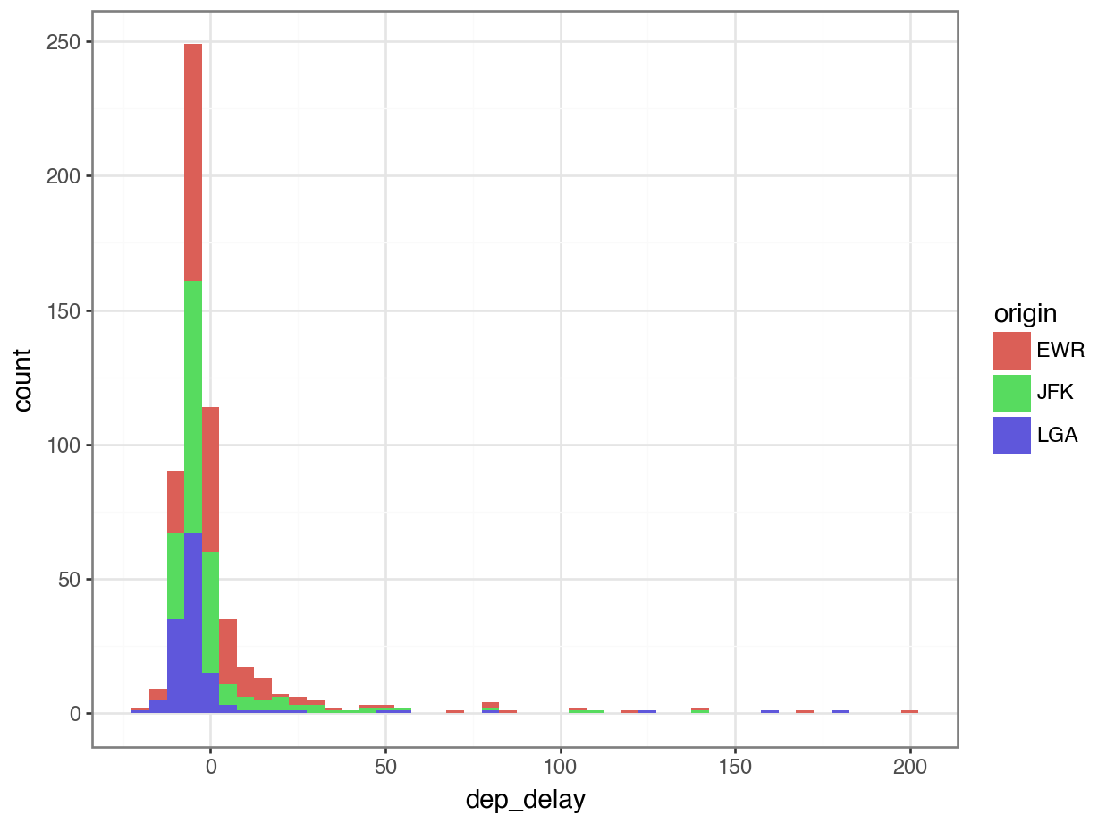
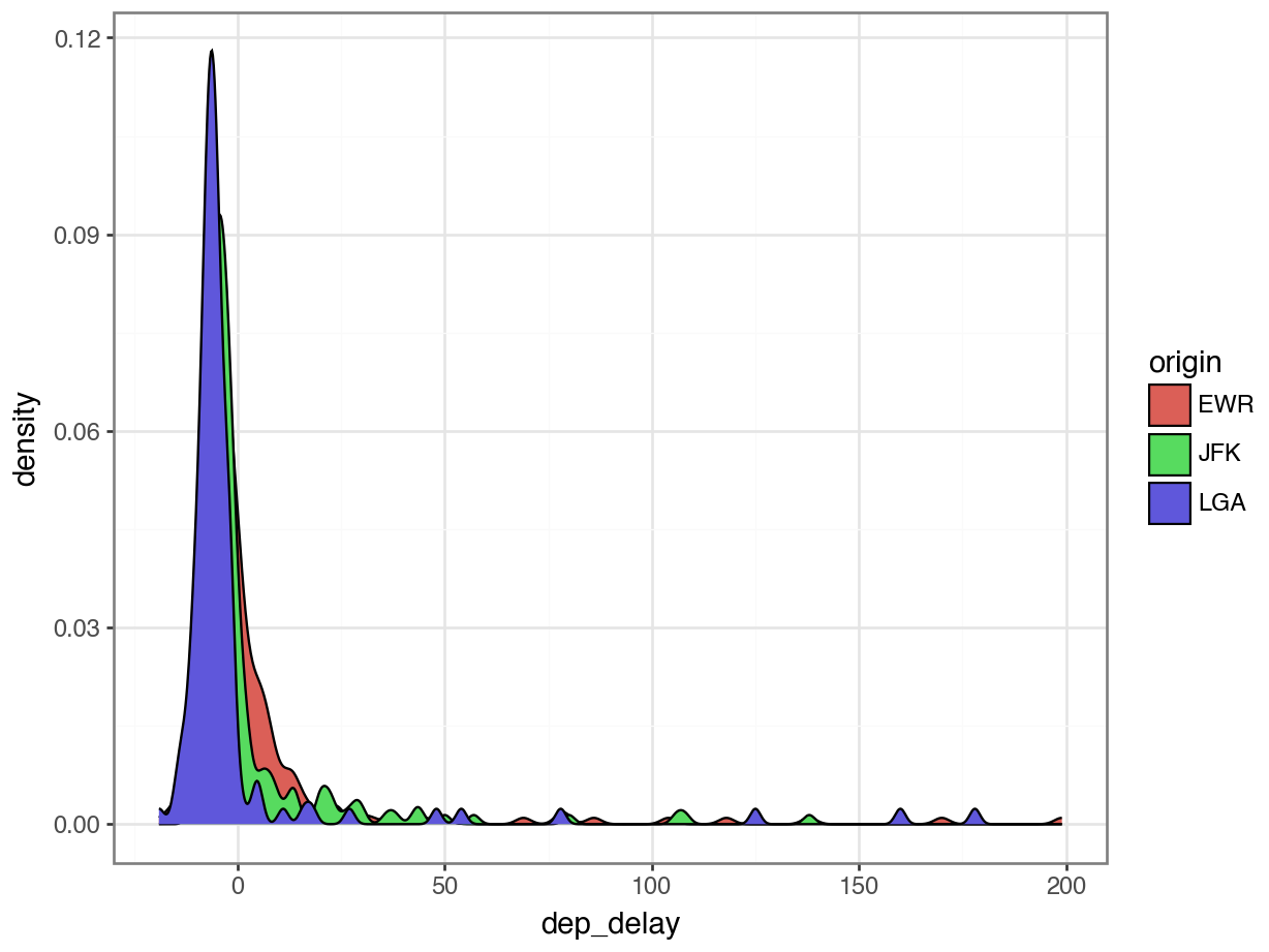
df carrier flight origin dest dep_delay
0 US 1895 EWR CLT -5.0
1 UA 1014 LGA IAH -3.0
2 AA 2243 JFK MIA 2.0
3 UA 303 JFK SFO -8.0
4 US 795 LGA PHL -8.0
.. ... ... ... ... ...
573 B6 745 JFK PSE -3.0
574 B6 839 JFK BQN 0.0
575 UA 360 EWR PBI NaN
576 US 1946 EWR CLT NaN
577 US 2142 LGA BOS NaN
[578 rows x 5 columns]