titanic = pd.read_csv("data/titanic.csv")

titanic["Pclass"] = titanic["Pclass"].astype("category")
titanic["Survived"] = titanic["Survived"].astype("category")Visualizing and Summarizing Quantitative Variables
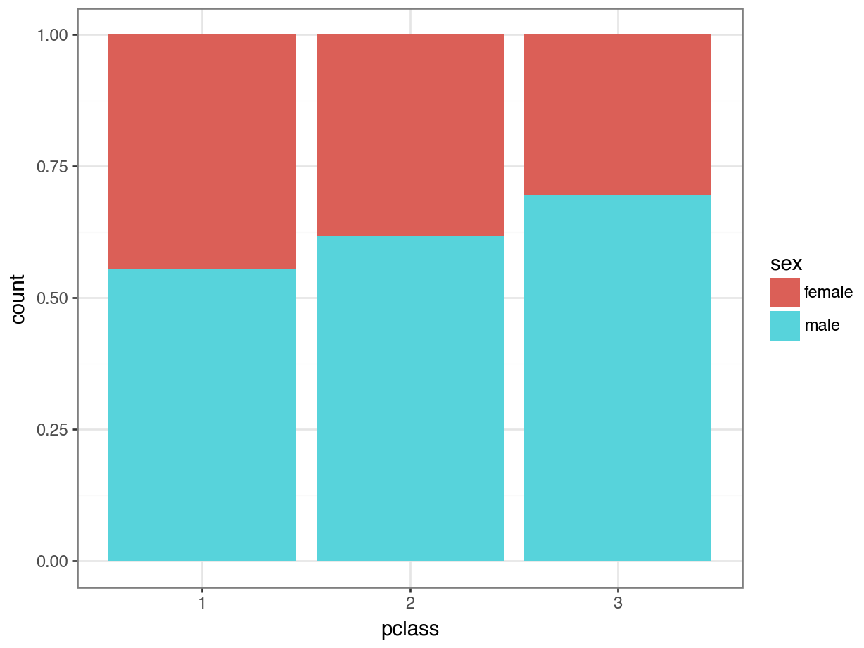
Visualizing with plotnine
(
  ggplot(data = titanic, aes(x = "Sex", fill = "Pclass")) +
  geom_bar(position = "fill") +
  theme_bw()
)
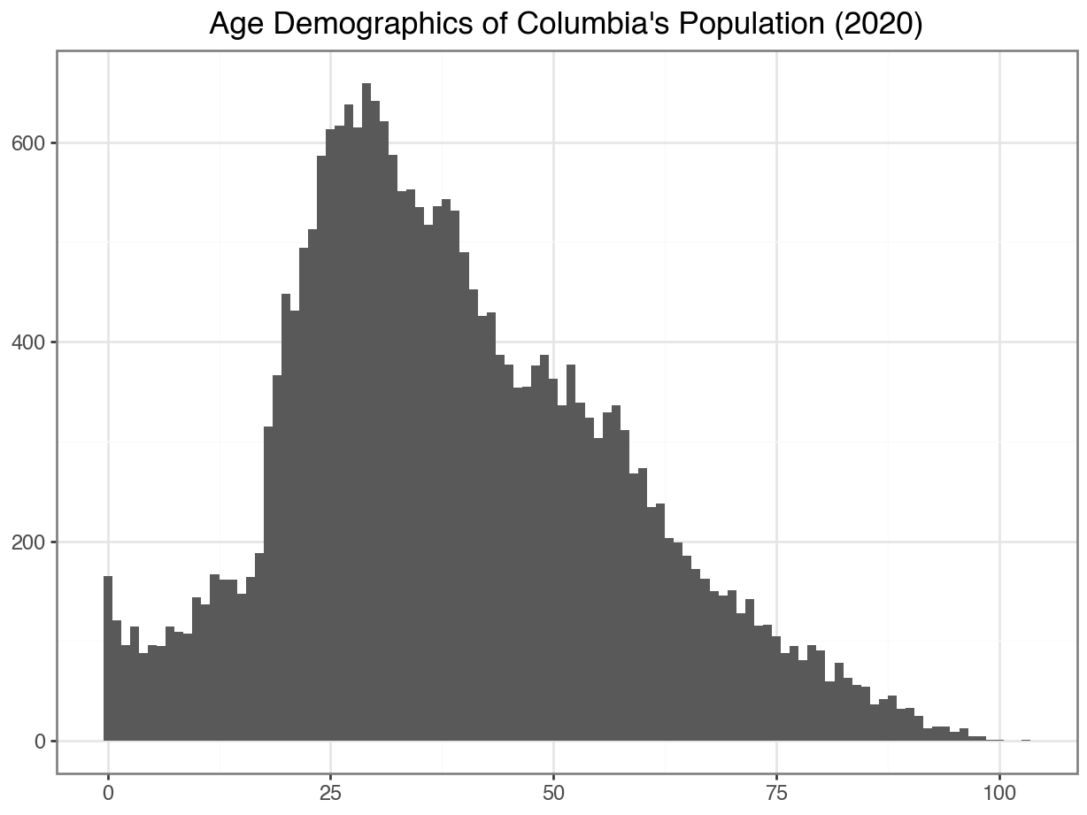
Option 1: Then make a barplot
Then, we could treat age as categorical and make a barplot:
Code
(
  ggplot(data = df_CO, mapping = aes(x = "age")) +
  geom_bar() +
  labs(x = "",
       y = "",
       title = "Age Demographics of Columbia's Population (2020)"
       ) +
  theme_bw()
)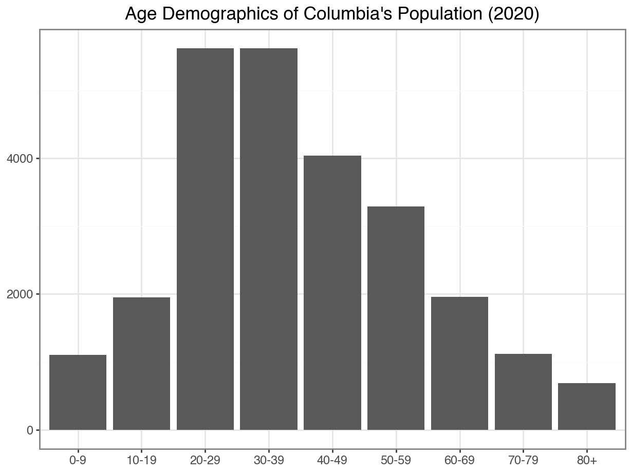
But this process seems a bit odd…
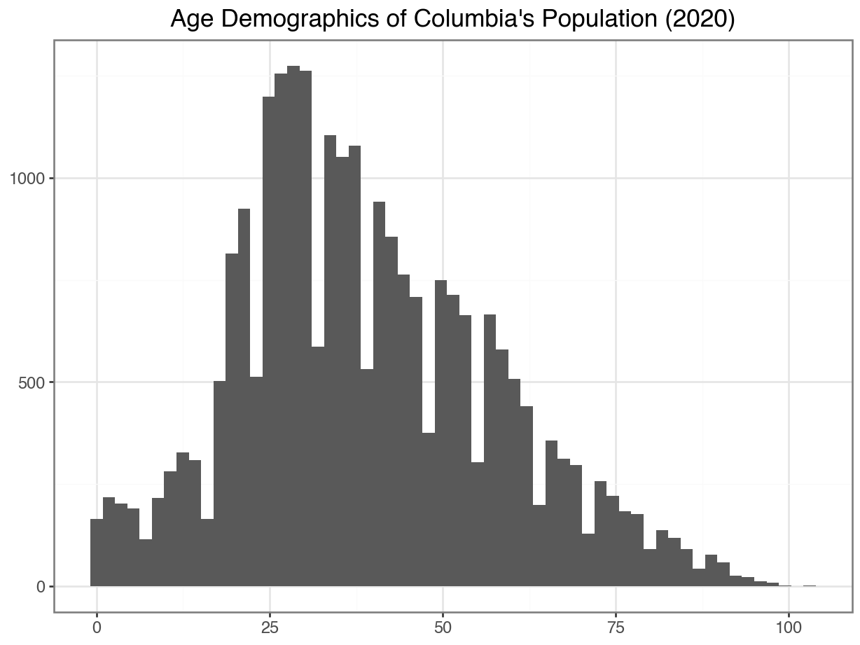
Option 2: Treat it as a quantitative variable!
A histogram uses equal sized bins to summarize a quantitative variable.
Code
(
  ggplot(data = df_CO, mapping = aes(x = "Edad")) +
  geom_histogram() +
  labs(x = "",
       y = "",
       title = "Age Demographics of Columbia's Population (2020)"
       ) +
  theme_bw()
)
Changing Binwidth
To tweak your histogram, you can change the binwith:
Code
(
  ggplot(data =df_CO, mapping = aes(x = "Edad")) +
  geom_histogram(binwidth = 1) +
  labs(x = "",
       y = "",
       title = "Age Demographics of Columbia's Population (2020)"
       ) +
  theme_bw()
)
Code
(
  ggplot(data =df_CO, mapping = aes(x = "Edad")) +
  geom_histogram(binwidth = 10) +
  labs(x = "",
       y = "",
       title = "Age Demographics of Columbia's Population (2020)"
       ) +
  theme_bw()
)
Adding Color & Outline
Code
(
  ggplot(data =df_CO, mapping = aes(x = "Edad")) +
  geom_histogram(binwidth = 10,
                 color = "orange",
                 fill = "darkgray") +
  labs(x = "",
       y = "",
       title = "Age Demographics of Columbia's Population (2020)"
       ) +
  theme_bw()
)
Using Percents Instead of Counts
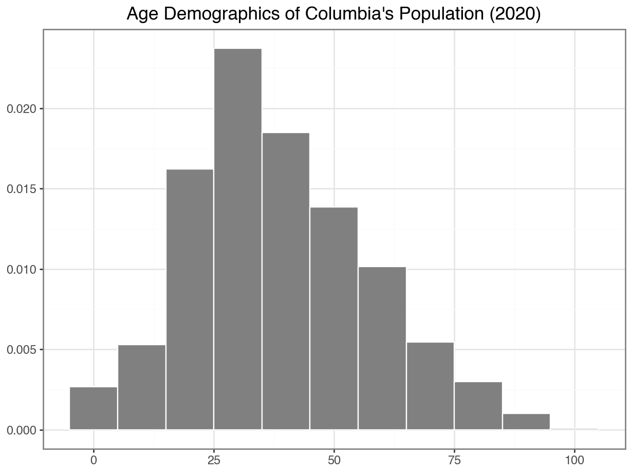
Densities
About what percent of people in this dataset are below 18?
Code
(
  ggplot(data = df_CO, mapping = aes(x = "Edad")) +
  geom_histogram(mapping = aes(y = '..density..'),
                 bins = 10,
                 color = "orange",
                 fill = "darkgray") +
  geom_vline(xintercept = 18,
             color = "red",
             size = 2,
             linetype = "dashed") +
  theme_bw()
)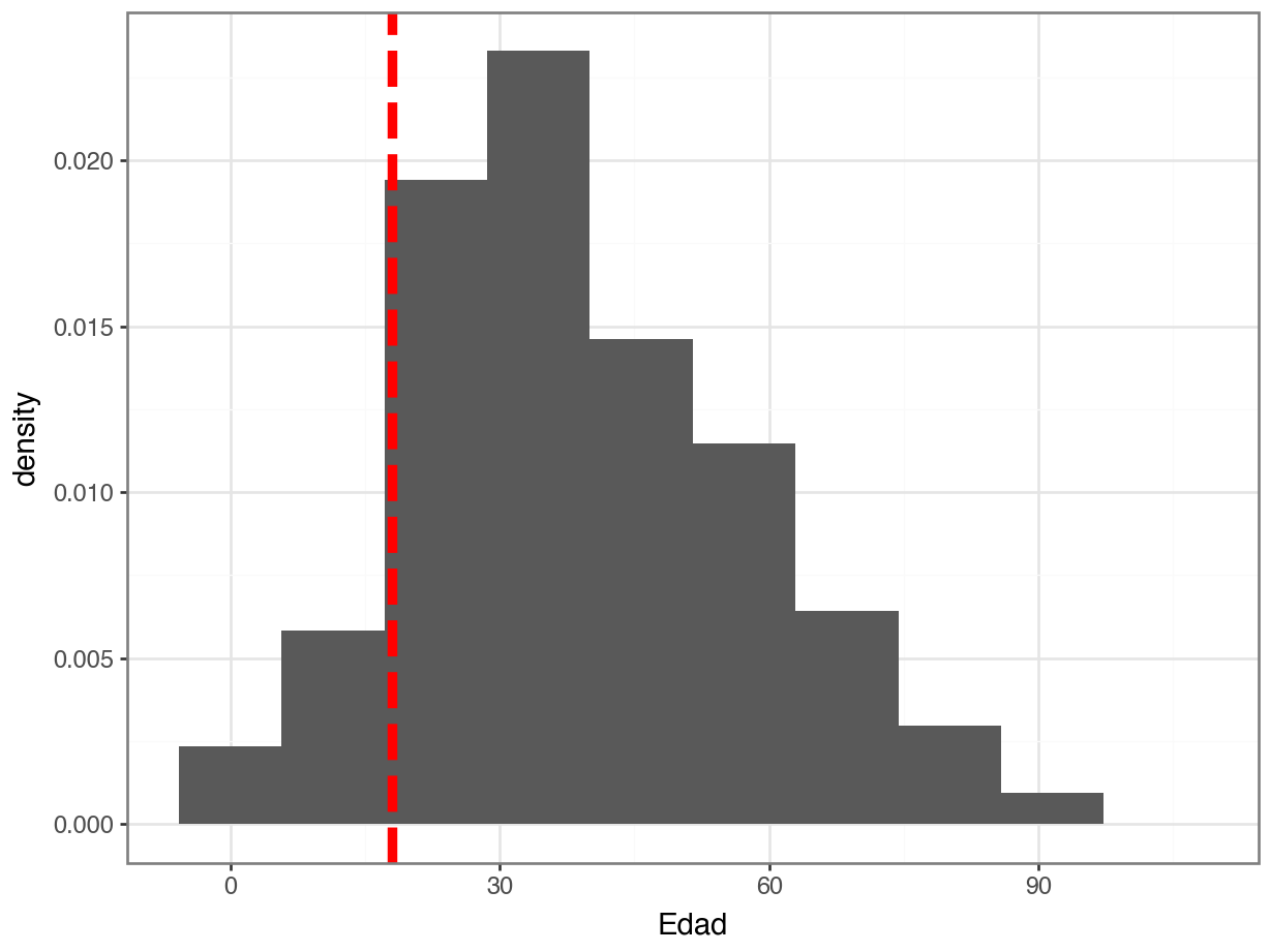
How would you code it?
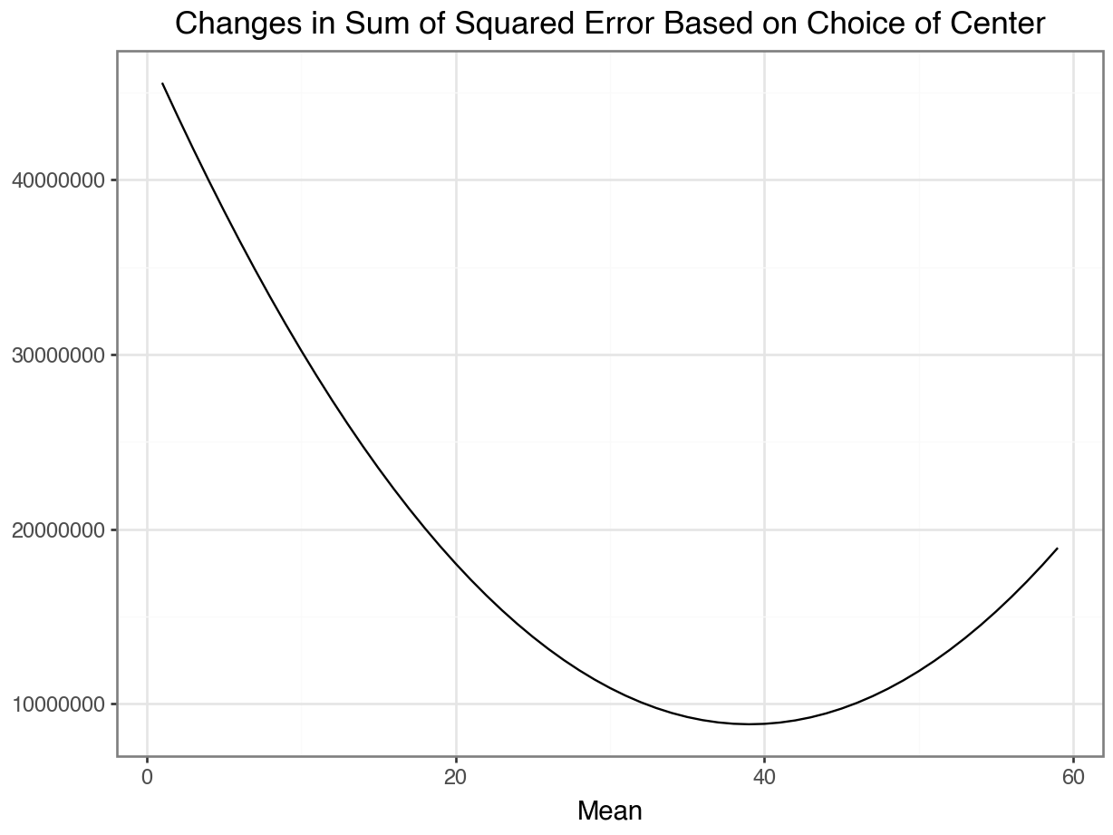
Minimizing squared error
Code
cs = range(1, 60)
sum_squared_distances = []

for c in cs:
  (
    sum_squared_distances
    .append(
      (
        (df_CO["Edad"] - c) ** 2
      )
      .sum()
      )

res_df = pd.DataFrame({"center": cs, "sq_error": sum_squared_distances})

(
  ggplot(res_df, aes(x = 'center', y = 'sq_error')) +
  geom_line() +
  labs(x = "Mean",
       y = "",
       title = "Changes in Sum of Squared Error Based on Choice of Center") +
  theme_bw()
  )