import pandas as pd

df = pd.read_csv("data/titanic.csv")Visualizing and Comparing Categorical Variables
The Grammar of Graphics
The Grammar of Graphics (GoG) is a framework for creating data visualizations.
A visualization consists of:
The aesthetic: Which variables are dictating which plot elements.
The geometry: What shape of plot you are making.
The theme: Other choices about the appearance.

Penguins!
from palmerpenguins import load_penguins

penguins = load_penguins()

Revealed!
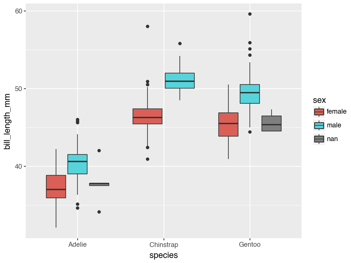
Themes
Code
from plotnine import theme_bw

(
  ggplot(penguins, aes(x = "species",
                       y = "bill_length_mm",
                       fill = "sex")
                       ) +
  geom_boxplot() +
   labs(x = "Species",
        y = "Bill Length (mm)",
        fill = "Penguin Sex") +
  theme_bw()
)
Check-In
What are the aesthetics and geometry in the cartoon plot below?
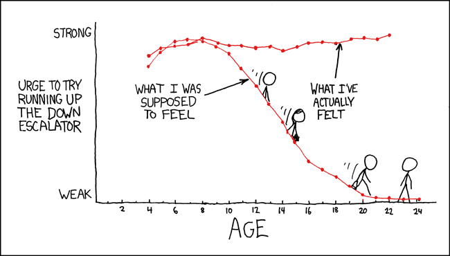
An XKCD comic
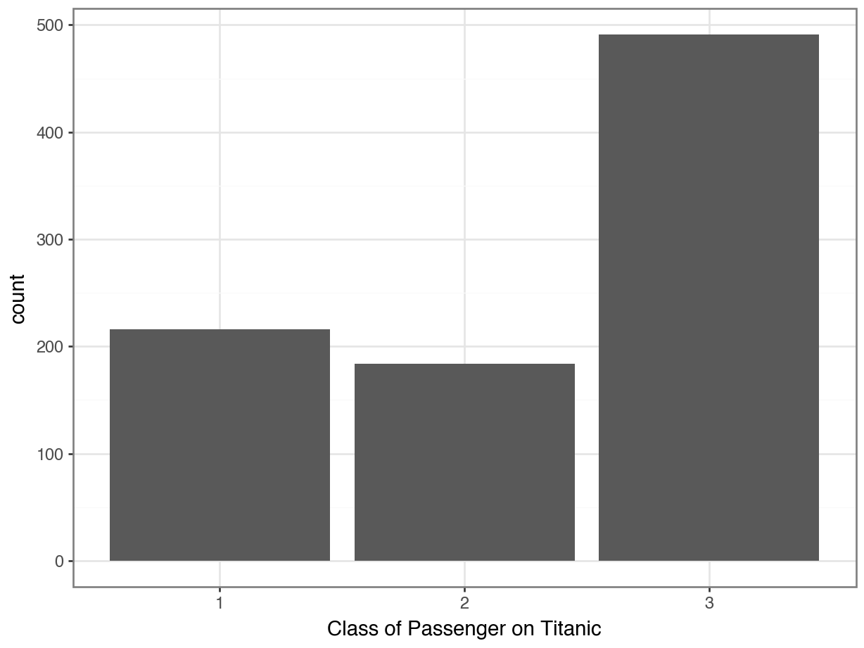
Bar Plots
To visualize the distribution of a categorical variable, we should use a bar plot.
Code
from plotnine import *

(
  ggplot(data = df, mapping = aes(x = "Pclass")) +
  geom_bar() +
  labs(x = "Class of Passenger on Titanic") +
  theme_bw()
)
Percents on Plots
Code
(
  ggplot(data = pclass_dist,
         mapping = aes(x = "Pclass", y = "proportion")) +
  geom_col() + ### notice this change to a column plot!
  labs(x = "Class of Passenger on Titanic") +
  theme_bw()
)
Tip
Technically, you could still use geom_bar(), but you would need to specify that you didn’t want it to use stat = "count" (the default). You’ve already calculated the proportions, so you would use geom_bar(stat = "identity").
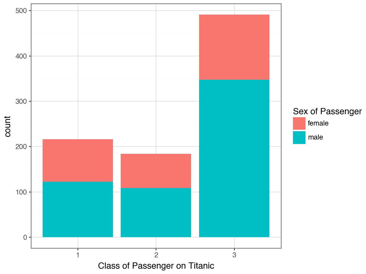
Option 1: Stacked Bar Plot
Code
(
  ggplot(data = df, mapping = aes(x = "Pclass", fill = "Sex")) +
  geom_bar(position = "stack") +
  labs(x = "Class of Passenger on Titanic",
       fill = "Sex of Passenger") +
  theme_bw()
)
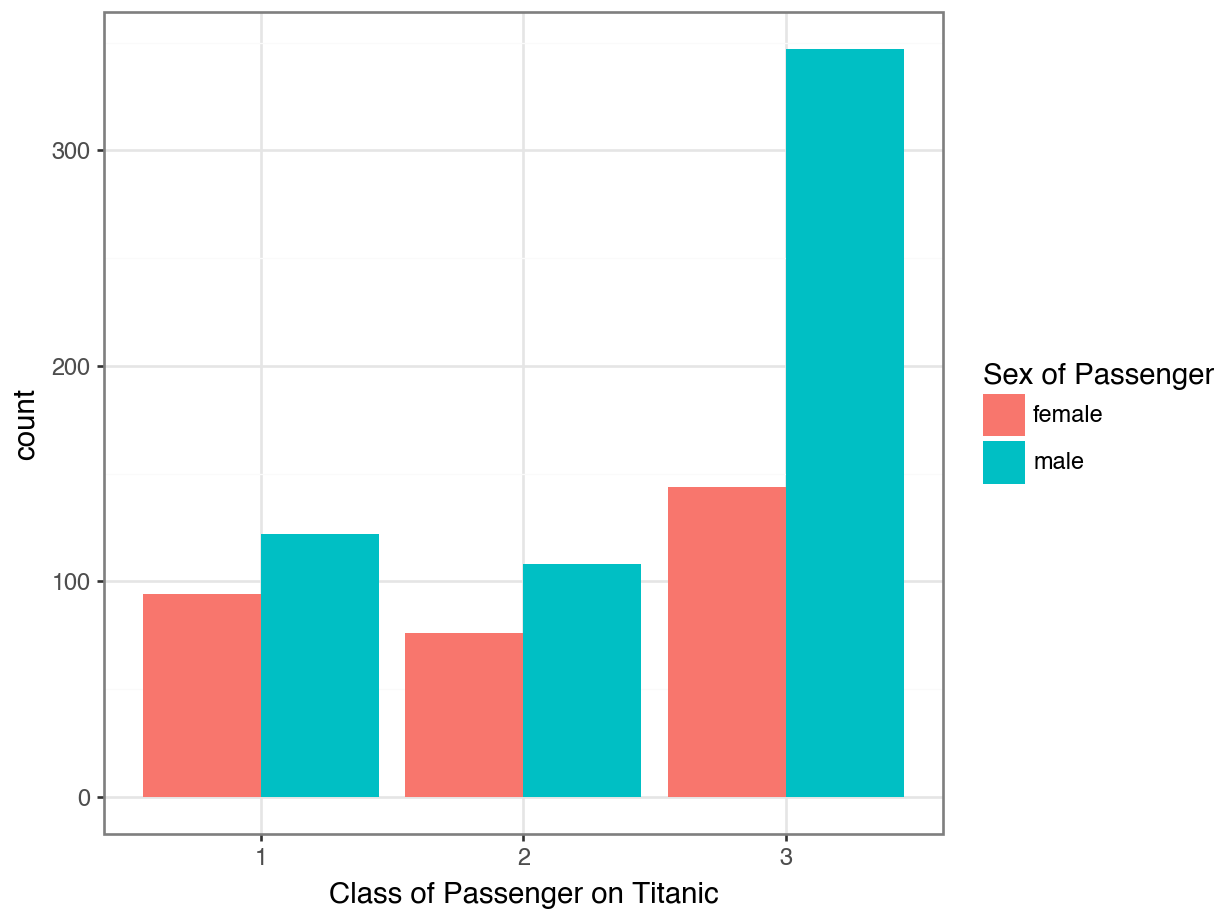
Option 2: Side-by-Side Bar Plot
Code
(
  ggplot(data = df, mapping = aes(x = "Pclass", fill = "Sex")) +
  geom_bar(position = "dodge") +
  labs(x = "Class of Passenger on Titanic",
       fill = "Sex of Passenger") +
  theme_bw()
)
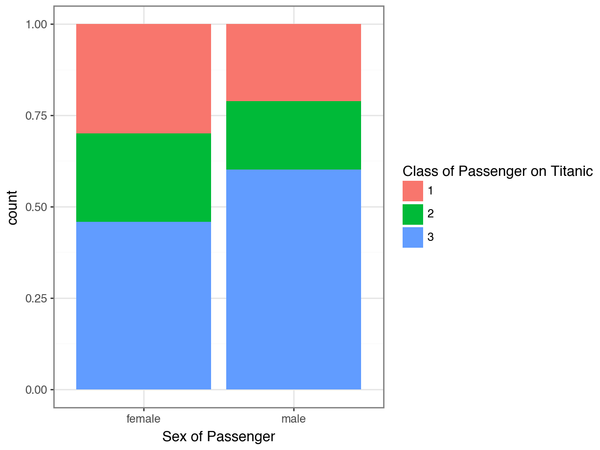
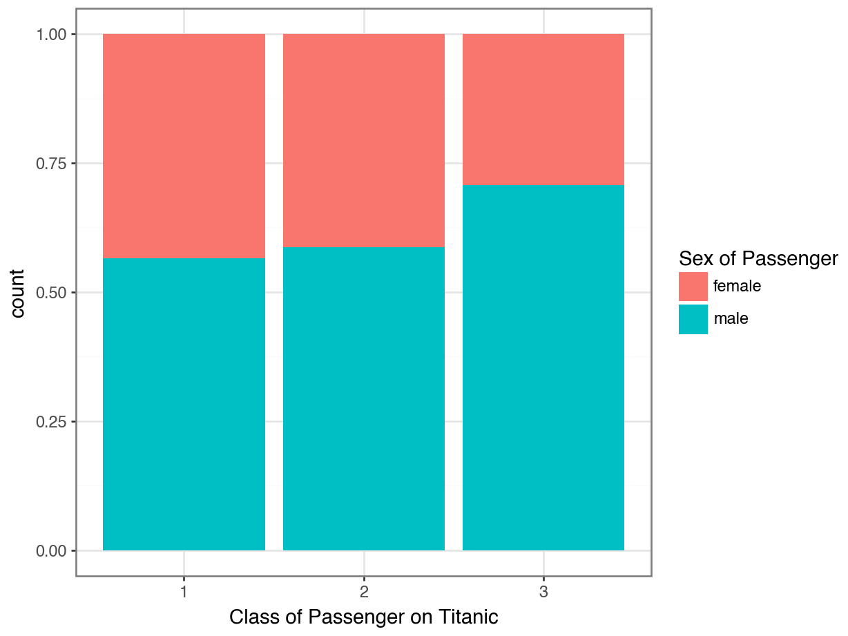
Option 3: Stacked Percentage Bar Plot
Code
(
  ggplot(data = df, mapping = aes(x = "Pclass", fill = "Sex")) +
  geom_bar(position = "fill") +
  labs(x = "Class of Passenger on Titanic",
       fill = "Sex of Passenger") +
  theme_bw()
)
Which plot better answers:
“Did women tend to ride in first class more than men?”
Code
(
  ggplot(df, aes(x = "Pclass", fill = "Sex")) +
  geom_bar(position = "fill") +
  labs(x = "Class of Passenger on Titanic",
       fill = "Sex of Passenger") +
  theme_bw()
)
Code
(
  ggplot(df, aes(x = "Sex", fill = "Pclass)) +
  geom_bar(position = "fill") +
  labs(fill = "Class of Passenger on Titanic",
       x = "Sex of Passenger") +
  theme_bw()
)